Light, happy, and whimsical design elements are just the trend we need in the world right now.
These projects bring a more joyous touch to all types of projects in various industries with common themes that are just a little more quirky than you might expect.
They don’t have to feel childish or tacky – they can bring a personality to your projects that’s often all too lacking in modern design.
Here’s a look at this website design trend with a little inspiration for incorporating it into your projects.
Identifying the Design Trend
It’s almost hard not to notice this website design trend. Elements of whimsy are fairly easy to identify and spot because they make you grin or smile just a little bit when you run across them. (Think of this trend as finding an Easter egg in a design, only without actually having to look for it.)
One of the most interesting things about this design trend is that these designs are being used across industries for a variety of purposes. From portfolios to e-commerce to even healthcare, elements of whimsy are a fun way to add a little something extra to the design. (And make someone’s day as well.)
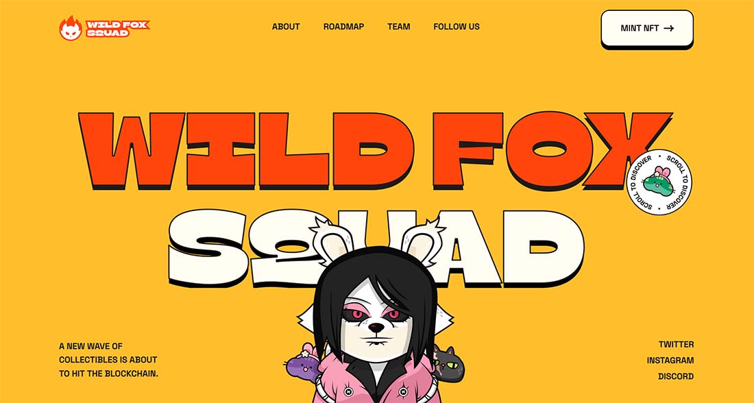
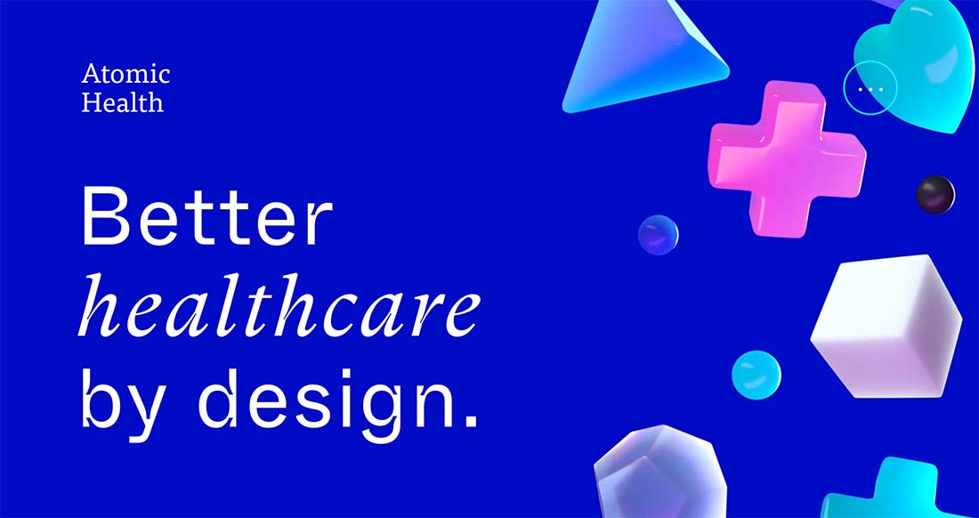
The best part of this design trend is the feeling that comes with it. Elements of whimsy are fun, visually interesting, and set a mental tone for the user experience. The design can be complete whimsy, such as Wild Fox Squad (example above), or just use elements of whimsy, such as Atomic Health (above).
Key Characteristics
There are plenty of elements and techniques that help contribute to a feeling of design whimsy.
- Color: Often bright and bold
- Font selection: Big lettering, color, novelty typefaces
- Animation: Elements that dance or move or behave with bounces or twists
- Illustrations: Surreal characters
- Animals: Pets with human characteristics are quite whimsical
- Nostalgia: Video or image elements that are reminders of other happy times or things
- User interface elements: Particularity with some sort of actionable feature
- Microcopy: Words that surprise or encourage in a good way
Tips for Using this Web Design Trend
This website design trend can be highly effective because users like to be delighted when they visit. By instituting a whimsical element, you can entice users to hang around because they will feel good when interacting with the design.
When thinking whimsically, you have two options for the design aesthetic:
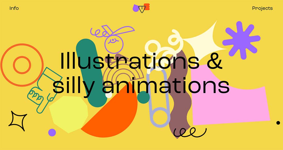
- Go all in with a fully whimsical design, such as Uve (above). Everything here from the colors to fonts to illustrations to the mouse pointer all include elements of whimsy.
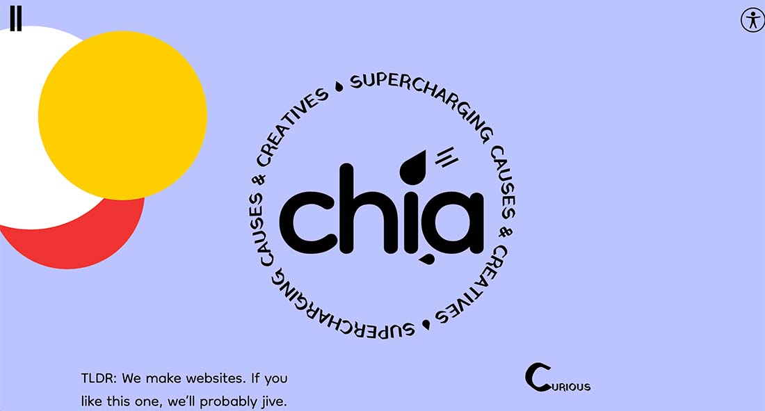
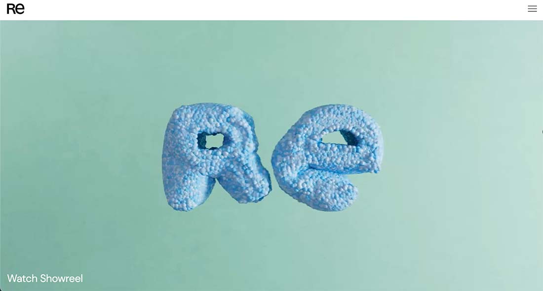
- Use one strong whimsical element and work the design around it with a more straight interface, such as RE (above). RE uses a video reel that explodes and showcases the two letters in a variety of ways, but when you get to the scroll that element is gone and the rest of the design is fairly straightforward. The whimsy is there to draw you into the design and fades so you can comprehend the content without distractions.
Once you decide whether you are going for it all or just with a smaller element, plan how it will work. What design elements will contribute to the whimsy? How will users interact with it?
Once you have a plan, this design concept should come together rather smoothly.
Things to Be Aware Of
The primary challenge with this website design trend is context and voice. While whimsy can be a great option for many projects, it might not create the right vibe for everything.
If you have a serious subject matter, a whimsical website design might not be the best choice for your project.
3 Examples We Love
Designing with whimsy can be a lot of fun. Here are three projects we love and why.
Pacifik Poke
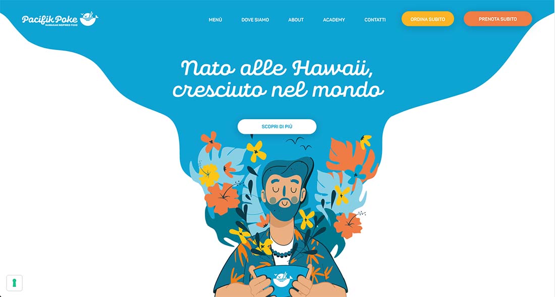
Pacifik Poke uses a fun illustration to create whimsy in a very expected way. The result is captivating and interesting. From color choices, to artistic style, to the use of space, everything about the design makes you want to learn more about the restaurant.
A couple of especially nice touches include the animation when the home illustration pops onto the screen and the use of background layer illustrations in the same style. All with actual photos below the scroll, merging elements of reality (necessary in this industry) with whimsy.
Bonnie Hong
Bonnie Hong’s portfolio is filled with whimsical elements in a way that’s fun and makes you want to keep engaging with the design. The thing that’s different than most of the other websites we see using this trend is that it contains an actual photo.
All of the whimsy here is in user interface elements, color, and microcopy.
Ruska
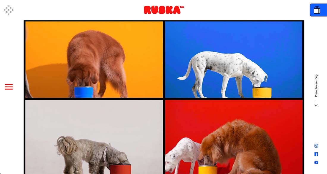
Ruska does a couple of things here – and you don’t have to speak the language to understand. They use animals, bright colors, and fun fonts.
They also play on nostalgia. (Watch the video and you’ll probably see a connection to The Brady Bunch.) Every element of this homepage makes you smile and feel good about the product.
Conclusion
When you see a lot of projects with a trend like this that has a distinct emotional tug or feel, it’s often an indicator of the way we collectively feel or want to feel. Design projects with an element of whimsy are lighter and happier than other designs. (While some design trends aren’t that emotional, that is the furthest thing from reality here.)
The best whimsical designs pull together a variety of elements so that the visuals and content have the same light, bright feeling. When you put all that together, you have a solid recipe for happiness and success.

0 Commentaires