Website navigation design went through a series of phases over the past few years. So, what can we expect to see this year? Which navigation trends will be most popular and effective? Let’s have a look.
Over the years, designers found creative ways to make website navigation look cool and interesting. While most of those trends died off quickly, some of them, like mega-menus, off-canvas menus, and sticky navigation made it to the web design hall of fame and are still being used to this day.
In this post, we explore some of the popular navigation trends of the past few months and see which ones will be most effective this year. Without further ado, let’s dive in.
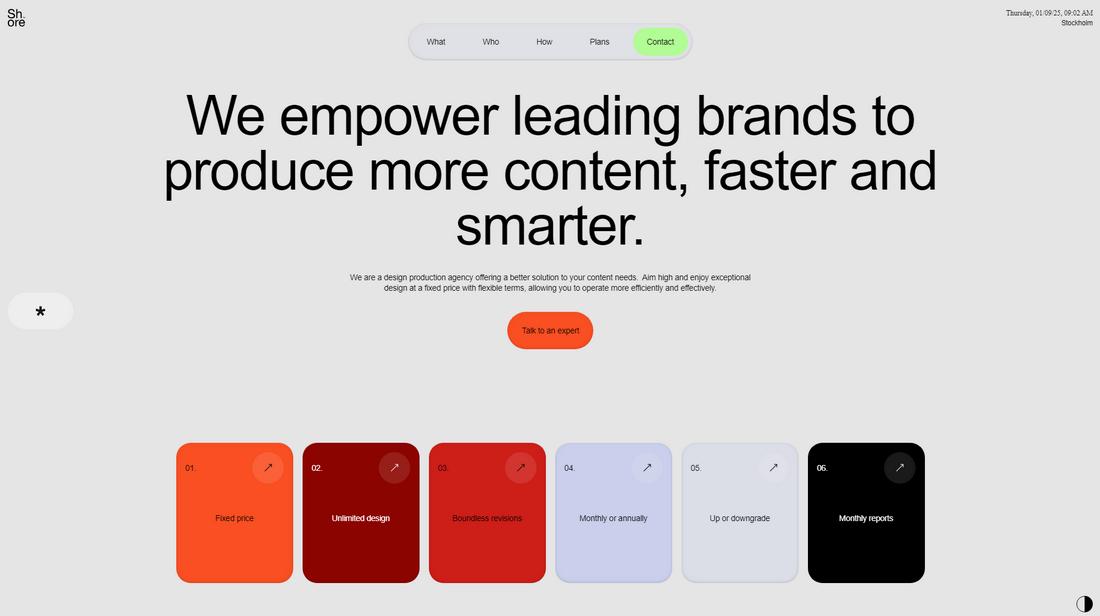
1. The Shift Toward Minimalist Navigation
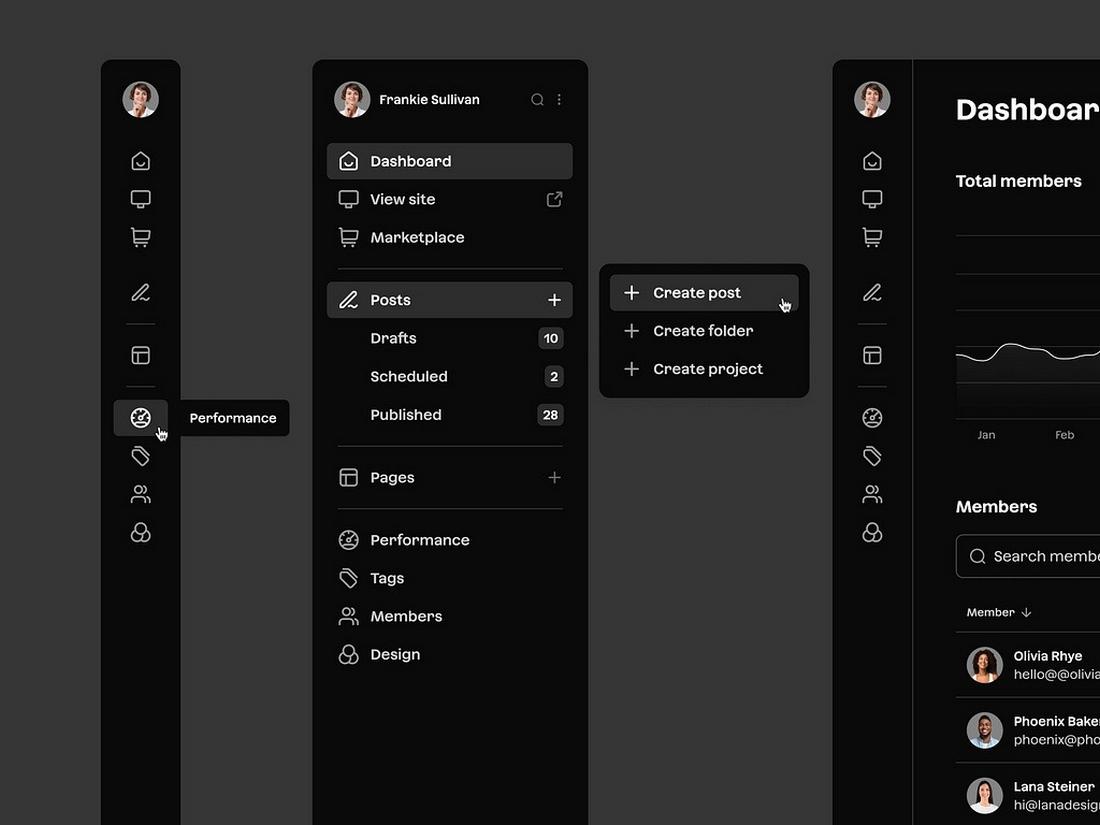
This year, we can expect to see a big shift in navigation design geared towards minimalism. Users now prefer much simpler and streamlined navigation over flashy and complex menu designs with animations and visuals.
Minimalist navigation is not about getting rid of all the design elements, it’s about working with the most essential parts of navigation to create a simplified user experience.
Whether it’s removing unnecessary links, reducing clutter, or using expandable sub-menus, minimalist navigation will help users find what they’re looking for much faster and easier than ever.
2. Sticky Navigation: Keeping Key Links Within Reach
Sticky navigation is nothing new, it’s been around for years. But no one can argue their effectiveness.
The way they stick to the screen no matter how far you scroll down on a webpage, allows users to quickly navigate to other parts of the site without having to scroll all the way back to the top. Even some of the popular search engines, such as Google and Bing, utilize sticky navigation to improve user experience.
Sticky navigation designs are now much more dynamic and creative than before. They offer much more creative uses beyond convenience, with floating buttons and interactive elements, to offer a memorable experience to users.
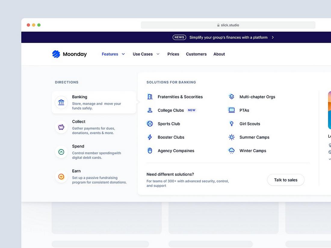
3. Mega Menus Are Still King
When it comes to eCommerce websites, educational platforms, and magazine sites, a mega-menu is the ideal way to showcase dozens of categories and subcategories in a well-organized way.
In the past few months, we noticed mega-menus becoming more dynamic with simplified yet more visually appealing designs. They now use hover animations, subtle interactions, and visual elements such as icons and product images to make the menu feel less overwhelming.
One thing is clear, mega-menus are still the king of navigation and they are here to stay.
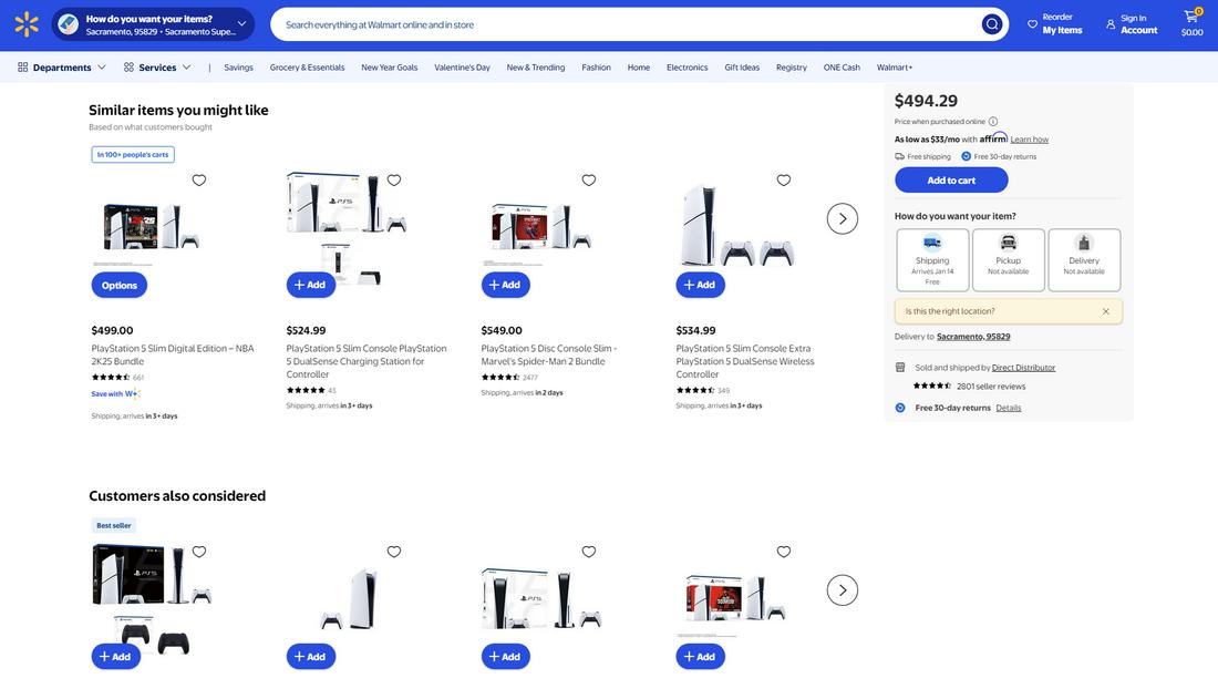
4. The Rise of Adaptive Navigation
Much like mega-menus, adaptive navigation designs have been a popular choice in eCommerce website designs over the past couple of years. These menu designs offer a more personalized experience to users with navigation systems that adjust based on user preferences.
Adding elements to navigation such as recently viewed items and suggesting products based on user history is an effective way to boost sales and engagements.
These adaptive menus are getting much more innovative and creative as designers create navigation that adapts and changes based on user behavior.
5. Breadcrumb Navigation for Enhanced Wayfinding
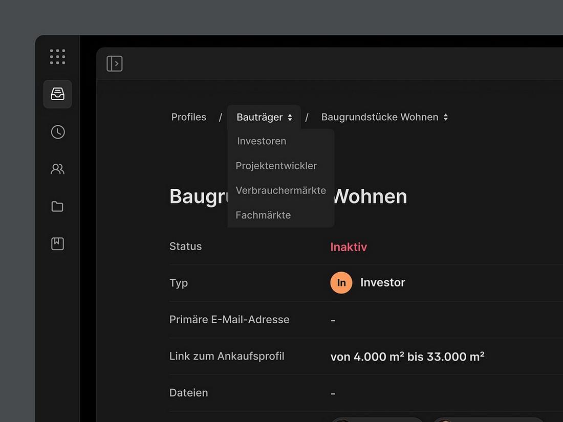
Breadcrumbs will be making a comeback this year as it has proven to enhance the user experience by providing a clear path through website navigation. Breadcrumb navigation allows users to easily find their location on the website and go back to specific pages without getting lost.
Modern breadcrumb navigation designs have evolved beyond text links to beautiful icon-based designs as well as tabbed sections and scroll-based navigations for mobile platforms.
6. Micro-Interactions in Navigation
Adding subtle and simple micro-interactions in navigation menus is one of the hottest trends in web design. It’s actually much more than a visual choice.
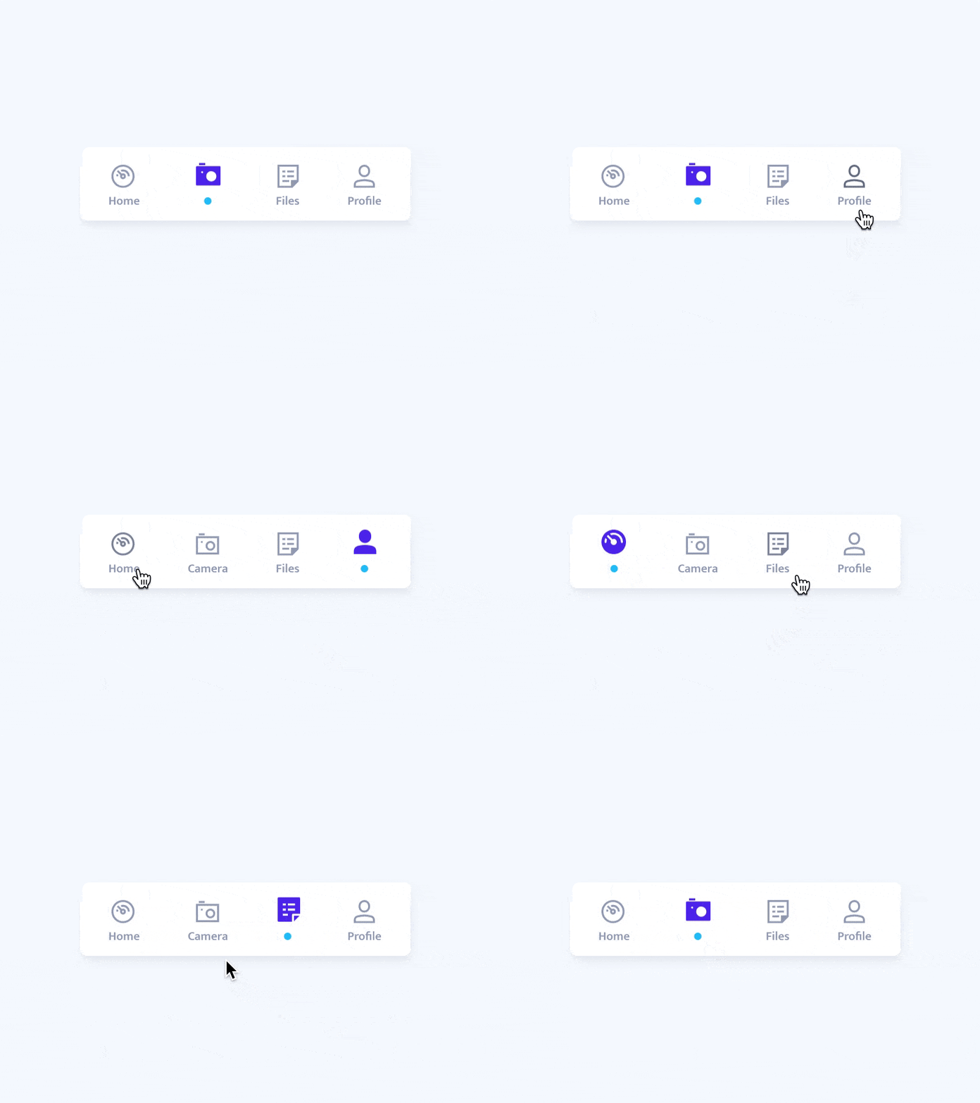
With micro-interactions, such as simple transitions, button animations, and hover effects, you can provide feedback as well as guide users on the buyer’s journey.
This year, short and meaningful interactions will help enhance website navigation designs. It not only allows you to effectively highlight the clickable elements on a menu but also provides better user guidance.
7. Innovative Floating and Off-Canvas Menus
Floating and off-canvas menus may not be the favorite among desktop users, but it’s been a huge space-saver in designing for mobile platforms.
Off-canvas menus provide much bigger space to showcase navigation menus without obstructing the main content area. It allowed designers to create much cleaner and intuitive user experiences on mobile screens.
We’ll surely see more innovative and creative floating and off-canvas menu designs this year, just as we have in the past few months.
8. Search-Centric Navigation
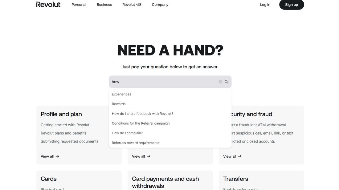
Search is arguably the most important component in navigation as it allows users to go directly to what they want to find and explore beyond the links in the menu.
Lately, there have been many advancements in search-centric navigation design. We saw websites that completely stripped off menus to replace them with advanced search bars that offer much faster navigation with filters, predictive text, and voice search. This is an ideal approach for content-heavy websites, such as eCommerce platforms. We can expect to see more of these search-centric navigation systems in the coming months.
9. Accessibility-First Navigation
Making sure navigation is accessible to everyone should be your biggest priority this year. While following accessibility guidelines and compliance with accessibility laws are important, you should always prioritize making your website open to all people.
Designing navigation menus that support keyboard navigation as well as adding ARIA roles to make the menus compatible with screen reader software are crucial to creating accessible menu designs.
10. Voice and Gesture-Based Navigation
With the new advancements in generative AI and AI-powered systems such as Google Gemini and Apple Intelligence taking over mobile platforms, users will soon be browsing the web using just their voice commands.
Voice-based navigation will be a must for mobile website design. Soon, with AR and VR devices on the horizon, it will make its way into desktop web experiences as well.
Conclusion
Navigation is one of the key components of website design. Without it, users will feel lost, like exploring a map without roads. The same goes for overly cluttered navigation designs that mislead and confuse users.
By adopting new navigation trends and designs, you can avoid creating such outdated menus and offer a smoother user experience to help them find what they need quickly and effectively.
As long as you prioritize clarity, usability, and inclusivity, you’ll be able to create navigation systems that feel effortless.
0 Commentaires