Picasso, Monet, Van Gough, and modern-day artists like Banksy are known for breaking the rules and redefining the standards of art.
These artists proved that sometimes, you need to break the traditions and rules to create more memorable and dynamic designs. Even today, you’ll see this to be true in both print and digital designs.
Designers are encouraged to follow the rules and use grids to create well-structured and “effective” designs. However, this also puts restraints on creativity.
So, is it safe to go off-grid when creating designs? When should you use a grid-based design? What are the pros and cons? Let’s find the answers.
What Are Grids and Why Use It?
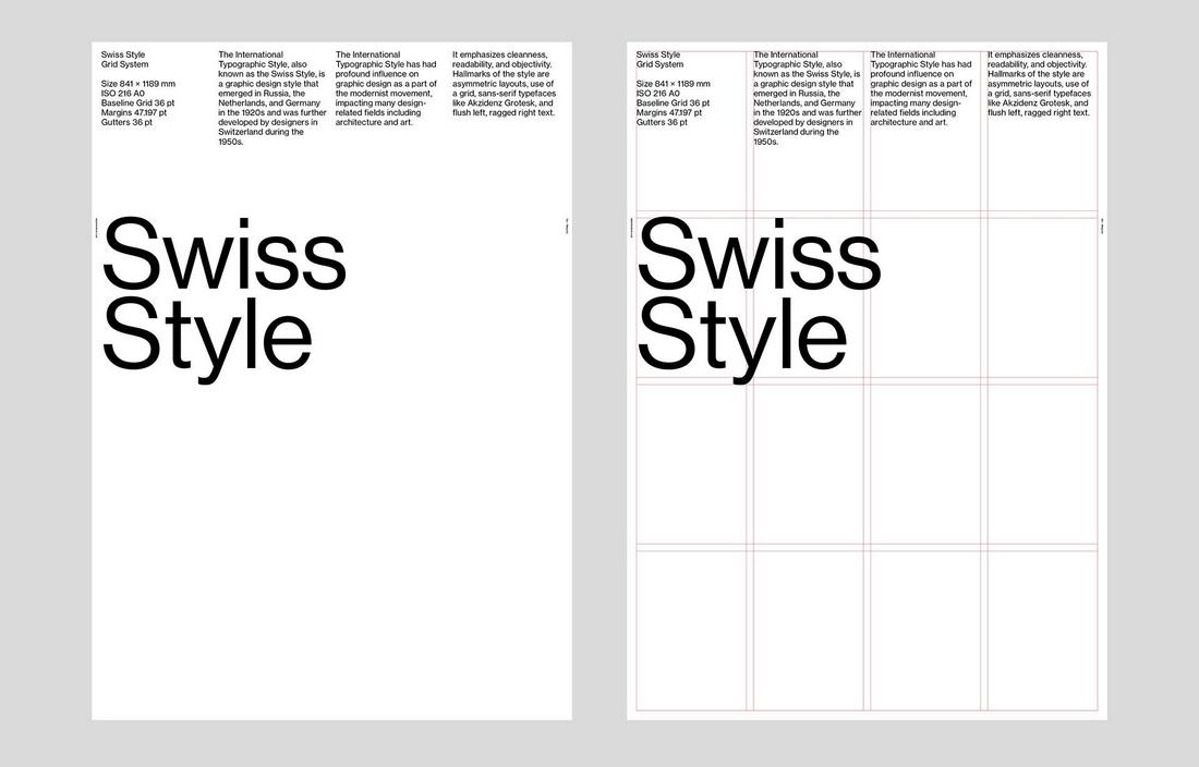
(Credit: Stephen Kelman / Behance)
The grids in design are systems designers use to organize and structure content. It’s more like the foundation you use to build your design. Grids ensure balance, better readability, hierarchy, and overall better user experience. Simply put, grids allow you to create safer designs.
Whether it’s graphic design, web design, user interface design, or photography, grids help you create well-aligned designs that are widely accepted as a standard. Grid-based designs are also easier to maintain and manage.
However, many designers feel grid systems are too restrictive as they limit your ability to be more creative and try new things.
Why Go Off-Grid?
In a way, grids force you to stick to a frame. This limits your options and sometimes leads to rigid and uninspired designs that just look the same.
The main reason designer go off-grid is to let their creativity run wild. When you aren’t restricted by a frame, you can go beyond the borders and try new things. This gives birth to unique and inventive designs.
Another reason to go off-grid is to capture attention. When you create things that defy the rules and the norms, they stand out. This is a common practice used in marketing to grab the attention of the users.
Some designers debate the relevance of the grid. Modern designs need to be more fluid and dynamic to serve users on various platforms. Grids could get in the way of creating such designs. Going off-grind allows you to try new approaches and adapt to new formats.
How to Create Balance Without a Grid
Going off-grid does not mean inventing your own ways of design. There still needs to be a balance in your design to make it usable, readable, and overall a better user experience.
To achieve this balance, you need to follow a few design systems:
- Visual Hierarchy: Visual hierarchy helps you to create a well-balanced structure that guides users on a journey. A great thing about this system is it doesn’t restrict you to stick to a framework.
- Focal Points: When you create your design with a main focal point, whether it’s a title, image, or a call-to-action button, it’s easier to give purpose to your design.
- Negative Space: With negative space, or white space, you can guide users to your focal point more effectively. It also helps create a clean and minimal look.
- Flow: Arranging your content in a flowing manner will allow users to easily navigate the design without feeling overwhelmed.
When & How to Go Off-Grid
Knowing when to go off-grid is quite important as this approach doesn’t work for every type of design. For example, some designs like newspapers, magazines, and business brochures need to follow a grid design to ensure readability.
Go off-grid when you want to make bold statements and reinforce your brand’s edgy or modern identity. And when you do, here’s what you can do to create grid-breaking designs.
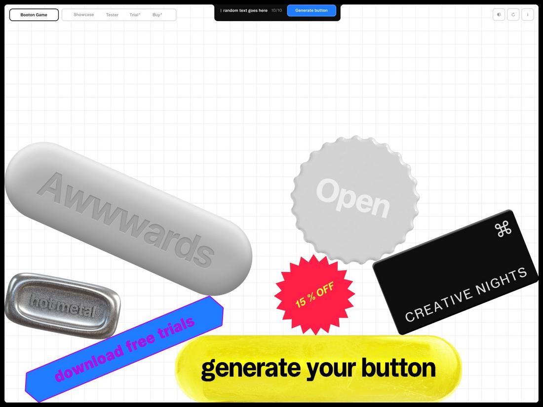
Layering and Overlapping Elements
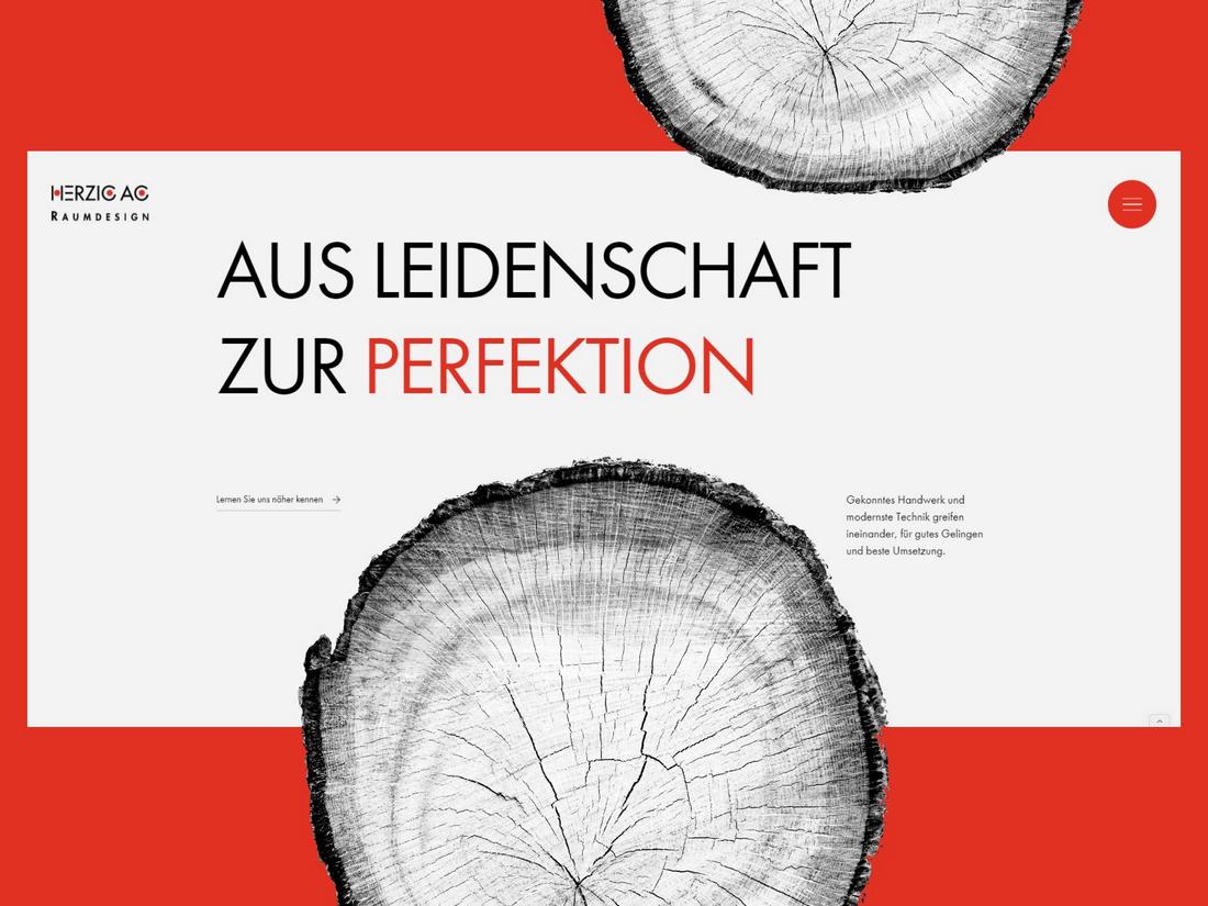
Overlapping and layering elements is one of the easiest ways to create depth in your designs. It also adds a sense of sophistication and movement that can’t be achieved through a grid-based design.
Dynamic Typography
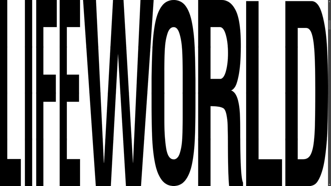
Trying out different placements, sizes, and arrangements for your titles and text is another great way to make your designs look edgy and trendy. When you go off-grid, you will get the freedom to experiment with typography, instead of placing text in a box.
Organic Shapes and Fluid Lines
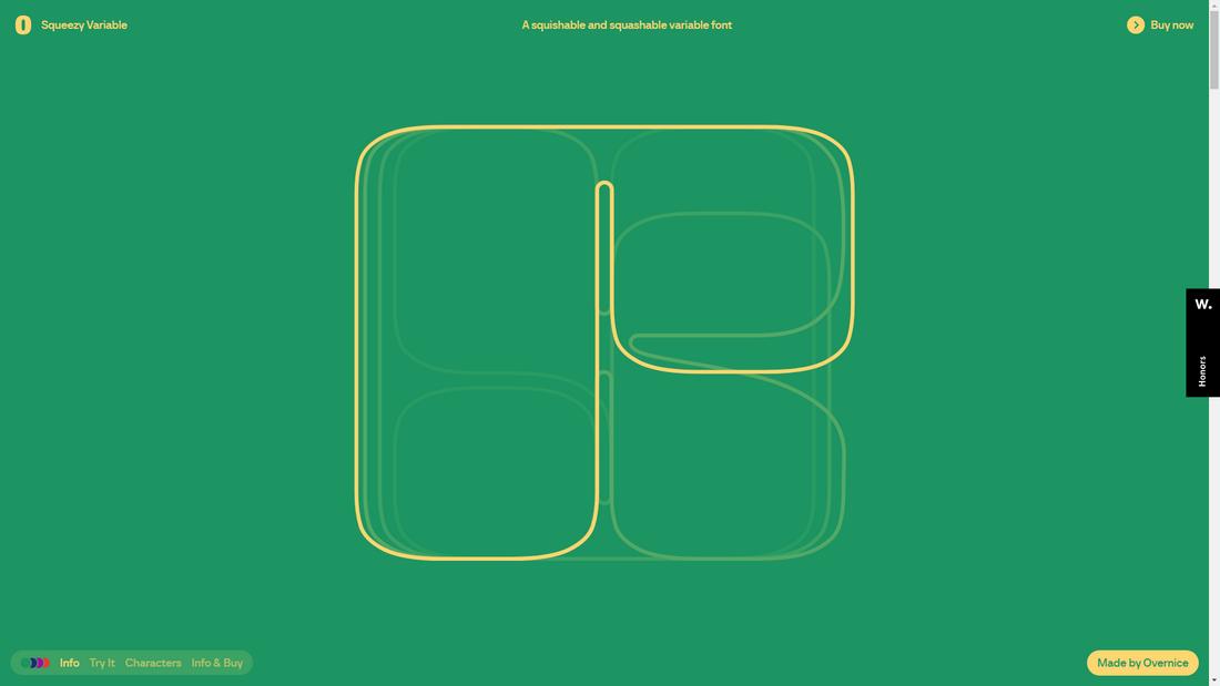
In an off-grid design, your lines no longer need to be straight and shapes no longer have to be geometric. You can add curvy lines and irregular shapes to your designs to create a unique and playful vibe.
Interactive Design
Adding unique animations and interactive elements often requires an off-grid design. Some of the most unique, interactive websites and mobile apps use off-grid layouts.
Pros & Cons of Off-Grid Design
While there are benefits to using off-grid designs, there are downsides to breaking the grid as well.
Pro: Stand Out from the Crowd
The biggest benefit of the grid-breaking design is the freedom it gives you to experiment with creative ideas. It also allows you to boldly express your brand’s unique identity and try fresh looks for designs.
Pro: Better Performance
When following grid-based designs, especially in web and app design, you have to use frameworks. These frameworks are often heavy with scripts and code, which affects performance. When you ditch the grid, you can also skip using a framework and it will result in much improved performance.
Con: Usability Concerns
One area that has a strong impact on using off-grid design is accessibility. It’s very difficult to break the grid and make a design accessible to people with disability and vision impairments. You’ll have to test the designs rigorously to make sure they adhere to accessibility standards.
Con: Risk of Chaos
When you create without a grid, designs tend to get chaotic with text, images, and shapes all over the place. A solution to this problem is to use fewer elements in your designs but even then you will have to be careful in structuring the content.
Con: Compatability Issues
A grid-breaking design you create for a desktop will not look the same on mobile devices. It’s almost impossible to create responsive off-grid designs. Sometimes, you will have to design separately for different platforms.
Conclusion
Off-grid designs not only give you design freedom but also encourage you to experiment with creative layouts. It will also inspire you to push the boundaries of designs to experiment with new ideas. And that’s what design should be about!
However, make sure to follow the right design systems to create balance and hierarchy in your designs and create designs with purpose.


0 Commentaires