Users are spending a lot of time interacting with websites on mobile devices, rather than desktops. And that number seems to be growing daily. According to eMarketer, adults in the U.S. spend an average of 3 hours and 35 minutes on their phones, and the amount of time engaging on these devices is expected to pass TV viewing next year.
That has significant implications for all web designers and developers. You must be creating effective responsive websites or apps to meet this need. Today, we’re exploring eight rules to make sure you follow whenever you’re designing a responsive experience (whether for a website or an app).
1. Declutter the Design
The best thing you can do to make the most of a responsive website or app design is to declutter it. Don’t pack the design full of too many options or buttons. All of this only overwhelms users. There are a couple of ways to do this effectively:
- Streamline the content: Pay close attention to what the user needs to know to interact with the website or app. Present this information in a logical manner using a series of screens or steps. Jumbling everything on the screen at once is overwhelming on small screens.
- Only use interface elements that are essential to the function of the design. Why include buttons for options that users aren’t interacting with? (If you aren’t sure, look at analytics data. You should be able to see a pattern of interaction and user flow from certain actions.)
2. Make Tasks Digestible
One of the most common tasks for users is to complete a form. So we’ll use that as the example here for thinking about how to make actions digestible. Imagine a checkout screen after you’ve put something in your cart online. What happens then?
Is there a long screen with tons of fields to fill out (some of them very small)? Or does the interaction start with a simple ask that you can complete on one screen?
My guess is that you are more likely to fill out the latter form. And so are most users. When the form looks easy, people are more willing to provide information and click through to the checkout (or other desired action).
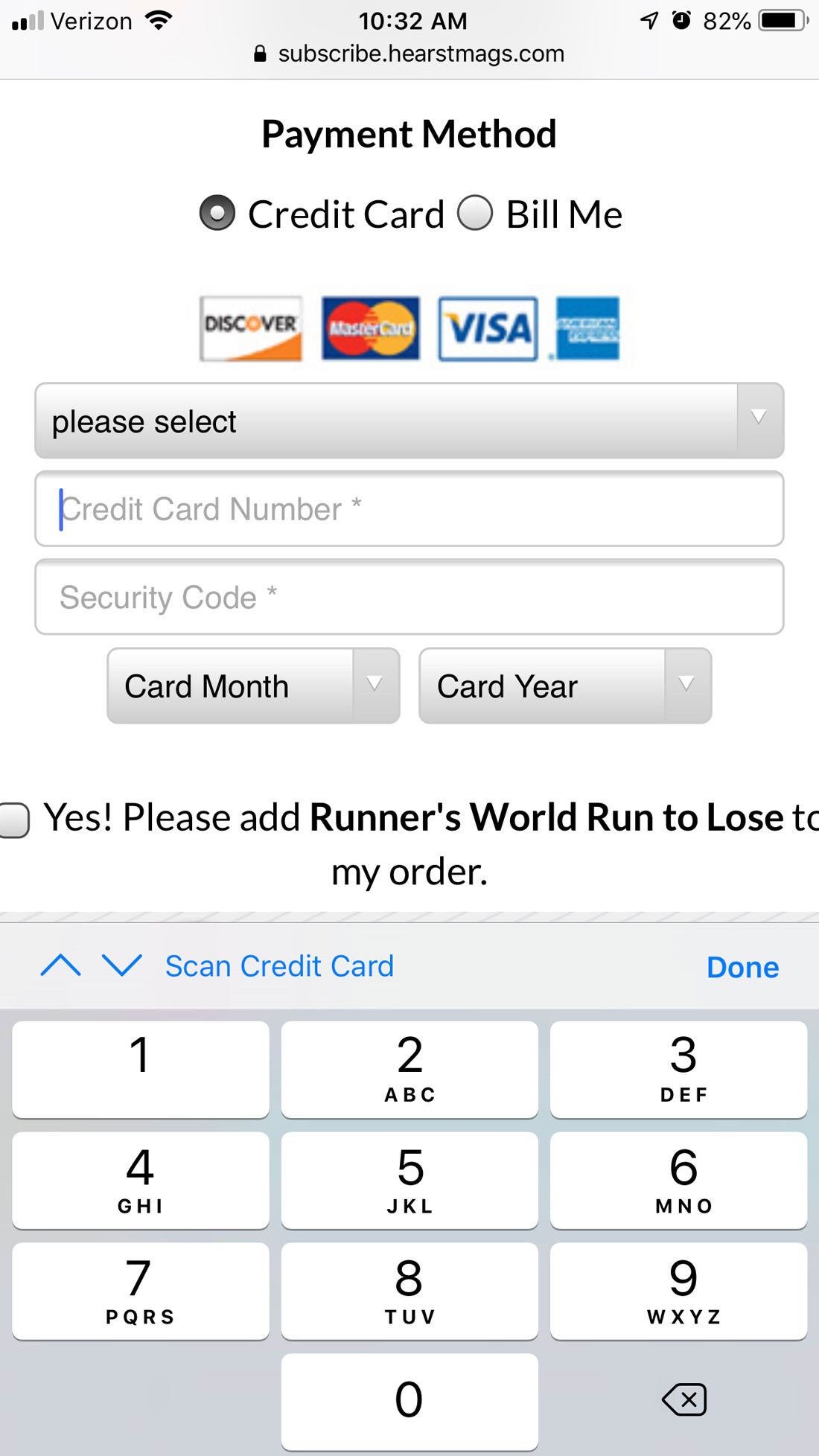
One more tip when it comes to data and forms – use smart features when you can. Functionality such as autocomplete will make a user more likely to actually convert that form all the way to completion because it is easy. The fewer things a user has to actually type (or tap to type), the more likely they are to keep going.
Another example is clear in the example of Evernote, above. One of the main tasks is to add a new note. The green + button is highly visible at the bottom center of the screen, making this action easy to find and complete.
3. Create Buttons That Are Obvious and Easy
Sometimes there’s this tendency for designers to want to create something new and exciting and overthink the obvious: buttons should look like buttons.
Don’t try to reinvent the wheel here. Don’t get fancy and design a new way to complete actions. Design buttons that look and act like buttons. Stick to common usage patterns and functionality.
If users have to think too hard – or at all – about how to engage with the responsive website or app design, the likely scenario is that they don’t engage at all and move on to another option.
4. Match the Keyboard to the Data
When it comes to responsive websites or apps, there are plenty of small engagements that have a big impact. Using the keyboard properly might be one of your biggest assets.
Make sure to consistently match the keyboard type – alpha or numeric – to the type of query. If you are asking for certain information, such as an email address, include the @ key. These little details delight users and make your website or app easy to use. And it only takes a little extra effort on your part.
Need more information on how to do it?
5. Use Simple Language
The words you use can dramatically impact the usability of a responsive website or app as well. An effective design includes language that’s easy to read and understand, both visually and cognitively.
Don’t try to get too cute with language or elements that users need to understand. Provide simple, clear and direct instructions. Avoid jargon or unclear language. Then take it a step further. Use clean, clear typography to help provide further emphasis and understanding with text elements.
Understanding and readability have two parts – cognitive understanding (a user knows exactly what the words mean or what action is implied) and visually (every word is clear and easy to read on the screen).
This means you need to write in a way that’s understandable, pick out a font that’s readable and provide plenty of visual contrast between the background and text so that it all comes together in a way that’s easy for users to understand.
6. Be Mindful of Errors
“Anything that can go wrong, will go wrong.” – Murphy’s Law
Things are going to go wrong. It’s no big deal if you are ready for it.
Users will tap an odd combination of elements, or copy a strange URL, or lose their internet connection, or do something else you just don’t expect. Provide as much information as possible when things do go wrong so that users can get back on track with ease.
When designing error messages, try to explain what went wrong and why – such as “no internet connection” – and how the issue can be resolved. Both pieces of information can be conveyed on a single screen with a link to the fix (when appropriate). Smashing Magazine has a nice long read on how to design error states for mobile here.
7. Be Wary of Video – For Now
While we love to use video on responsive websites, it’s still not always the best option for mobile. (Many devices are still spotty when it comes to playing video in this way. And even if the device can handle it, the internet connection might not be ready for the load.)
That’s not to say you have to avoid video altogether, but make sure to account for this content type and provide an alternative for mobile users. It will make for a better overall experience. The simple solution is to always have a still image that works in place of the video for mobile, only playing the video if specifically requested by the user.
8. Use a Consistent Design
Finally, the best thing you can do when it comes to creating an effective responsive website or app is to develop a consistent design that looks and works in the same manner across devices. The only real difference in the design should be device-specific functionality or user patterns.
Visually, this means you should use the same fonts and color palette, imagery and calls to action. Most of this might seem like common sense, but the fact that it has to be said means that too many websites and apps aren’t honoring this design principle.
The goal is that any user can use your website or app on one device and move to another without really noticing that things are different. The same is true if you have both a responsive website and app. Note the similarities from the ESPN homepage (left) and app home (right), above.
The bottom line? There’s a strong possibility that the majority of what you are designing is made for mobile. That’s not going to change any time soon.


0 Commentaires