Do you change your design style seasonally? Even if you don’t plan major refreshes every time the weather changes, there are some advantages to using seasonal changes as a time to evaluate and think about design elements that might need a little tweaking.
Autumn can be one of the most inspiring times to make some of these changes. With deep colors, crisper air and that sense of energy that comes with cooler days, you might be inspired to add a touch of fall design to your projects.
Not sure where to start on your fall design refresh? We have plenty of tips, tools and design inspiration.
Switch Up Your Color Palette
Fall is the perfect time to try a new selection of colors for your base palette or to accent the design.
Two great options for fall include switching to a more monotone color scheme – pick one hue and really make the most of it.
The other option is to consider a switch to warmer colors. A warm color palette matches the season well and can add new life to a project that’s been cool in color.
What’s a warm color? Warm colors occupy one half of the color wheel and are the hues that are reminiscent of the sun or fire. Reds, oranges, yellows, and pinks are warm colors. (You can learn all about warm colors here.)
Tackle a Design Trend
If you haven’t already implemented some of the biggest design trends of the year into projects, consider a trendy refresh for fall.
Sometimes the season can inspire a design change that’s not connected to anything, but merely a chance to mix things up and try something new. Here are a few hot design ideas to try:
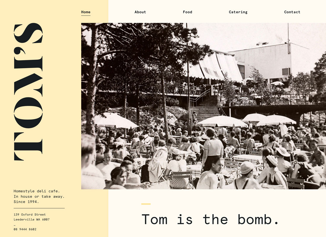
- Brutalism: This trend is the epitome of minimalism but is in no way subtle. It features almost harsh designs with distinct elements and lack of embellishment.
- Gradients: Color gradients – from backgrounds to overlays – have been one of the biggest trends of the past 18 months. They are everywhere! Use a gradient for fall by picking a warm color combination.
- 3D Design: With some many projects rooted in virtual and augmented reality, it’s no surprise that 3D elements are growing in popularity. This also applies to 3D text. It’s a fun trend that’s not that hard to implement.
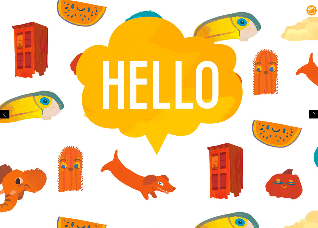
- Hand Drawn Elements: A specialty element that you create by hand (or has that look) can add a special touch to a project, giving it a more custom feel. Hand drawn elements can include icons, illustrations or typography.
Add Subtle (Seasonal) Animation
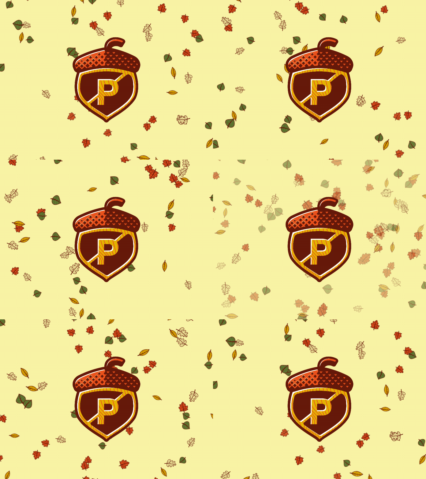
Falling leaves, a jack-o-lantern with glowing eyes or any number of other simple animations can add a fall touch to a website design.
Simple animations are an easy season add-on element that you can deploy for a short time and then remove later. They can also be that little special something that delights a user when they least expect it.
A seasonal animation can also tell users that your site is modern and current because it uses a timely design element.
Change Some of the Language
Sometimes the best element to switch up with the season is the copy. Good copywriting can help you use seasonal language or even plays on words to create just the right vibe.
Consider this: “Fall for this great deal!”
If the autumn season is already top of mind. The phrase might be clever or entice users to think about a deal or promo featured in the website design.
Pair fall language with other divots of autumn in the design for a simple, and timely refresh.
Create an Autumn Pop-Up
Along those same lines, you can consider a pop-up or dialog box that has a fall theme. This add-on element doesn’t require changes to the overall scheme since it is an extra design item, not a facelift of an existing one.
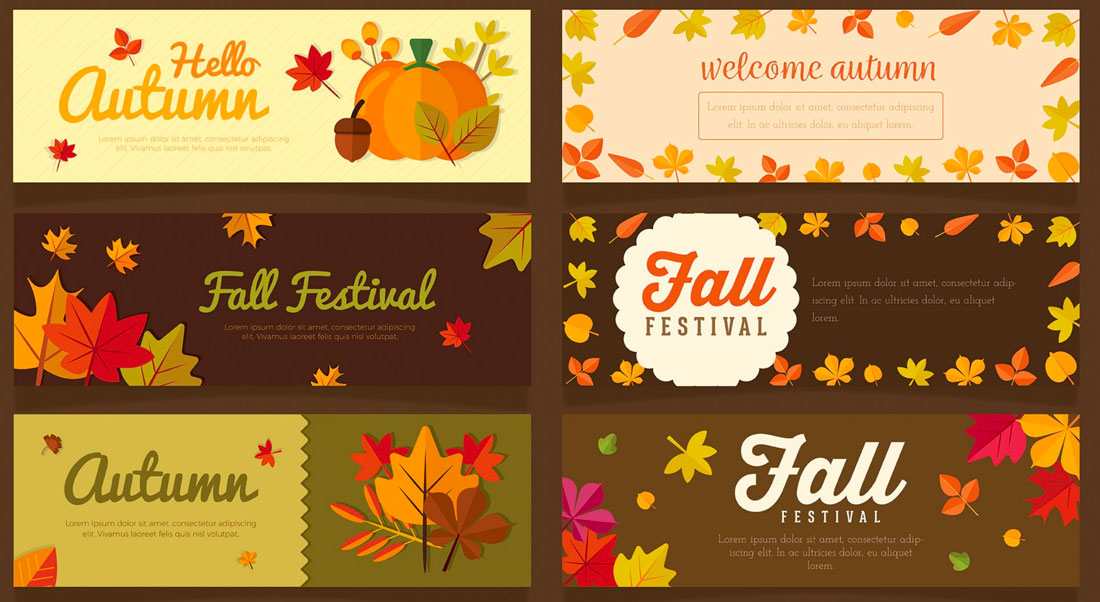
Use the imagery and language of the season to create a fall-inspired design that users will love.
Play On Fall Events
Creating a fall design theme can be as easy as playing up fall events. From football and tail-gating to holidays such as Halloween to hyping back to school season, each of these events provides a great opportunity to help visitors get in an autumnal state of mind.
Whether you choose to go with a blatant theme or use more subtle touches for the season, these elements – like many of the others featured as fall inspiration tips – create a distinct sense of timeliness that helps the design feel fresh.
Switch Up the Photography
Simply adding a photo to the homepage with a season feel – people in long sleeves and jackets rather than shorts and tanks – can establish an autumn mood.
Take advantage of the golden hour when it comes to lighting, which can also help set the tone for longer days and cooler air.
Seasonal photography helps put the user into the image you are creating. It helps them see themselves in the way pictured and hopefully create a stronger emotional connection that can result in more clicks and overall engagement with the design.
Look for images that have a seasonal feel with outdoor scenes that show leaves or autumn colors in the background or even event-based imagery with kids playing football or dressed for Halloween. You can see that many of these tips can be combined to create a complete fall design project.
Conclusion
Now here’s the catch to using fun fall design techniques: Don’t forget to swap them out at the end of the season if they are indeed seasonal. Some of these ideas weren’t tied to autumn per se.
It’s a good idea to consider ways to refresh and reinvigorate design projects with each new season, and fall-specific designs can be a fun (and somewhat festive) option.


0 Commentaires