Whether you’re a designer wanting to show off work or have a request to create one for a client, a lookbook can be an effective way to showcase a variety of elements in a single design.
A lookbook is a portfolio of sorts and has wide application in a number of fields, including website design, graphic design, and development.
Here’s a guide to what a lookbook is, what to include in one when you start designing it, and some examples that are sure to help you find a little lookbook inspiration.
What is a Lookbook?
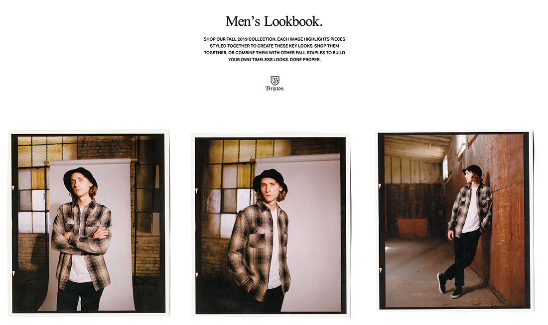
A lookbook is a design collection that started in fashion but has applications for designers and photographers as well. A lookbook is essentially a portfolio, that’s formatted and updated in a diary-style with frequent changes and updates.
For designers, a digital lookbook can be a great way to show off projects as they evolve from start to finish or blog a day in the life of a designer.
For photographers, a lookbook can showcase a range of styles or help you stretch your creative muscles.
Generally, lookbooks are a collection of design change over time. Having a solid platform for this collection, whether printed or digitally, can help showcase your work to others and even potential clients.
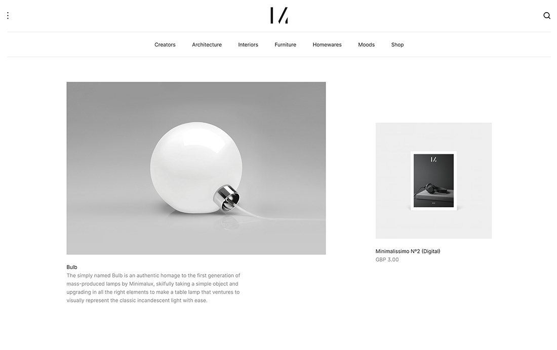
Lookbooks can be printed or PDF books, presentation decks or slides, or websites. The format really depends on your needs and audience. Some may opt for a lookbook in multiple formats.
5 Things a Lookbooks Should Include
When it comes to building a lookbook, include many of the same key elements you would in a traditional portfolio. Every lookbook should include the following elements:
1. A Stunning Cover
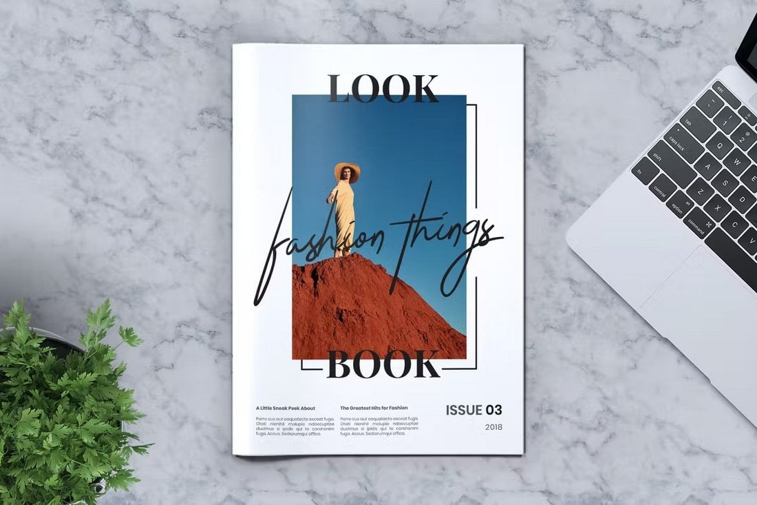
When presenting a lookbook, making a good first impression is very important. Needless to say, a stunning cover design is a must for every lookbook to attract attention.
Keep in mind that a lookbook is not a business brochure or a magazine, it’s a representation of your work. So make sure your lookbook cover represents your brand and identity.
2. Large & High-Quality Visuals
Lookbooks are usually filled with big bold images, that’s the main point of making a lookbook. However, you should also consider the quality of the images you include in the lookbook.
Use images that are print-friendly and in high resolution. And don’t be afraid to use colors and shapes to create page layouts that are great to look at.
3. Detailed Descriptions of Projects
The problem with showcasing art or designs is that people may see and interpret them differently. Many won’t see the true meaning or purpose behind an artwork the way you intended it.
It’s always a good idea to include a description alongside your projects and designs. Share the story behind the design and tell the users what makes it unique.
4. Show Examples
It’s also important to share what the purpose of your lookbook is and what you plan to achieve with it. You can do this by providing clear explanations and examples.
5. A Bio Section and Contact Information
Of course, the whole point of a lookbook is to showcase the works of an artist. So it wouldn’t be complete without a bio section that introduces the artist or designer behind all the works.
Add your contact information too, just in case a client wants to hire you for work.
Key Design Elements
The design and style of a lookbook is a lot like a traditional portfolio. Much of the design of the project is related to elements that the lookbook features and the personal style of the owner.
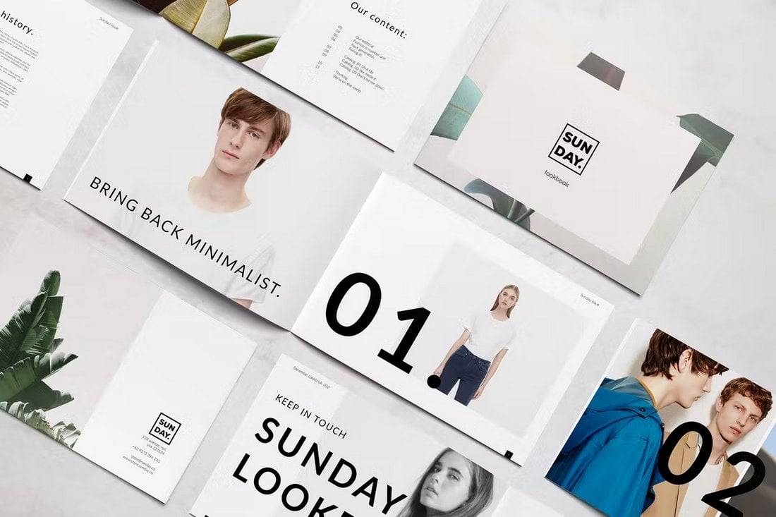
But there are a few common design themes to consider when it comes to lookbooks. Primarily, you want to create an aesthetic that gives room to the content. Design elements are not the primary visual here, individual content elements are. Therefore, a lookbook design probably has a simple feel so that projects are better featured.
A simple feel and style can also help create a consistent lookbook design even when different projects have varying and unique designs. It’s a lot easier to mix a retro-styled project against a clean and modern style if the overall framework of the design doesn’t get in the way.
Think of it this way: You don’t want the lookbook design to compete with the projects featured therein.
Key design elements for lookbooks include:
- White space
- Simple typography, often sans serif
- Design accents and elements in a limited color palette
- Consistent design hierarchy for images and text elements
- One project per page/screen/slide
10+ Stunning Examples
Ready to get started with a lookbook project? Here are 10 examples of lookbook designs – in print, presentation, and online – that you can use. (Every one is a design template, courtesy of Envato Elements)
1. Designer’s Lookbook Template
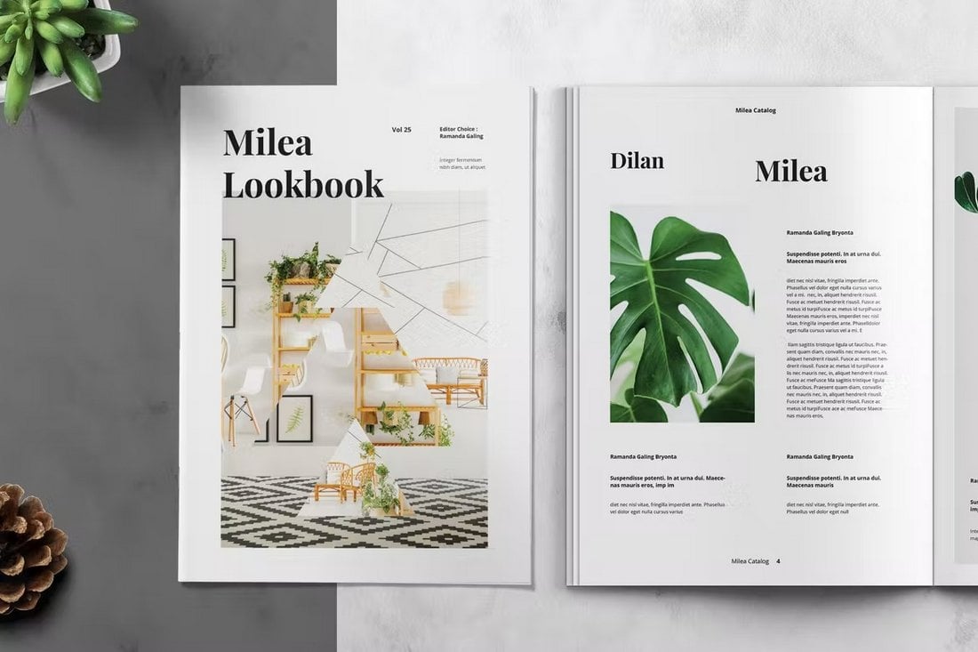
Whether you’re a graphic designer or fashion designer, this lookbook has stylish and creative page layouts that allow you to showcase your work in a professional way. It uses shapes and colors quite brilliantly to add a unique look to each page.
2. Fashion Design Lookbook
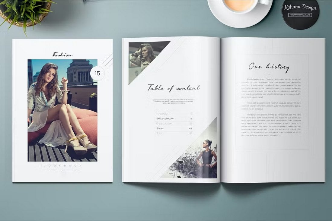
This lookbook template is designed with lots of space for adding large images and it’s perfect for fashion designers for showing off their unique designs in style. The beautiful single-color theme also creates a consistent look across all of its pages.
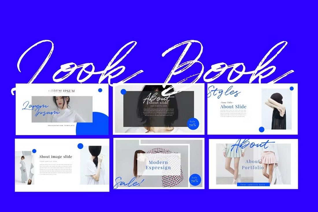
3. Modern Lookbook PowerPoint Presentation
This PowerPoint template has all the right elements for making a PowerPoint lookbook presentation with a modern design. It has clean slide layouts with minimal designs. And offers lots of space for your images as well.
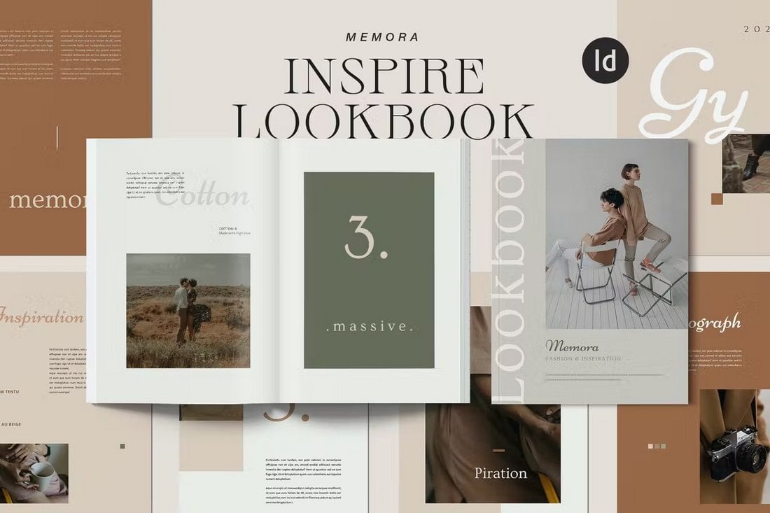
4. MEMORA Inspiration Lookbook
The stylish and elegant designs used in this lookbook template make it the perfect choice for designers and studios for presenting their work. Each page in this lookbook template features a unique layout.
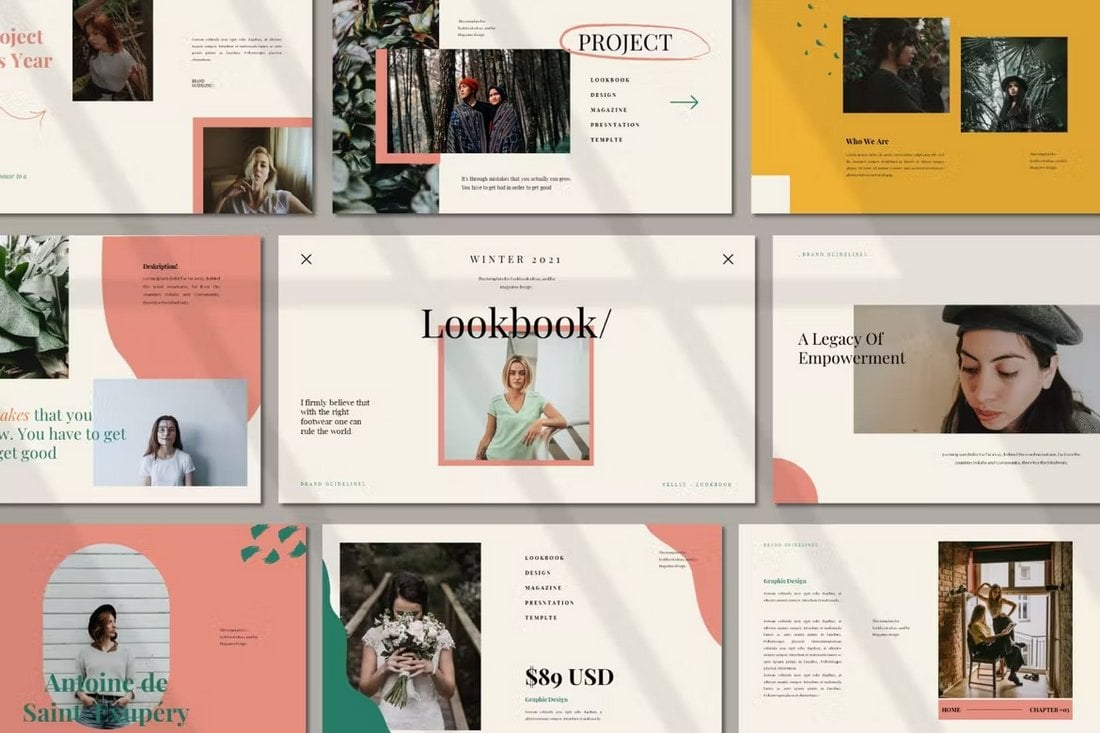
5. Creative Lookbook PowerPoint Template
A great lookbook presentation template for creative artists and designers. This PowerPoint template includes 15 unique slides that are designed to highlight your creative skills and designs.
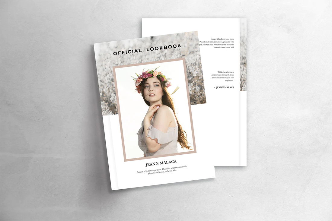
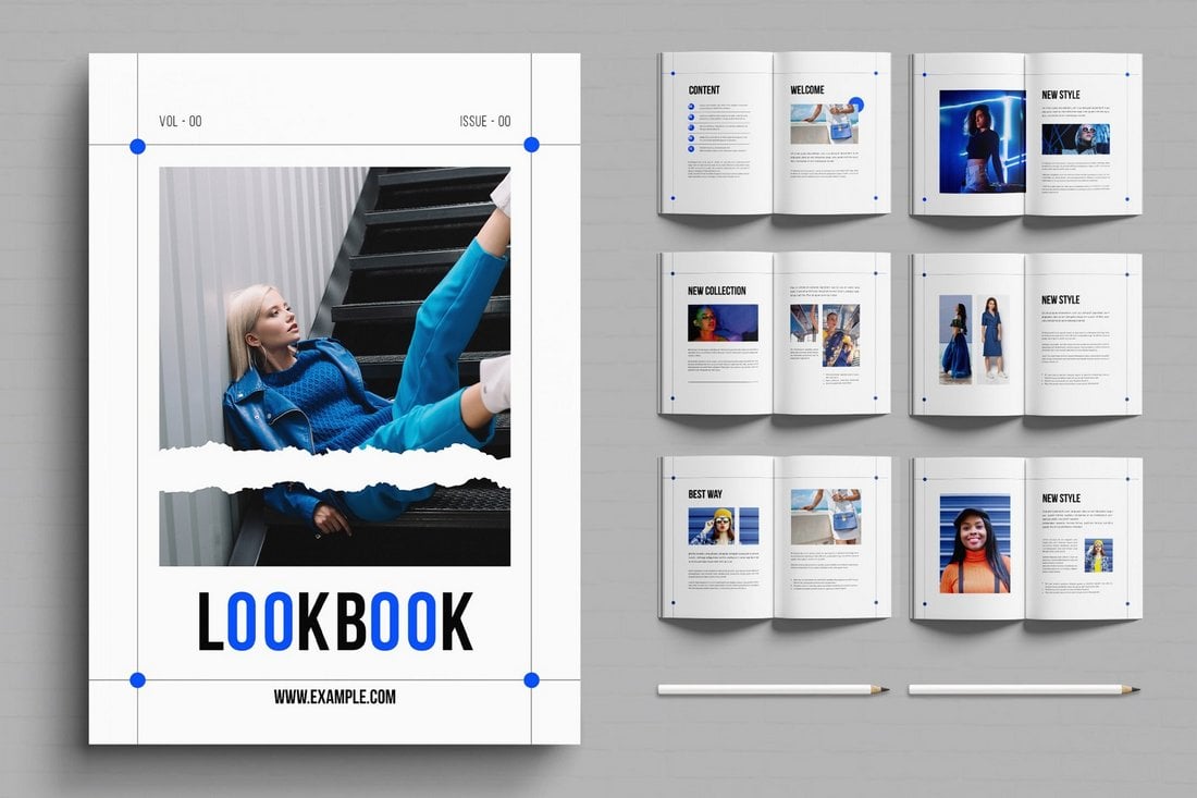
6. Lookbook
Lookbook is what comes to mind when you think of design in this category. The clean booklet design features plenty of room for large elements with a simple design outline.
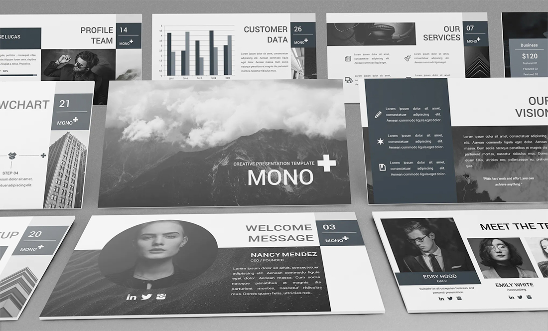
7. Mono Lookbook Powerpoint Template
Mono Lookbook Powerpoint Template is made to create a lookbook in a presentation format. The slides use a sleek monochrome color palette to give more room to your work. It can be used with black and white images (as featured), but works equally well with full color.
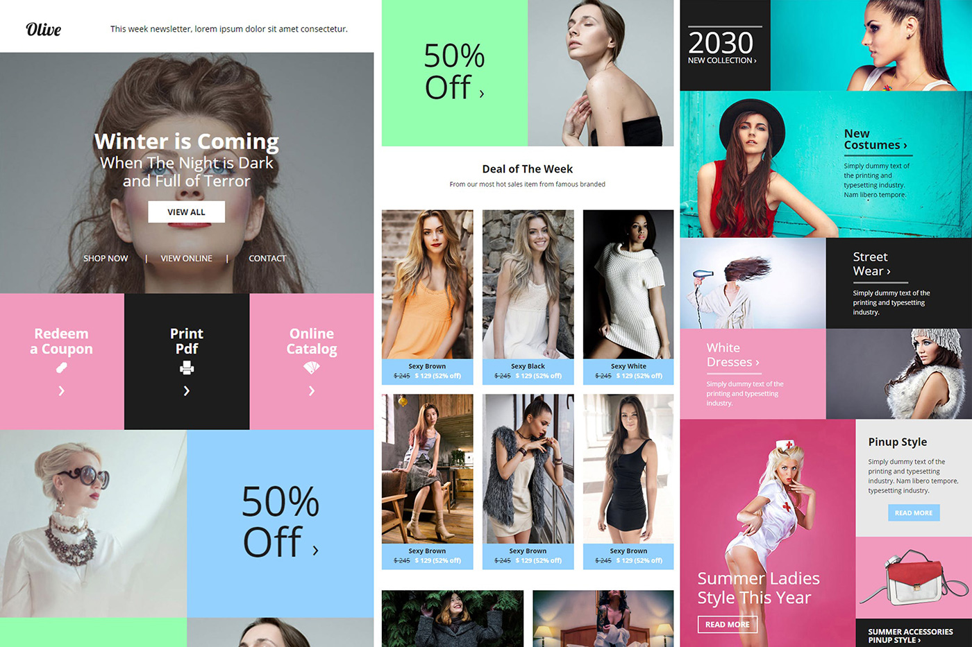
8. Olive Fashion Ecommerce Email Newsletter
Olive Fashion Ecommerce Email Newsletter provides one more avenue to showcase a lookbook – via email. While this design is a little busier than you might expect, bright color choices can work well against photography and serve as a disruptive element in inboxes. This can be just the thing that helps your design get seen.
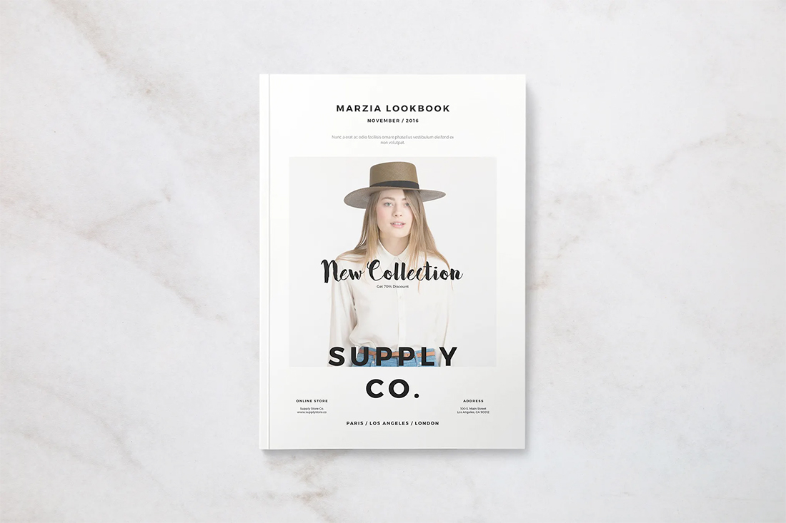
9. Marzia Lookbook
Marzia Lookbook is a minimal printed lookbook style that also makes a beautiful PDF. The style is somewhat trendy with a wider font palette and text elements that overlap images.
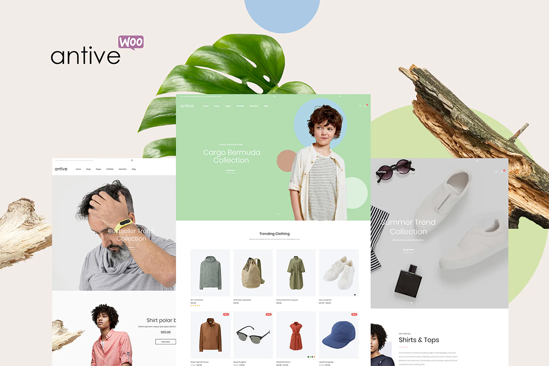
10. Antive
Antive is a WordPress theme that mixes the great design of a simple lookbook with ecommerce. (A popular option for fashion or photographers who want to sell images.) Streamlined ecommerce themes are a good place to go for lookbook inspiration because they often showcase projects (products) in an easy to see and simplified manner.
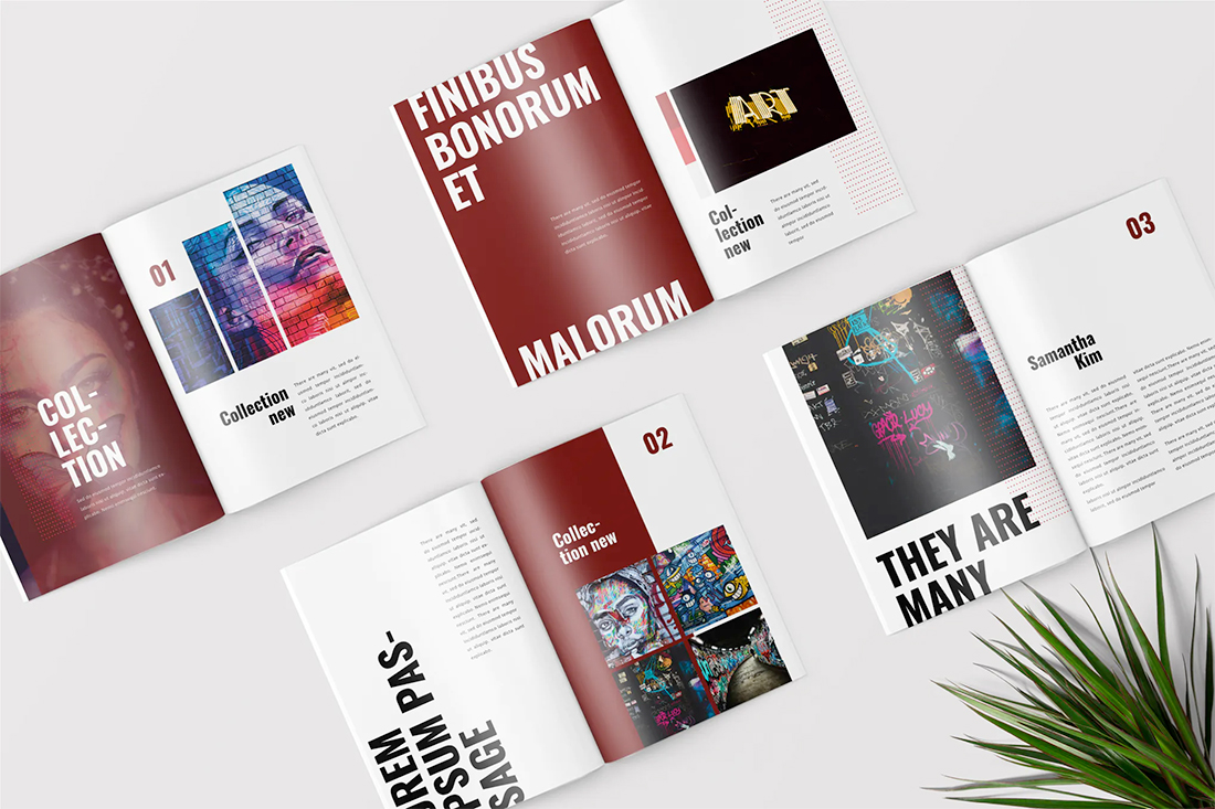
11. Graffiti Pop Art Lookbook Magazine
Graffiti Pop Art Lookbook Magazine has a bold look that’s fun and interesting. The magazine style works for printed lookbooks or PDFs. The contrast between colored pages, images, and white pages with descriptive text here keep visual impact high page after page.
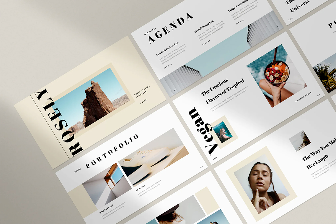
12. Rosely
Rosely is a presentation template made for lookbooks. The use of whitespace here is fantastic and provides ample showcase space for images with limited text.
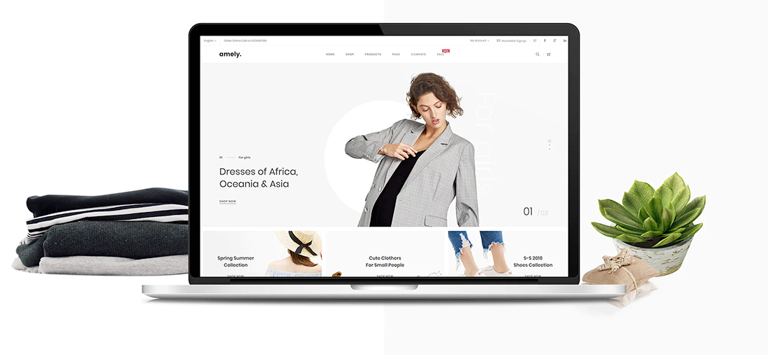
13. Amely
Amely is a clean web theme (Magento) with plenty of whitespace and slides that make it easy to show the evolution of projects. N=The single line navigation style provides a nice space to group projects by type or timeline for your digital lookbook design.
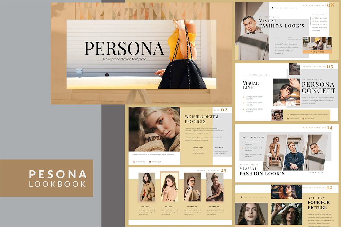
14. Persona
Persona is a lookbook presentation design with plenty of room for heavy descriptions. This design is heavier with color and typography treatments and might be best suited for a simple lookbook that doesn’t include a large number of elements or a single-project portfolio evolution piece.
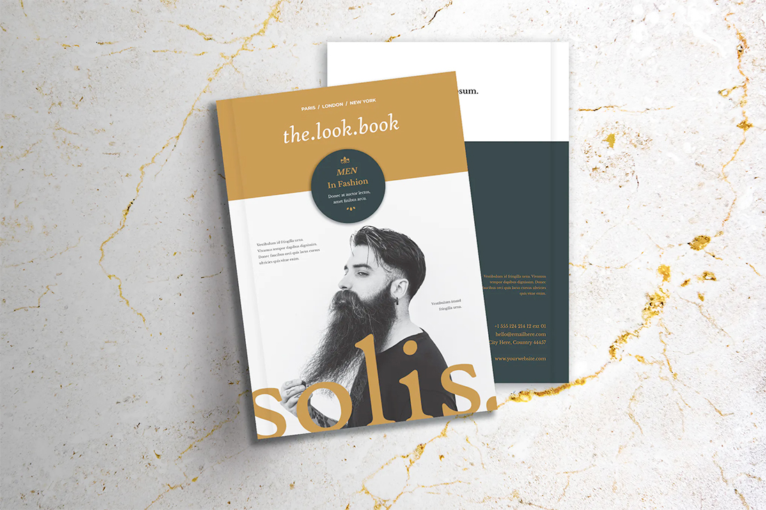
15. Lookbook
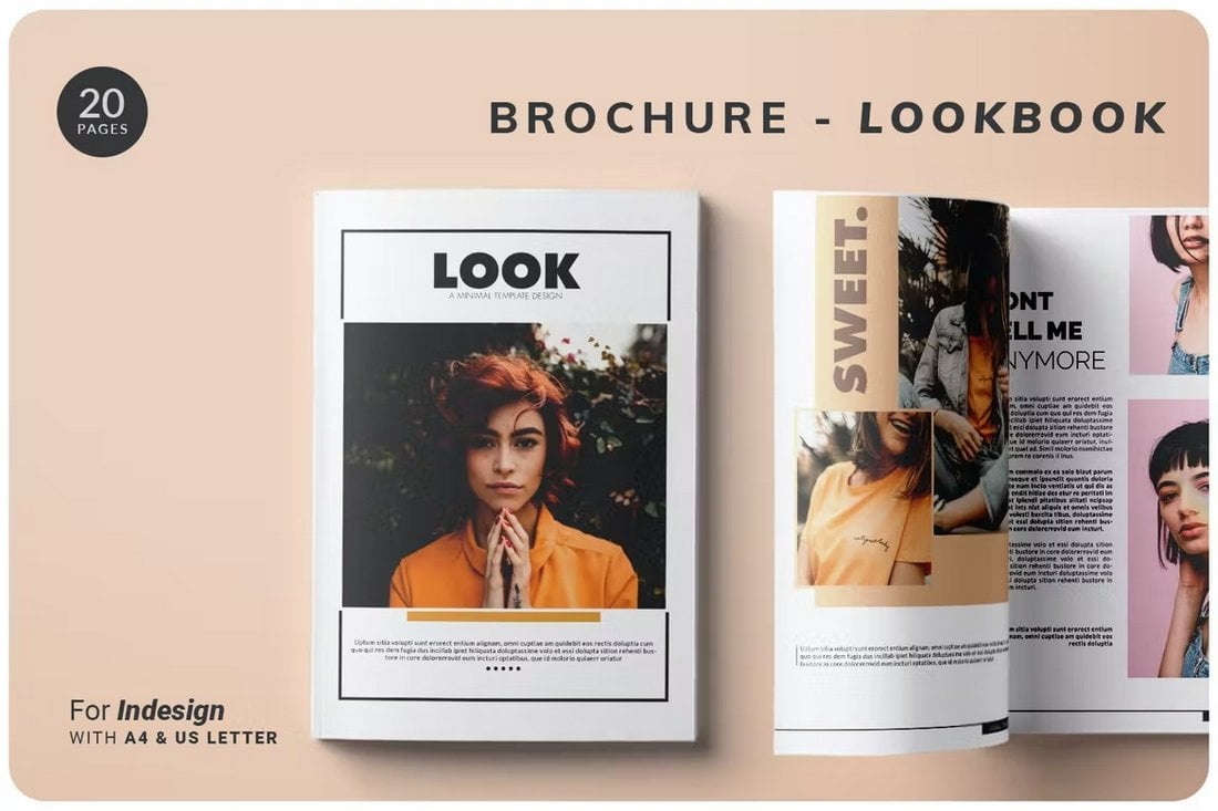
Lookbook is for printed or PDF books. The design is super modern with a two-hue color palette that mixes white space that’s actually white with white space in color blocks. The design has a creative flair that can help projects stand out, and can be particularly useful for designer lookbooks.
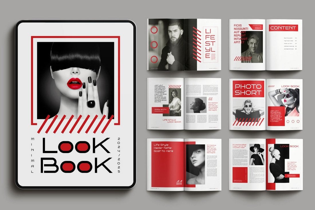
16. Minimal Lookbook
The bold red accent is the highlight of this lookbook design. It perfectly blends with the minimal layout of the pages and the stylish typography to attract attention. It offers a sophisticated look in a simple way.
17. Fashion Look Book
For showcasing fashion and lifestyle designs, this lookbook provides the ideal page layout. The image placements, accents, and clean lines create the ideal combination to make this a stylish lookbook for chic and high-end brands and businesses.
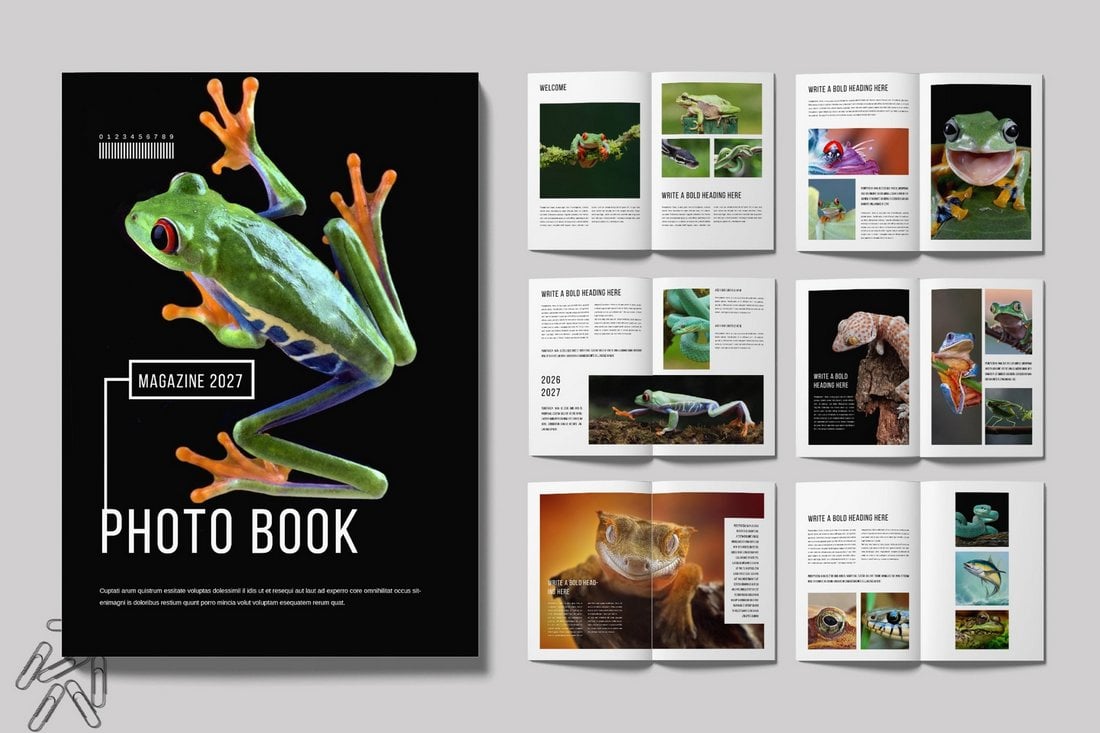
18. Photo Book
The visuals take the stage in this lookbook template, which makes it most suitable for photography-themed magazines and photobook designs. It does a great job of highlighting the photos and images by blending the typography into its simple, clean white background.
19. Bold Lookbook
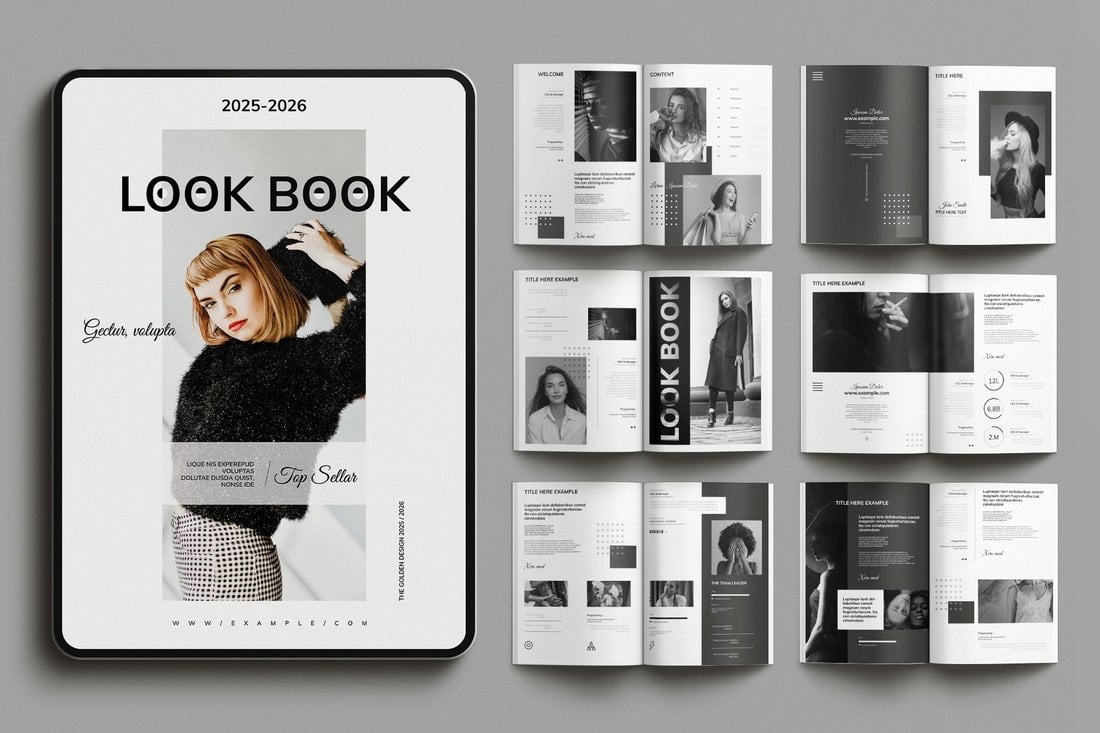
Black and white is the go-to choice for creating extravagantly classic vibes and this bold lookbook design proves it quite well. By stripping off all the colors, this lookbook breaks expectations while creating an uncommon look that stands out.
20. Brande
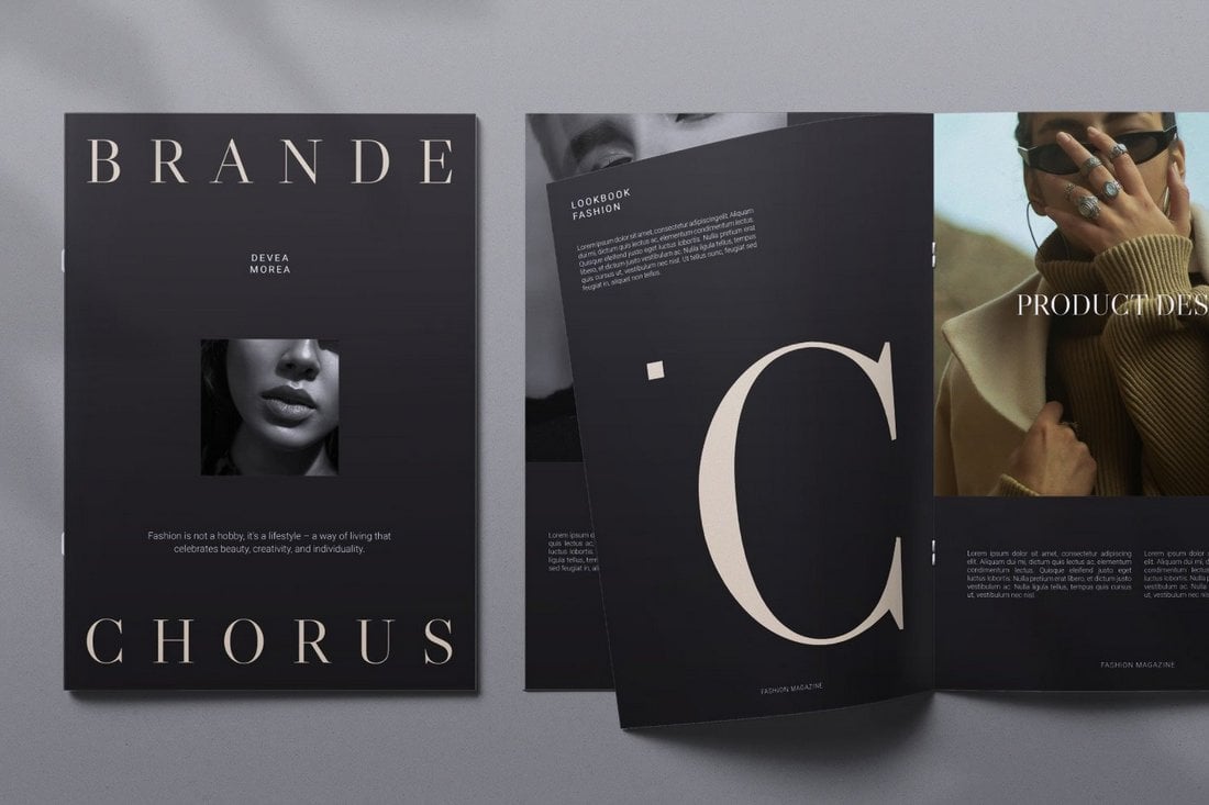
The stylish dark color theme of this lookbook design creates a luxury vibe that makes it much easier to highlight high-end products all across its pages. Whether it’s jewelry, fashion, or lifestyle items, each page fits perfectly to create a branded lookbook.


0 Commentaires