Design trends play a big role in moving the web design industry forward. However, most of the new web design trends usually fade away as fast as they appear.
It’s part of innovation. As technology evolves better and more creative trends appear. And we replace the old trends with those newer design trends. The problem is, sometimes we forget to let go of those old design trends.
So in this blog post, we share with you some of the outdated web design trends that need to go away. These design trends are no longer relevant and some of them could even lead to major issues with website functionality.
See if you’re still using any of these design trends.
1. Neumorphism

(Source: Dribbble)
Neumorphism was one of the hottest design trends in 2020. This trend was popular among both graphic and web designers as it added a unique aesthetic to designs by creating a modern look, especially for UI elements like buttons and cards.
Simply put, Neumorphism was all about making UI elements look like they were part of the background by using a mix of shadows and an extruded effect. And when it first came around, people loved it. But as time went on, we started to see why it’s a terrible approach to designing user interfaces.
The biggest problem with Neumorphism design was the lack of proper contrast in elements. Since the UI elements look like part of the background, they weren’t distinctive enough. This caused issues with accessibility and user experience, especially for people with visual impairments.
Web accessibility compliance is an important part of designing better websites that are accessible to everyone. So be aware that using trends like Neumorphism today might even lead to legal trouble.
2. Parallax Scrolling
Parallax scrolling used to be a popular trend in web design. In fact, many designers consider it a feature when crafting website designs but not anymore. Unfortunately, this trend is still being used in some parts of the web.
Making the background images move at a different speed than the foreground elements was actually a cool effect. It was like an optical illusion that we loved to see on websites. However, it also caused many issues.
For example, when using parallax scrolling, designers had to define different static backgrounds for mobile users as it did not work with touch gestures. On top of that, it caused slow page loading times and issues with certain types of browsers.
Considering all that trouble you had to go through and the sacrifices you had to make, using the parallax scrolling design trend is simply not worth it anymore.
3. Hamburger Menus
Hiding your navigation menu behind the three stacked lines icon is still an effective way of creating more organized layouts while saving screen space. Especially when it comes to mobile devices and backend user interfaces, hamburger menus are quite useful.
However, everyone started using hamburger menus in everything, including business websites, personal websites, blogs, and even news websites. This led to terrible user experience issues.
When exploring a business website or an eCommerce website, the navigation menu needs to be clearly visible. It’s an important part of generating user engagement and more clicks. Since the button was small, hamburger menus were easy to miss. Most users, especially seniors, did not even know how to access the website menus.
Hamburger menus also caused issues with accessibility as well. While they are still useful in some applications, you should try to avoid hamburger menus in common website designs.
4. Single-Page Websites
Not to confuse with landing pages, single-page websites were quite popular for a long time. With a one-page website, businesses were able to pack all their information into the homepage of the website. There was no need to have multiple pages or persuade customers to visit other pages.
While this method was effective for landing and sales pages, it only caused issues when used to create one-page websites. The biggest problem with one-page websites was terrible user experience.
When a customer wanted to find specific information about a product or service, they were tasked with endless scrolling to find that information on the page. It also had an impact on website loading times. As well as limited SEO opportunities. Having to target all your keywords on a single page was not an effective strategy.
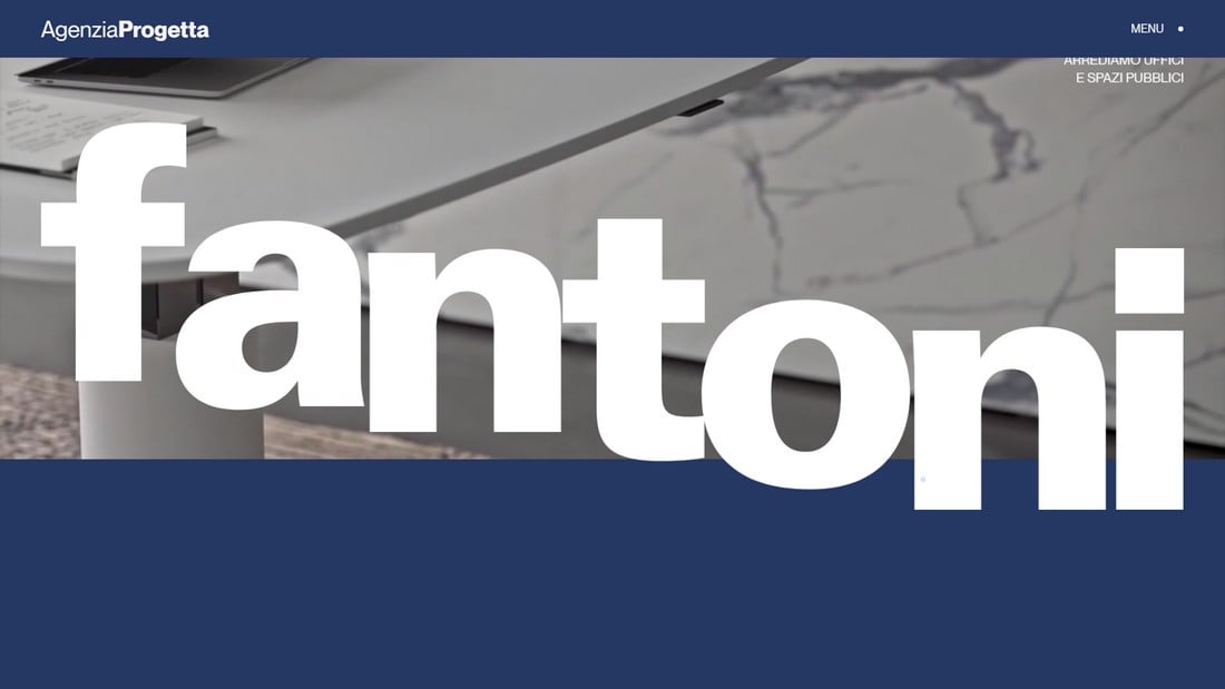
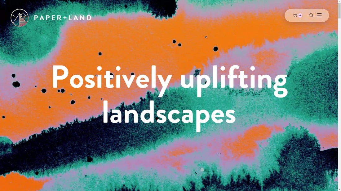
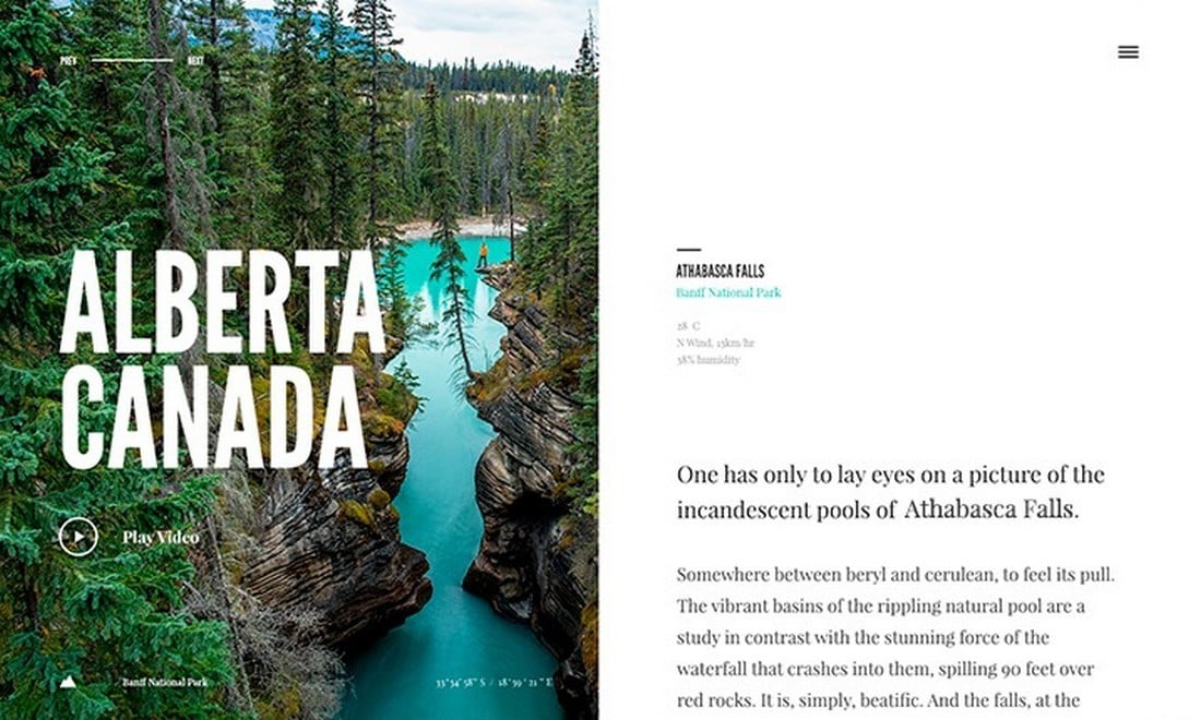
5. Giant Headers
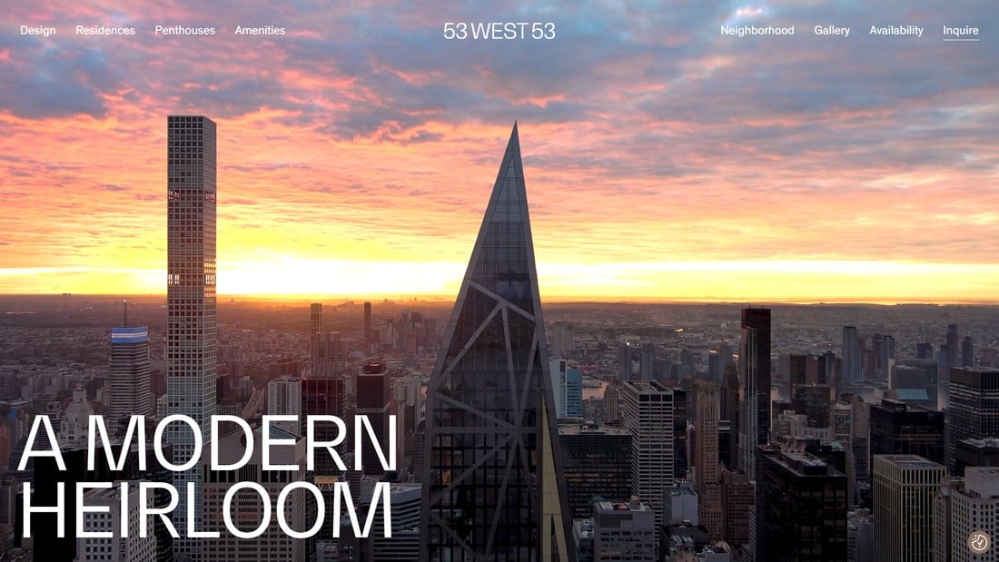
While they serve as stunning visuals and help create a minimal aesthetic, using large headers with fullscreen images is not an effective strategy for business websites.
The main problem with this trend was the waste of space. Studies have found that when visiting websites people spend most of their time on the “above the fold” section of the website and spend very little time after scrolling beyond the top half of the website.
If you waste the above-the-fold section of your website with a giant image and just a headline, you might lose the attention of your visitors. And it’s why more and more web designers are avoiding this design trend.
Admittedly, a giant header section does help create a bold first impression. And if that’s your goal, you should go for it. But also keep in mind that you’re wasting valuable real estate that could be used to persuade your visitors to take action.
6. Full-Screen Pop-Ups

Marketers kept raving about how effective fullscreen popups were back them. Whether it’s to get people to sign up for a free trial, get more email subscribers, or sometimes even to push discounted products, these popups did convert better than most other methods. But for a terrible reason.
Fullscreen popups were one of the most intrusive methods of promotion. They not only block the entire screen with an ad but also hide the “close” button by making it barely visible. Especially on mobile devices, these ads are an annoying inconvenience to deal with. Any visitor who comes across these popups will leave the website with a bad impression of the business and the brand.
Unfortunately, even some of the biggest brands and marketers are still using fullscreen popups on their websites.
7. Carousel Slideshows

Auto-rotating carousel slideshows have been the go-to option for header designs for many years. They were beautiful to look at and were also effective for eCommerce websites. But these carousels also had a few big flaws.
According to recent studies, users are only interested in the first item on the slideshows and only 1% of visitors stick around to see the rest of the slides.
Carousel slideshows are not as effective as they used to be. Today, they are only an inconvenience to users as well as the website performance. As many experts point out, these sliders now seem like advertisements to most users and they ignore it completely.
8. Split-Screen Designs
(Source: Dribbble)
Being able to scroll one half of the website while the other half stays fixed to the screen seemed like a unique approach to website design. While they still work well for personal websites and resume pages, they only create more challenges when used for other types of websites.
With a split-screen website design, you will be forced to pack many details using only half of the screen space. This often creates cramped designs that look terrible on smaller screens.
The impact on user experience alone was enough for designers to abandon the split-screen design trend. Simply put, usability, accessibility, and user experience in much more important than making your website look “cool”.
9. Progressive Web Apps
Progressive Web Apps, or PWAs, were actually a great web development trend that allowed small businesses to create better web experiences for mobile users. Even though web developers and designers wanted this trend to succeed, it just could not compete with native mobile apps.
PWAs allowed developers to easily convert websites to offer a native app-like experience for mobile users. It was cost-efficient and offered a better way for eCommerce and other websites to attract new customers.
However, mobile technology kept evolving rapidly with new devices and operating system upgrades being introduced in short periods of time. PWAs could not keep up with these innovations and kept causing issues with newer devices and new mobile OS versions. It just wasn’t as smooth as a native mobile app anymore.
10. Fixed Background Images

Having a large, high-resolution image as a background is never a good way to create a fast-loading website. And if you make it a fixed background, it will only make matters worse by creating a terrible user experience. Not to mention its significant impact on mobile devices.
Those are a few of the reasons why fixed background images disappeared from existence. They were once considered visually appealing but having to fix typography, contrast issues, and all the other problems turned it into a leading cause of poor user experience. These same concerns are now starting to appear with fixed background videos.
Conclusion
Using trends is a crucial part of making your website designs more relevant and trendy. But, it’s important to stay up-to-date and know which trends to follow and which to discard.
Hopefully, with the help of this list of outdated web design trends, you’ll be able to cross out a few terrible design trends from your list. Keep our Trends category bookmarked and check in often to see which trends are worth following.


0 Commentaires