A flyer is a great way to promote your work, event, or even a business offering. This small piece of collateral is a point of contact that can help get people excited about something and generate interest.
A well-designed flyer grabs the attention of users and is something that people want to grab a hold of.
While most flyers are on the smaller side, they can include anything from printed pieces that are postcard size to information that is the size of a sheet of office paper (and even slightly larger).
Here’s how you create a flyer design that stands out.
Use Color to Draw Attention
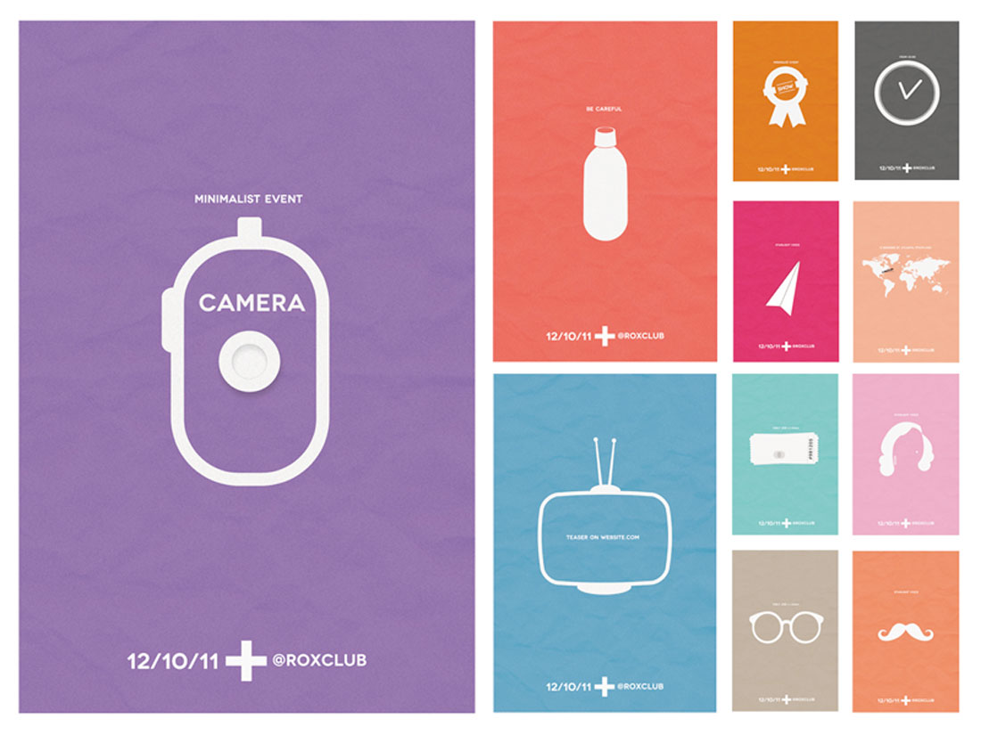
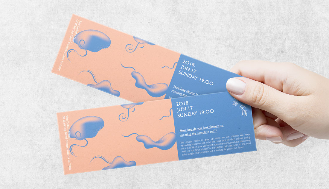
There’s nothing like vibrant color to make people stop and look. Bright color choices, unusual color combinations or a complete lack of color altogether can all be effective color tools to create an inspiring flyer design.
When it comes to the color of a printed item such as a flyer, think about where the item will be placed physically. Select a color palette for the flyer that contrasts with the natural environment so that it is visible from a distance.
(If you’ll be putting the flyers on a wooden table, for example, a brown background might not distinguish it from the tabletop itself. But a bright pink color will be easy to see.)
Play on a Trending Theme
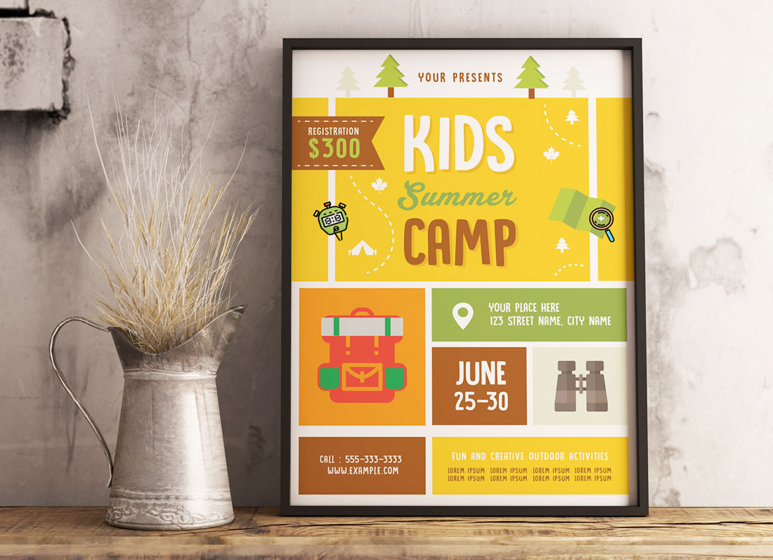
Because flyers are often intended for short-term use, it’s the perfect medium to play up a trendy design element. Use fun typography, interesting shapes or details or an illustration that references design trends or even pop culture to entice users.
Some of the same design techniques that you use in other projects can be great flyer design inspiration as well. It might be the perfect playground for a trick that you aren’t ready to deploy on a website or piece of collateral that will hang around for a long time.
The other nice thing about using trends in flyer design is that due to the smaller scale, these techniques won’t be too overwhelming. Smaller printed objects always have a less in-your-face feel than physically larger projects.
Use a Repeating Shape to Encourage Eye Movement
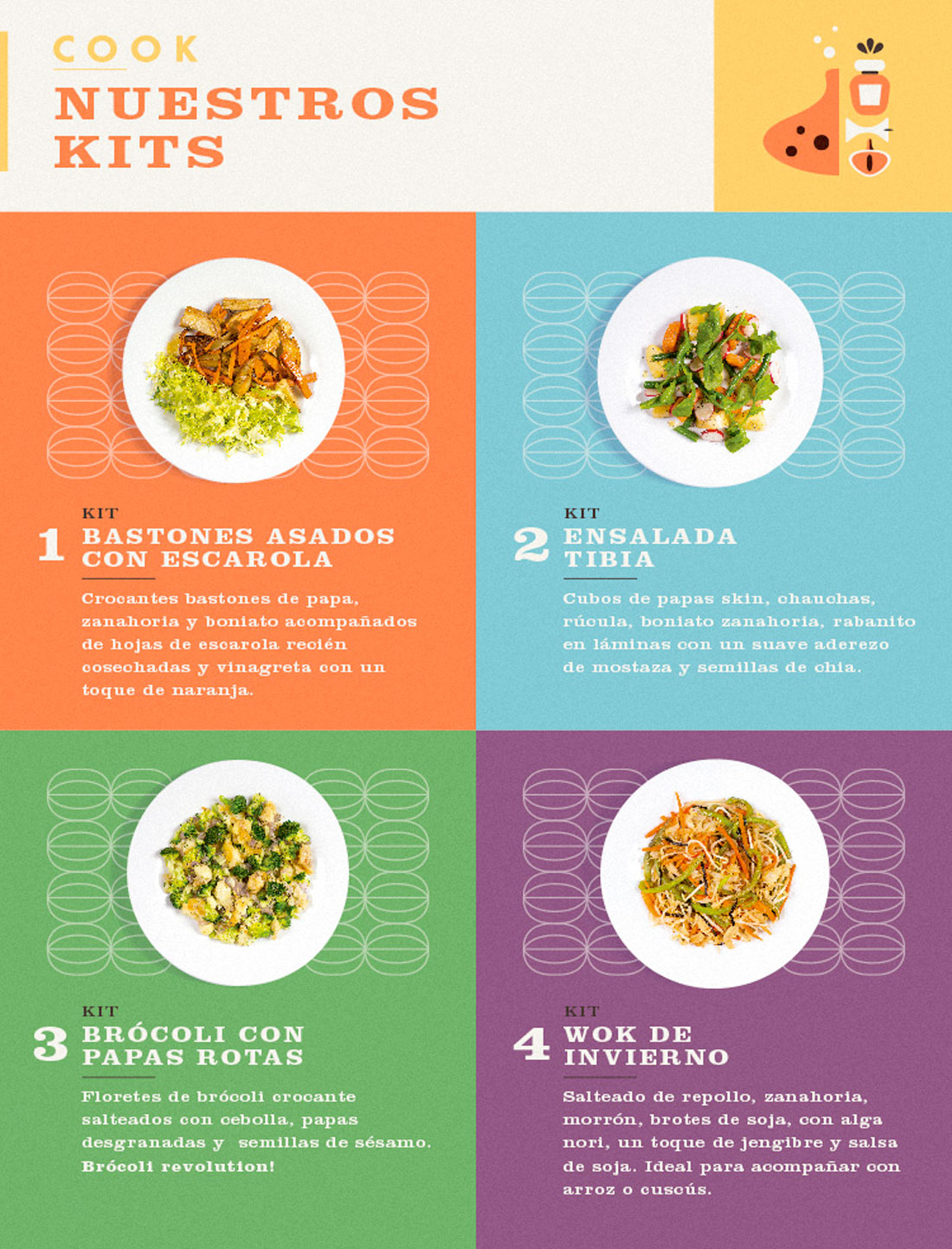
Look for a repeating shape or pattern to create some visual consistency and encourage eye movement in the flyer design. Circles, poly shapes and even simple lines and help users look from one part of the design to the next and even provide a clue as to whether to turn the piece over for more information on the other side.
Use of shapes and visual effects to help readers look across the design helps to show them how to interact with it. It’s a simple lesson in design functionality. You are creating a piece that provides information, is visually appealing and that users know exactly how to interact with.
Use a Bold, and Interesting, Image
Flyer designs are the perfect place to express your most creative ideas.
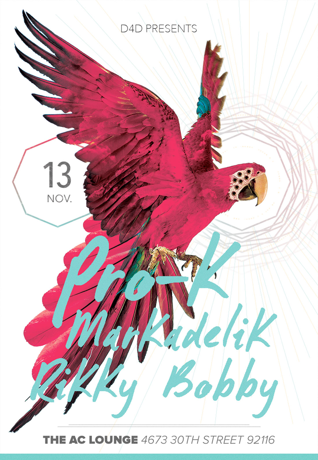
Try working with a custom illustration or hand lettering for a design that stands out. This can be a great project to serve as a creative refresh if you don’t have opportunities to try these techniques.
But don’t feel limited by these suggestions, as you are looking for flyer design inspiration, consider design elements that you would like to use more or learn about. See if there’s a way to incorporate them into this type of project.
Create the Right Mood
From light and fun to serious and informational, the design of a flyer should match the mood, brand, and content therein. Create a logical visual association that connects these parts. The first step is to know the goal of the project. What is the flyer for? Who do you hope will see it?
Create a design that appeals to this segment. You don’t want to use light language and bright colors just because it’s trendy or looks good; you want to use it because it works with the content and for the desired audience.
As a general rule, a flyer should not feel too corporate or stiff when designed for a “public” audience. Lighter designs often grab user attention and encourage action a little quicker than something overly formal. This is likely because users need to be invited into the design if the content/information/event isn’t something they are already familiar with.
Sometimes you might find that you create multiple flyers for the same information, but for different audiences. (And that’s ok, too!)
Ask Users to Do Something
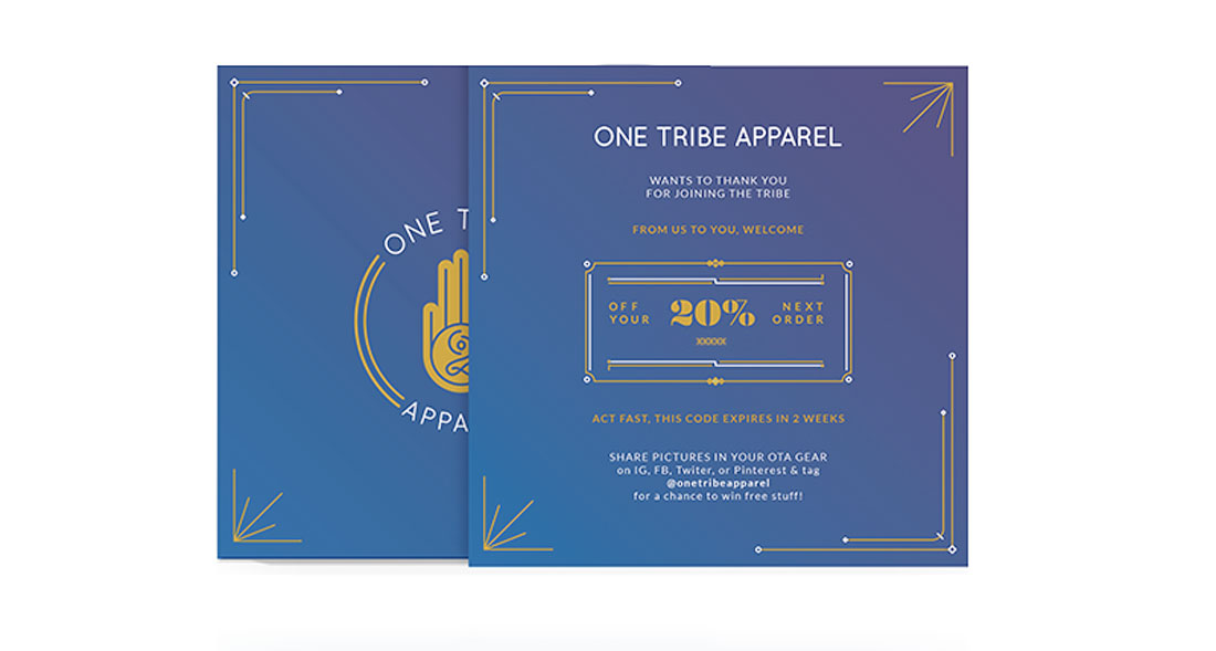
Speaking of goals, a flyer design should include a call to action. It won’t be the same direct button that you design for a website, but there should be a suggestion to act in some way.
That might be in the form of a time, date and place for an event. It could also be a scannable code, short URL to type into a web browser for more information or a promo code.
Actionable elements give you some information about the success of the flyer – not in the same way as digital analytics – but you will know that something is working if they fly off the table.
Make it Easy to Read
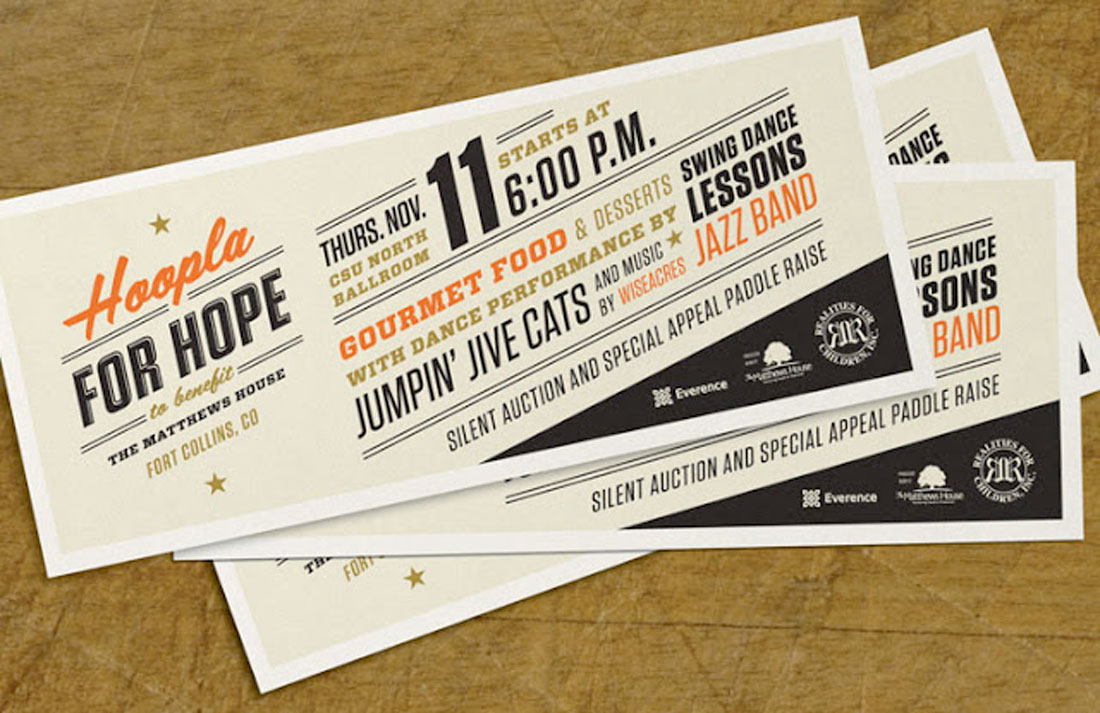
Fun typography and funky typefaces can serve as a great visual element to get people to look at a flyer design. On a small canvas, using a text-only treatment might be your best option.
If you use something that’s not easily readable to create a word art element, use highly readable typefaces for the rest of the design. This way the visual text will draw users and in the readable text will provide necessary information to users.
Don’t forget to think about print capability when it comes to text readability as well. Take special care with small and lightweight typefaces, especially when used in reverse type. (Ink bleed can change the integrity of letters and impact readability.)
Print for Takeaways
One of the most important elements of a flyer design might happen before you ever touch a computer. Pick a shape and size that will be easy to see and is optimal for your audience to take with them.
Smaller flyers are easy to stick in a pocket – think postcard size. But oversized flyers can have a little more impact and stand out if there are lots of print pieces in competition for the same space or attention – think unusual postcard size, such as 4 by 9 rather than 4 by 6.
The shape can also play a role. Chances are that most flyers you see are based on a standard one-sheet design – full page 8.5 by 11 or A4, two-up on the same size or 4-up on the same size. Essentially they are all rectangular. Consider a die cut flyer in an interesting shape as the thing that draws attention to the design first. This can also lead to more takeaways as well—just because it looks different.
Bonus Tip: Splurge on Printing
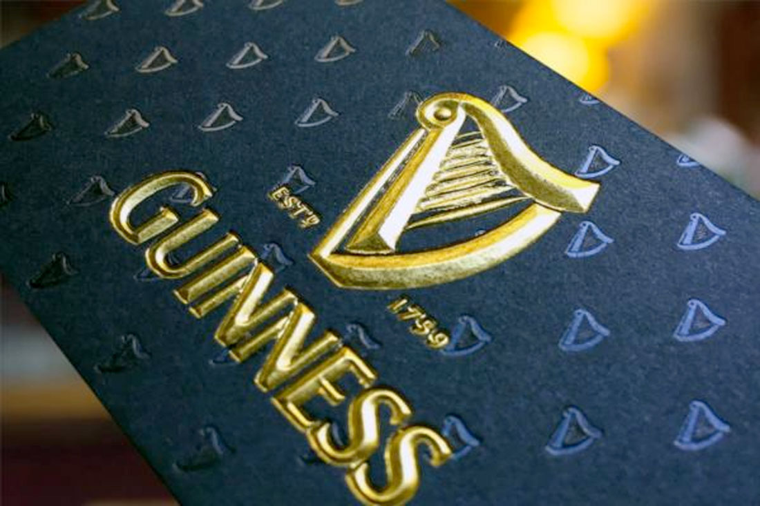
If you can budget for it, opt for premium printing of flyers. Not only will specialty printing give you more design options – UV coating, embossing, foiling and the list goes on – but it will also give your piece a more premium feel.
Even if you don’t need a print effect, a thicker paper stock or top coat can make your flyer something users want to touch. Print quality alone can communicate quite a bit to users; upgrade if you can, to take your flyer design up a notch.
Conclusion
For flyer design inspiration, start with trends and design elements that work on a smaller scale. Don’t go overboard with cluttered elements or too much text to create something that’s easy to read and understand.
Premium effects or unusual design elements can make your flyer design stand out, particularly when you are putting a card on a table of flyers at a conference or passing them out at events. And have fun. The best thing about a design like this is that it isn’t often intended for long-term use and can provide an excellent creative opportunity.

0 Commentaires