Modern logo design is a collection of classic and trending elements, all of which combine together to create a brand mark that feels fresh. Today’s modern design is exemplified by sleek lines, simple lettering, color, and highly defined elements.
Here, we’ll look at trends in modern logo design with examples from large companies and smaller brands.
Whether you’re gearing up for a minimal design, love gradients, like hand-drawn imagery, or have a clear need for a responsive logo, we’ll have you covered with these trends and examples.
1. Minimalization

Drop the embellishments. Logos that feature a minimal style are totally trending.
This is a modern take on logos that’s been evolving for a long time as more designs feature flatter styles, fewer colors and as few words as possible.
Minimal styles are popular for a few reasons:
- They are easy to read at a glance, and at small sizes
- They reflect an overall trend in design of all types
- They are easier to use from placing on images to icons to billboards
- Big brands are doing it – Google, Airbnb, Spotify and others have all streamlined their logos
Dunkin’ dropped the “Donuts” in a recent change. While the idea of the logo didn’t change that much, it’s simple and minimal. This is representative of a shift toward minimalization that’s happening across logo design, for brands new and old, large and small.
Best Buy moved from a price tag icon logo with tilted text inside to upright text next to an icon. The new logo does look more modern. It is easier to read and it has an overall sleekness that minimal styles tend to convey.
2. Gradients
Gradients are one of the best color trends to bounce back after being “flattened” by flat and material design trends. The newer versions of gradients have been bright, bold and integrated into the design. They are anything but boring.
This trend is carrying over to logo design as well. The modern take on gradients is to make them obvious. (There aren’t some of the skeuomorphic hints of graduated color from the past.)
Mozilla Firefox uses gradients in its logo elements and overall website design. A color theme – such as a specific gradient hue – can carry a visual theme so that people know you almost by color alone. (There are rumors that the upcoming version of the logo will feature an even more prominent gradient style.)
3. Text in a Box
“Text in a box” logos are another example of how minimalism and readability are impacting design. This logo style is incredibly easy to read and highly functional. (Think of how easy it is to put a logo such as the one above on top of an image and still be able to read it.)
This style works best with clean lettering and simple words.
The trend might also be reflective of some of the do-it-yourself logo options on the market.
Duke University Press uses a text in a box logo that emphasizes the prominence of the university name in the design. The larger reverse letters have an immediate impact in the logo while providing plenty of space for “university press,” which includes a long string of letters for a logo.
4. Icon Next to Text
This is one of the things that sets apart many newer logo designs from anything more than 6 months or so ago – a text and icon element placed next to each other.
For a while, elements in icon design seemed to touch or overlap. Not anymore.
Designers are treating logo elements – icons and text – as separate things. This works for a few reasons:
- So people will look at each part of the logo independently, visually differentiating the icon and text
- To create an easier visual path for responsive logos or social media icons (just drop the text)
- This option can be fun, and adaptable when it comes to animation
Slack said this about its logo change (that features an icon next to text) and the philosophy is spot on: “A good reason to change a logo is that it’s not doing the job you want it to do—and because a simpler, more distinctive evolution of it could do that job better.”
5. Hand-Drawn Logos

The trick to a solid hand-drawn logo is that it is whimsical, but not sloppy.
The hard thing with this modern logo design is that it’s difficult to explain. You almost just know it when you see it.
The logo for Alexie, find it in the Design Shack Gallery – features a simple drawing that could have been done by hand or computer. It’s playful and simple and just imperfect enough to be charming.
6. Responsive Logos
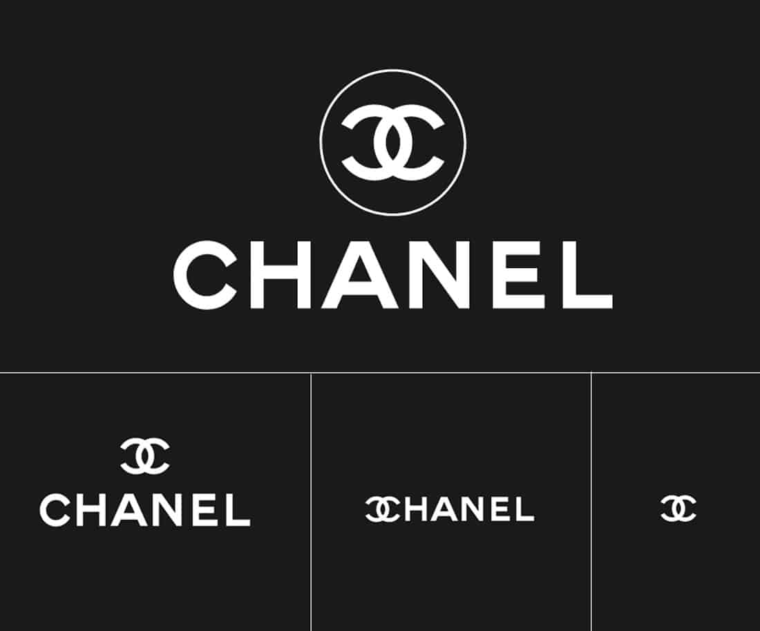
Responsive logos shift based on the size of the viewport where they are displayed. A logo might include one or two versions or five or six for different use cases.
Almost all responsive logos include a full-size render that’s the largest and most complicated version of the design and a logo-only option that’s the most basic option for the smallest uses.
Head over to Responsive Logos to see more examples such as the one above that show how they work. There are more than a dozen options to experiment with.
7. Intricate Details
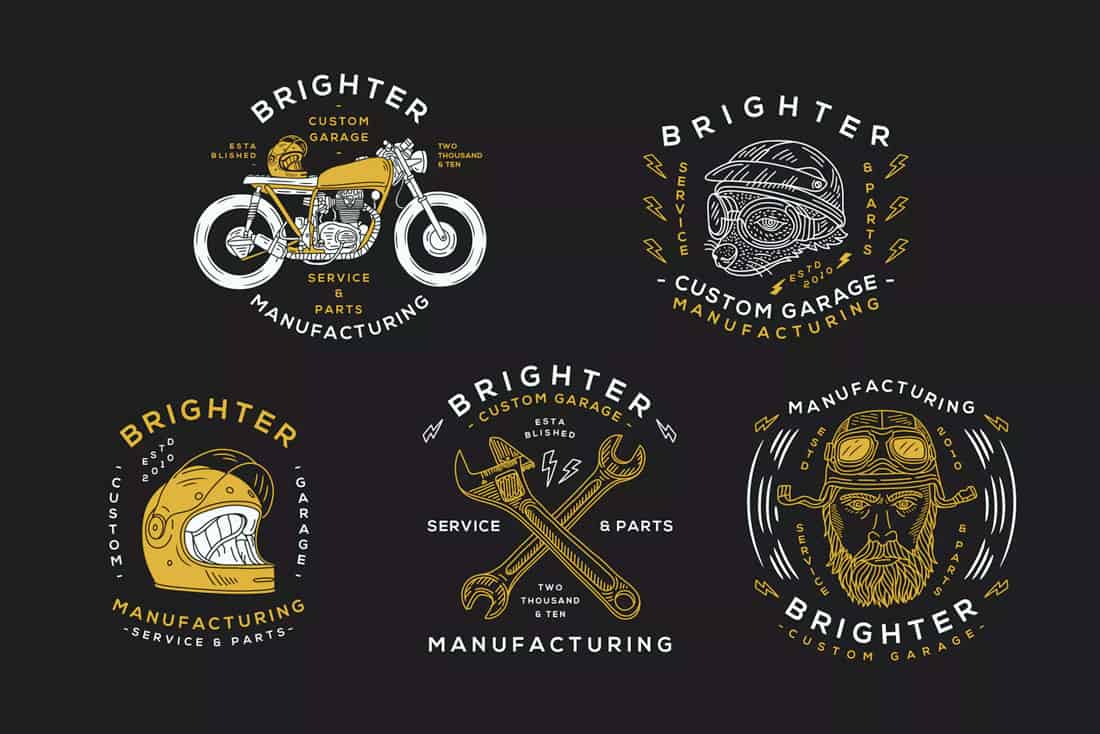
This modern logo design style seems contrary to almost everything else in this article. Intricate details and fine lines for icons and type are a trending element.
This style is popular because of vintage styles that feature more classic elements. With such a focus on minimalism, vintage is anything that’s got more detail and visual interest.
While these styles are a little harder to use, they are especially popular in some industries – think wine labels and clothing.
The options in the Motorcycle Logo pack featured above showcase this style perfectly. Intricate details still feature rather simple styles, such as line or hand-drawn elements.
8. Bright or Bold Color
Adding a bright color to a logo design can help it stand out.
Designers are playing when it comes to color and logo design with vibrant brand marks featuring fun color palettes, with often unexpected hue combinations. (No more boring sky blue logos!)
The brand design for Audrey & Bernice features a wide palette with plenty of contrast and interest. While the a and b have some of the same colors, the pops of green and red stand out.
9. Squares (And Circles)
While there’s no rule that a logo design needs to have a specific shape, square and circle options are the most common.
It’s for one distinct reason – these icons easily convert to profile photos for social media channels. A logo that fits into a square/circle will best fill the space for these platforms with the most visible space for the brand, making it as large as possible.
Sometimes logo trends can be influenced by the most practical applications.
The logo for Mizuno running isn’t perfectly square but it fits the shape well with just the right spacing. The company even puts the icon and text in a square for most uses to follow a consistent visual theme.
10. Interesting Typography
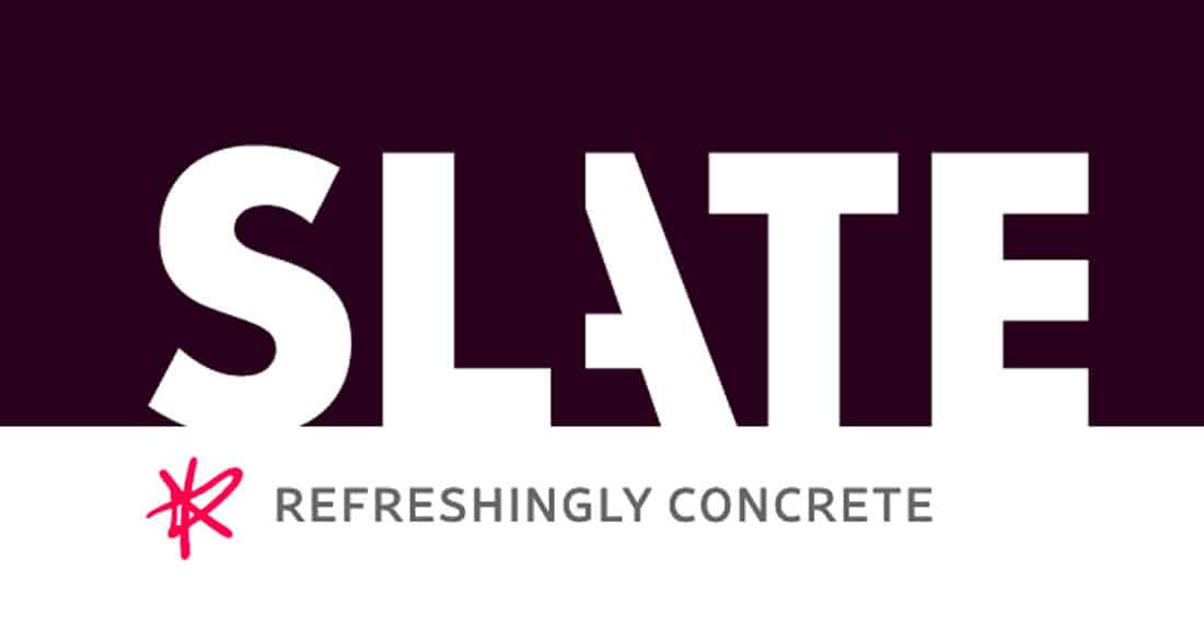
One logo trend that never goes out of style is the use of interesting typography. The modern spin on this trend is using something in a style the reflects the times.
Sans serif typography is the most popular logo option right now. The modern twist is making it your own.
Slate takes a slice out of one of the letters for a simple logotype. But it’s completely original thinks to the interesting representation of the “A.” This also solves a design problem with SLATE. In almost any other use the L and A would create an odd trapped space that might suck attention away from the word as a whole. Use of the sliced A eliminates that problem with a trendy style.
Modern Logo Design Templates
If you’re looking to design a modern logo for your brand or business, start with these templates. They are fully customizable and will save you a ton of time and money too.
Twin Horse Modern Logo Template
When you want to showcase style, strength, and power through your logo design, this is the type of logo you should aim to create. This logo template has a bold and creative design that represents businesses and brands in a modern way. You can easily customize this template using Adobe Illustrator.
Rising Phoenix Modern Logo Template
This logo template features a modern representation of a Phoenix, the symbol of immortality. Show your competitors that your business can not be defeated with this logo. It’s available in AI and EPS formats.
Creative Brand Logo Design Template
When you want to show off the creative side of your agency or business, this is the type of logo design you should use. It features a unique look that offers many layers of creativity. You can edit it using Photoshop or Illustrator.
Simple & Modern Logo Design Template
Another modern logo design with a simple look. You can use this template to design elegant logos for modern fashion, lifestyle, and beauty brands. This template also comes in multiple formats, including AI, PSD, and EPS.
Minimal Geometric Logo Templates
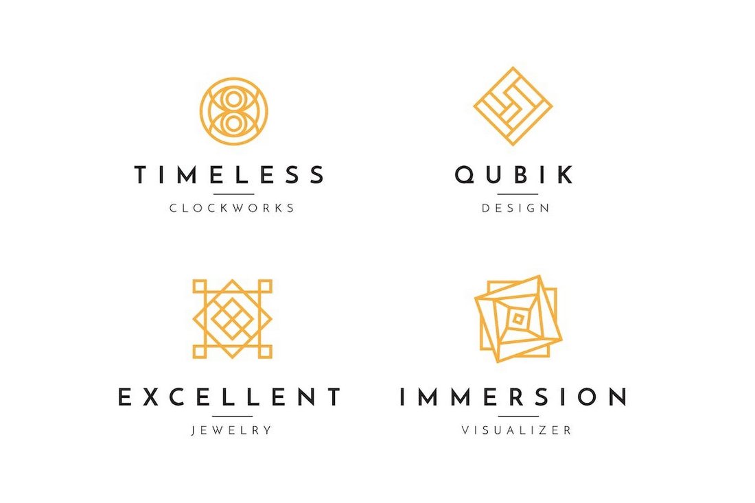
Creating a timeless look for a logo starts with a minimalist design. This collection of minimal logo templates is made to achieve that goal. It includes a set of beautifully elegant logos that are suitable for various types of brands and companies.
Colorful Modern Logo Design Template
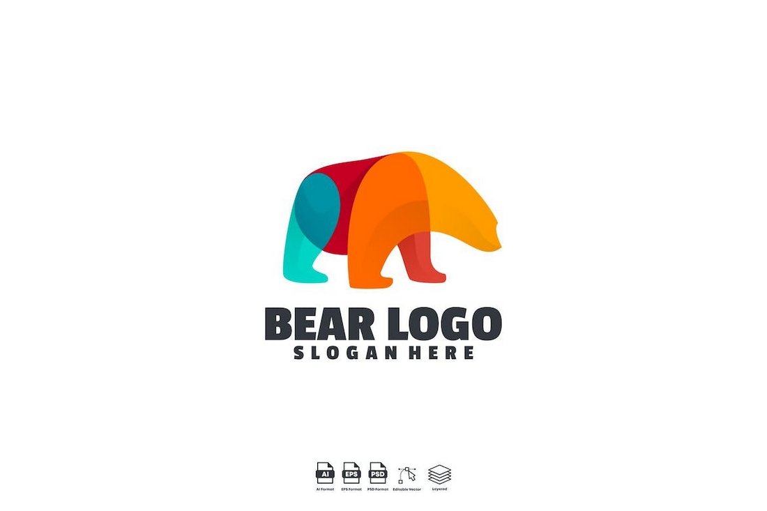
If you want to create a modern logo design with a colorful look and feel, this logo is for you. It features the symbol of a bear that’s been created using multiple colors. The template is available in AI, EPS, and PSD formats.
Jumping Fox Hand-Drawn Logo Design
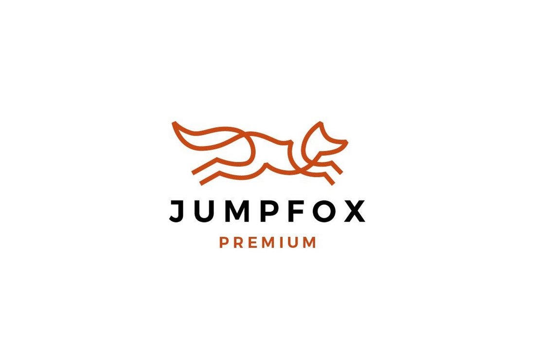
Hand-drawn style logos are another popular trend used by many big brands and companies, as we’ve discussed earlier. This logo template also has a unique hand-drawn design depicting a fox. You can edit and customize it however you like.
20 Modern Badge Logo Templates
This is a collection of 20 modern badge designs that you can also use to create logos and signage. Each template features a unique symbol and design for various types of businesses. The templates are easily customizable and come in AI and PSD formats.
Modern Lab Flask Logo Template
If you’re working on a logo design related to science, nature, or technology, take inspiration from this template. It features a stylish and modern logo that combines multiple elements to create a cool negative-space logo.
Modern Alphabet Letters Logos Collection
With this logo templates collection, you get access to the entire Alphabet. It includes creative and modern logo designs for each letter in the Alphabet. You can create unique monograms and single-letter logo designs with this template kit.
Conclusion
A modern logo design tells potential customers or website visitors that your brand or business is hip and interesting. A solid logo can establish credibility and trust.
Even small tweaks to an existing logo – such as streamlining it to remove dated elements – can bring new life to a brand mark.

0 Commentaires