If you have noticed more cartoon-style design elements lately, you aren’t alone. Quite a few projects are using design themes that feature cartoon elements, making this a trending design style.
There are plenty of ways to use the trend, from a full cartoon aesthetic to smaller elements throughout the design.
In this guide, we will dissect the different ways cartoon elements can be integrated into designs, demonstrating their versatility.
Whether you’re just dipping your toes into this trend or planning to plunge headfirst, we aim to fuel your creativity with practical insights and stimulating examples.
What is the Cartoon Elements Design Trend?
Cartoon design themes are one of the must-have techniques with new web designs in 2023. From flat illustrations to animated elements to three-dimensional styles, cartoon elements are almost everywhere.
The nice thing is that this is a versatile trend that can be used in a number of ways and can be a great option for projects that might be lacking quality photos or video. But some designers are finding that you can mix cartoon elements with these visuals as well.
For the most part, a cartoon style has a whimsical feel, but not always. These projects can include elaborate drawings and artwork or simple sticker-style elements and icons.
One of the reasons this trend may be growing in popularity is due to projects that feature virtual reality, AI, or even NFTs, which can all be somewhat difficult to visualize with photos or video.
Characteristics of this Trend
Cartoon-style design themes are characterized by their playful, whimsical, and exaggerated nature. They often feature vibrant colors, bold outlines, and simplified shapes.
Some of the things you might find or experiment with when using this design trend include:
- Cartoon designs tend to emphasize and exaggerate certain features or characteristics of the subject matter. This can include oversized heads, big eyes, elongated limbs, or disproportionate body parts.
- Simplifying complex forms into basic shapes such as circles, ovals, rectangles, and triangles to create characters, objects, and backgrounds is a common visual effect of this trend. You may see this with minimal design schemes or black-and-white color palettes.
- Thick, bold outlines help define shapes and forms, making the elements stand out and giving them a distinctive cartoonish appearance. The outlines are often in black or white.
- Colors are often bold and vivid, capturing attention and creating a lively and eye-catching visual experience.
- Cartoon characters are known for expressive facial features that help express emotion.
- A strong sense of movement and action can create a sense of energy and excitement.
- Playful and whimsical typography is a common, but not required, design element.
- Whether through visual gags, funny situations, or clever details, cartoon designs aim to evoke a sense of joy, laughter, and amusement.
- Cartoons often tell stories and can depict scenes, and interactions between characters, or convey a sequence of events.
- Three-dimensional or lifelike character that helps convey action, interaction, or functionality.
- Cartoon-style designs can be adapted to various mediums and platforms, including illustrations, animations, comics, children’s books, merchandise, and digital media. A good cartoon-style element will appeal to various age groups and demographics.
Examples We Love
This design trend can be one that people love or hate, but there is value to it in a number of applications. Here are five examples that we think work exceptionally well and use the cartoon style to its full potential.
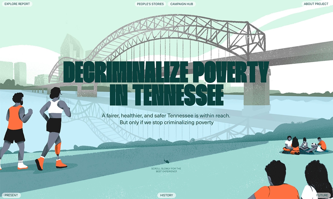
Decriminalize Poverty
While “cartoon” often does come across as a serious word, the illustrative style can be used for serious content. It’s all in the way the images are constructed. In the example above, a cartoon style is used to highlight a very serious issue, but works well because it allows the design to include people but without photos of real people. This helps humanize the issue without calling out individuals.
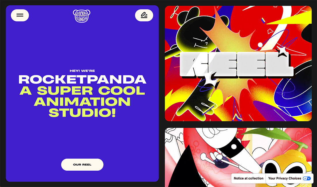
Rocket Panda
When you think cartoon, this is exactly what comes to mind. The fun, colorful animations on the right side of the screen are engaging and interesting. Click through to see how this works because each cartoon is a click that corresponds to the content on the left. Its interactions are seamless and fresh and the whole design makes you want to keep clicking!
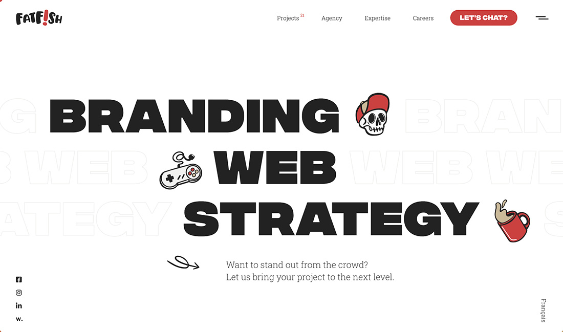
Fat Fish
Sometimes the best cartoons are ones that aren’t a full-screen takeover and work with a more minimal aesthetic. In the design example above, simple cartoon elements help carry the portfolio and give you a glimpse into the agency. The fun cartoon carries throughout the design as well.
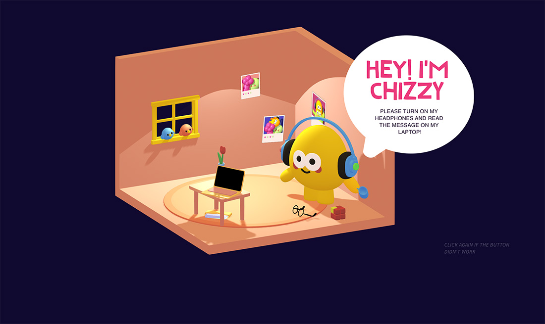
Chizzy
This three-dimensional style cartoon is exploding in popularity. From movies to tv to website design 3D cartoons and animation are becoming the norm for storytelling. The trick here is to include fun characters that bring the design to life.
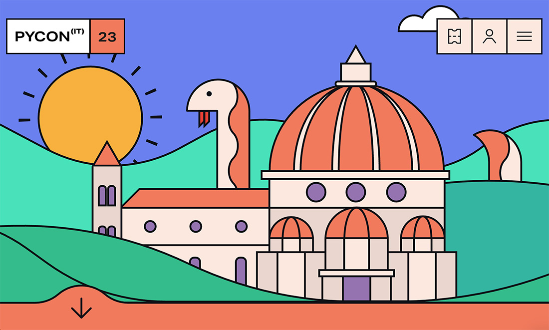
Pycon
Sometimes a cartoon has the perfect, simple, childlike quality that just makes you smile. That’s what you get with the example above. (We love that the monster animates onto the screen during load, too!) What’s exceptionally nice here is that the cartoon style flows through the rest of the design and is even paired with headshots that fit together beautifully.
Conclusion
While the type of illustration can greatly impact how this style feels, it is important to match cartoon elements to your overall content and theme. Sometimes cartoons can have a very light feel that doesn’t match all projects.
If you have a project without a lot of other art potential, creating your own in this style can be a fun – and functional – alternative to help get your message across and generate engagement. As long as the imagery works with the content and is understandable, you have a winning combination.

0 Commentaires