Can you spot AI-inspired imagery when you see it?
There’s a trend in website design projects with hero images that feature models who maybe aren’t quite human. But then again, maybe they are.
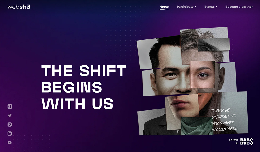
The line between reality and artificially created images is beginning to get blurred all the time. In many projects, there is a look and feel that’s supposed to contain an element of AI.
Here’s a look at that website design trend.
What is the AI “Model” Design Trend?
When you think about “models” for design projects, the first thing that probably comes to mind is staged photos or videos of people. But that’s not always the case.
More projects are using AI-inspired or created models. This includes everything from the main hero image to avatars to various other images in the project.
It’s a trend that’s gaining in popularity for a few reasons:
- You can create exactly what you want
- Technology is helping create more realistic-looking AI “people”
- It can be less expensive than hiring models for photo/video shoots
- Digital illustration is getting that good
- You can create or change images in projects swiftly
These AI-inspired models are showing up on projects across industries and with varying look-and-feel. There aren’t a lot of right or wrong ways to deploy this trend right now. It only needs to work with your content and overall design style.
Key Characteristics of the Trend
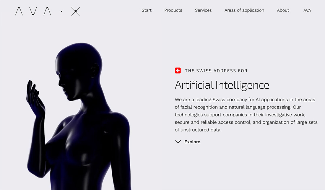
While you can try almost anything here, there are some design elements that appear more commonly than others. And you might find that some AI-based models have a similar look and feel – the glass or liquid style female shape is really popular.
Here are a few other characteristics you may notice:
- Minimal design patterns with white space
- Overly colored images that seem extra bright or cartoonish
- Futuristic flair
- Dark color or liquid style for AI models
- Paired with experimental or retro typography
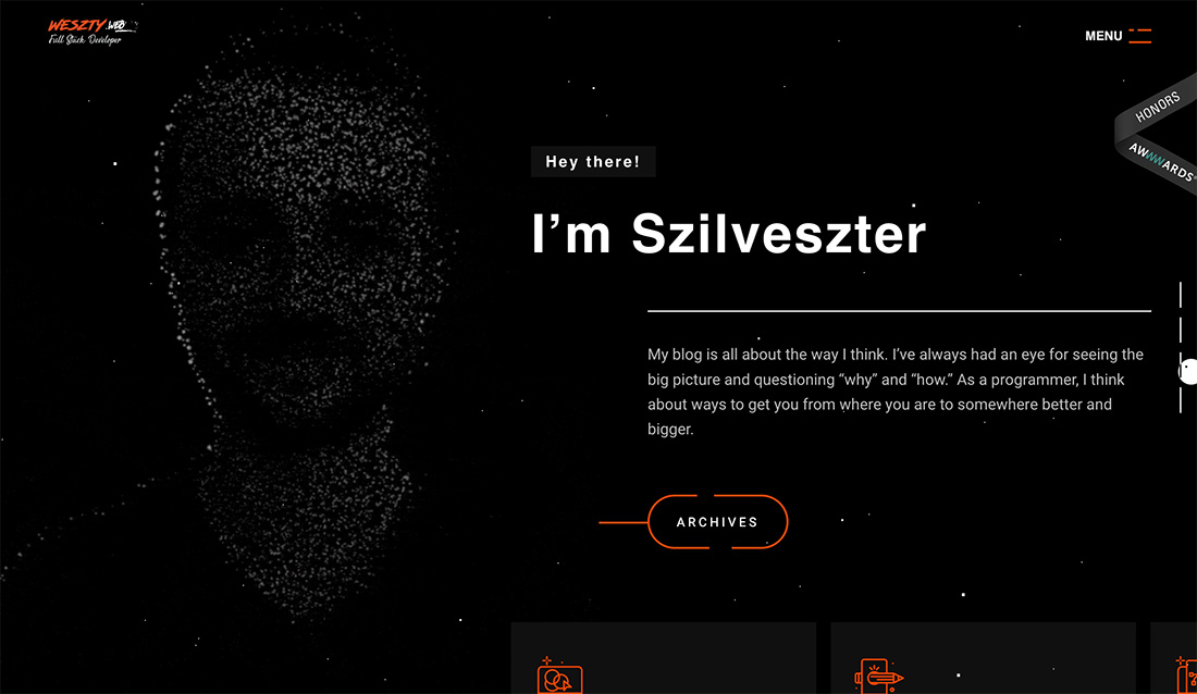
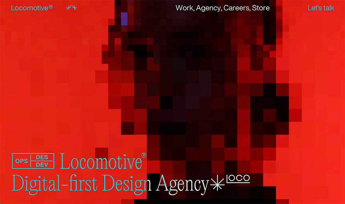
- Glitch or dot matrix patterns that simulate the outline of a person
- Often include animated elements
- Use for brands in tech fields
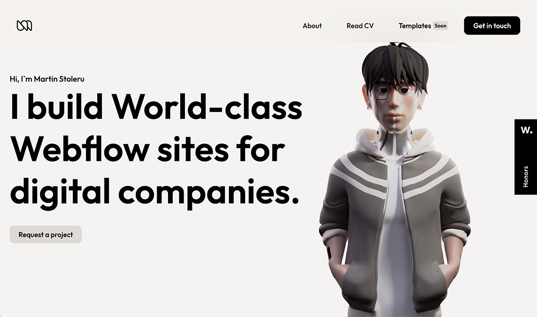
- Three-dimensional elements
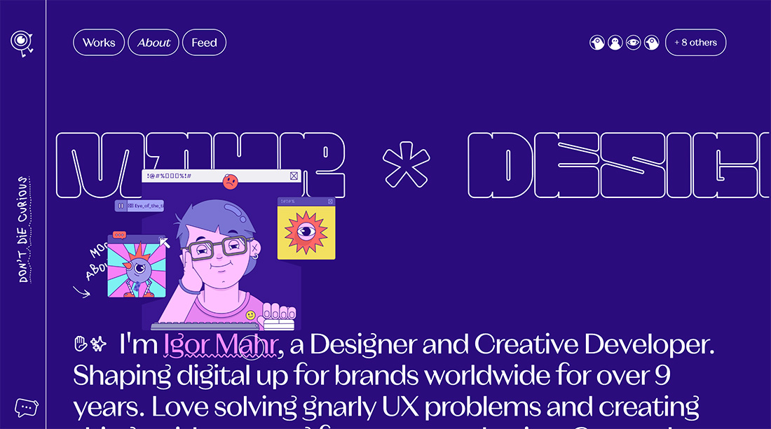
- Popular with portfolio websites to represent the person who made the site
- Used for smaller websites
The challenge with this trend is that many of the AI models seem to look similar. To expand it further, we are starting to see more non-human models with humanized features, mostly animals to continue to push the AI trend forward.
Tips for Using It Well
Using this design trend well takes a little extra imagination. A well-executed design can stand out and help users better enjoy their online experience, whereas a poorly-developed AI model will look out of place and off balance.
The challenge is that with these types of elements, you sometimes don’t know the good from the bad until you see it. Additionally, this style can be unappealing for some users, making it vital to know your audience.
But there are some things you can do to maximize the potential of this website design trend.
- Keep the design simple overall; AI-inspired elements may be more complex and need breathing room to ensure the design isn’t overcrowded or disorganized.
- Match your content. Don’t just toss AI out there for the sake of it.
- Be aware of the line between fantasy and reality. Does your model look like it was created using AI tools or inspiration? We’ve all seen some of those AI-generated “photographs” that feel false and insincere. Stay away from those.
- Pair with animation or other elements that create a unified feel. Use motion that seems realistic and with appropriate timing.
- Use these images or models in one distinct location in the design. You don’t have to overwhelm the design with AI to prove you can use the trend or technique.
- Test everything. If you aren’t sure if the design works, ask. This isn’t always the easiest technique to pull off and you want to ensure that your design is readable and understandable.
Examples We Love
The great thing about AI-inspired design elements is that they can be almost anything right now. Models can be human or animal and can look almost real or completely fantastical. The range of design elements in projects here is one of the things that makes this a fun and versatile trend to work with.
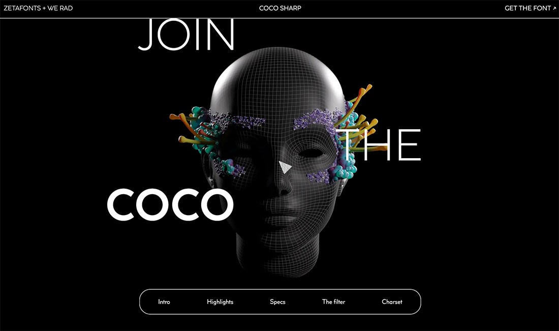
Coco Font
Many of the AI-inspired models that we see right now have hints of a female look to them. The model here is no exception, with a gridded head and floral halo. The animation here is also worth a click to explore.
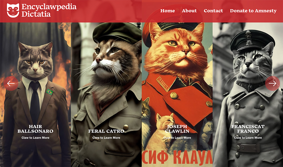
Encyclawpedia Dictatia
Artists have been turning animals into humans for a while; now AI can do that for you. This series of cats in costume is a fun example that leaves no question about how the images were generated.
Carsten Mell
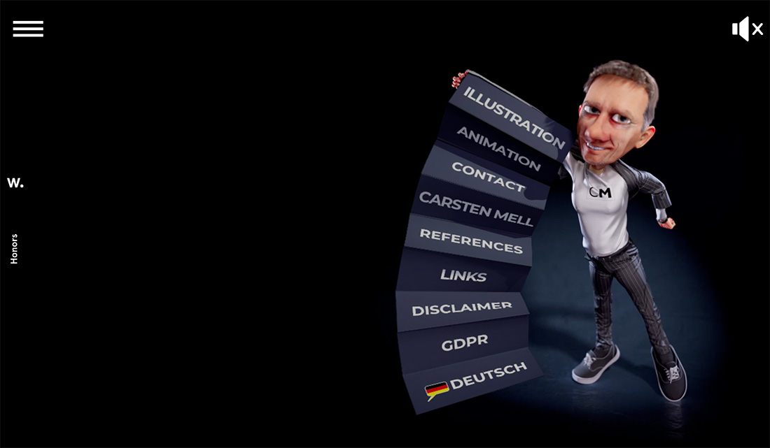
There’s only one thing on the screen here, the AI model of who we would assume is a likeness of Carsten Mell. What’s cool about this model is the animated, but almost real feel combined with the fun, jacket dropdown menu. (It pops open when you click the hamburger icon.)
Mugler
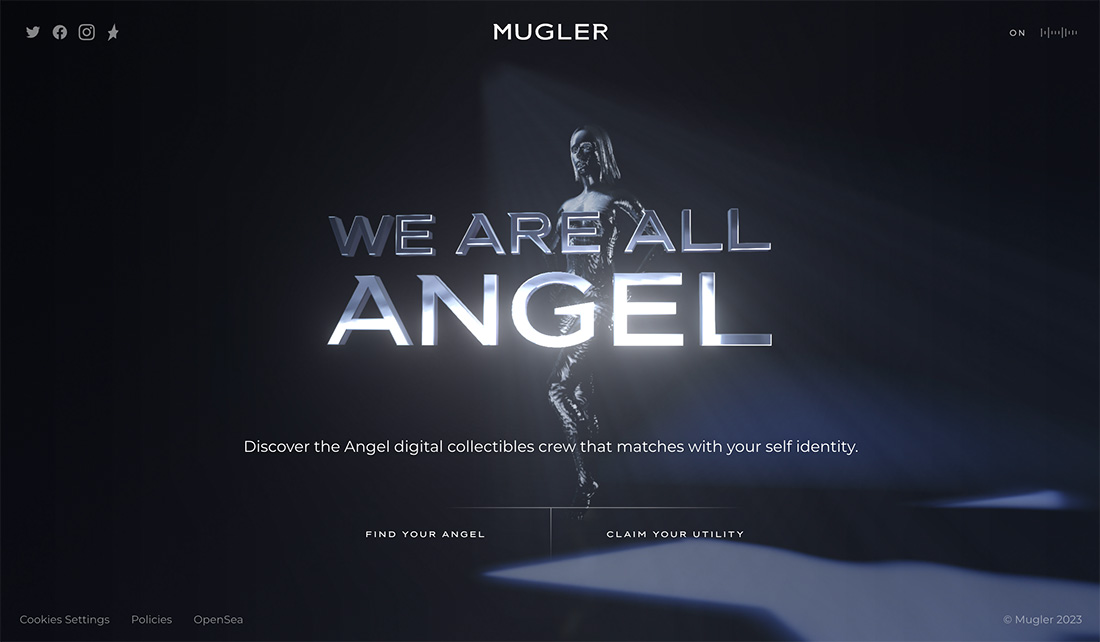
Mugler uses liquid animation for an AI model. The model is in the background – common with these designs – and has a quote robotic look to her.
My Dog Company
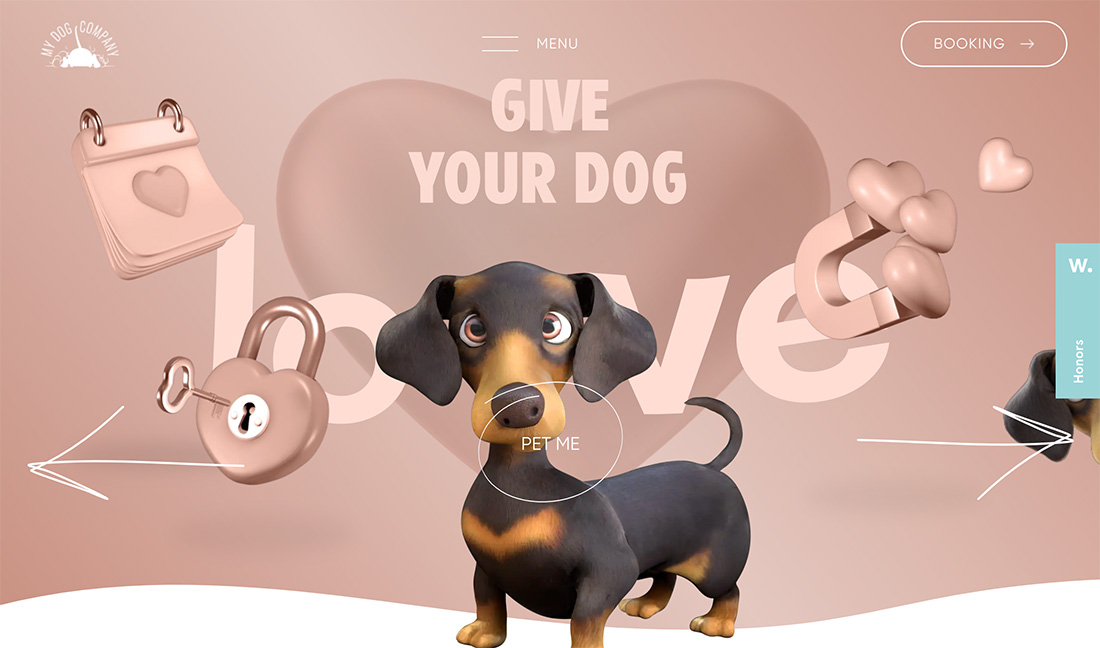
With a combination of smooth, 3D animation and human-like features, the Ai-inspired dog model is both fun and engaging. What makes it work is that the model looks and interacts with a dog-like motion but has very human eyes. This crossover between humans and animals is a good use of AI model effects.
Conclusion
When you are thinking about how to use AI models in your projects, the first question is “How real do I want this to appear?” And then you can go from there. The best projects don’t try to trick you with created “people” that look real; they are part of an imagined reality that works seamlessly with the content on the screen.
0 Commentaires