If you are ready to amp up your designs in Microsoft Word, this is the right place. Here – with templates as examples – we are going to look at a variety of ways you can create more modern, professional-looking page layout designs using this common tool.
Microsoft Word is capable of so much more than you might expect with page layout. You can build modern, on-trend documents, and push the software further than ever before.
Forget the old days of Word Art and choosing between six fonts. Let’s take Microsoft Word into a new world of improved design and typography!
1. Asymmetrical Grids
Get out of the default template and try an asymmetrical grid for a look that will create a fresh look for design projects in Microsoft Word.
When it comes to creating a grid, consider smaller columns as the foundation so that elements will still have a sense of organization and place, without having that split-down-the-middle look.
Another thing to think about with grids is creating both horizontal and vertical grids. These imaginary lines are the secret to organizing content in a visually meaningful way.
2. Infographics
A common theme in design is “show, don’t tell,”
Infographics are the way to do that, and you can design and include them in Word documents, from one-page brochures to multi-page booklets.
Think carefully about infographics in the planning process to keep information easy to digest and understand. Use maps, numbers, charts, and icons to help show the information your document is designed to convey.
3. Gradients
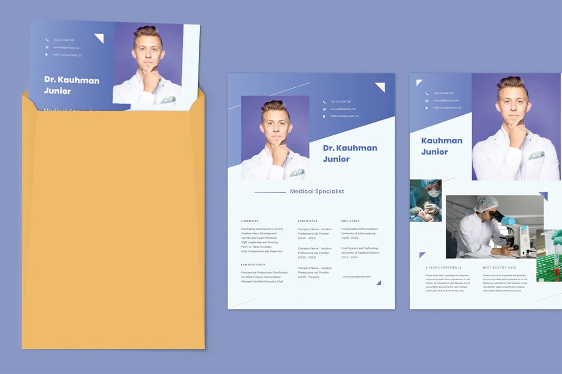
Gradients are the color trend that we can’t get enough of. You can use them in designs for Word documents for a truly modern feel.
From bright monotone gradients that move from light to dark hue to multi-color options, you can find an application for almost any color variable.
Gradients can be used for borders, big text elements, backgrounds, or other visual elements as you see fit.
Take particular care with gradients if you plan to print the Word document to ensure that your color choices will look as intended on paper.
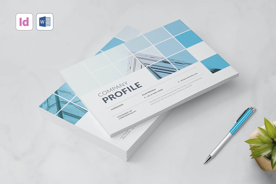
4. Monotone Color Palettes
Monotone color palettes have a beautiful simplicity that just works. Using dark and light variations of a single color feels classic and inviting.
A monotone feel can also solidify brand elements and images and avoid that “plain Word doc” look.
Even with a monotone palette, don’t feel like you have to have a wide range of hues. Pick a color and a handful of variations to use in the design. For most projects, that’s enough.
5. Layers
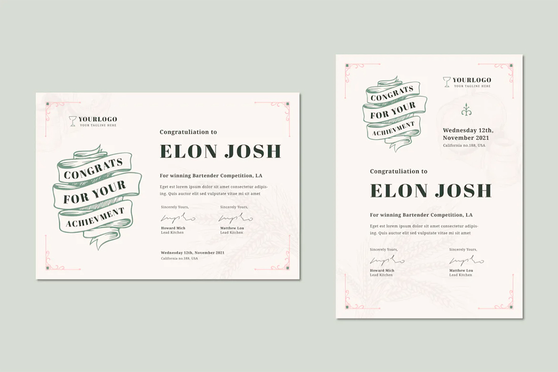
Layering is a fun and practical effect that brings design elements in the two-dimensional space to life. This design trend has been popular in website design for some time and can work just as well with Word documents and printed layouts.
The trick to using layers is to overlap elements without making the design feel cluttered. Continue to use space and your underlying grid to ensure that everything has a place and it doesn’t look like a smattering of parts were just thrown on the canvas.
Layers can also begin to look and feel heavy if you aren’t careful, so take care with placement and visual weight of colors, typefaces, and images so that everything maintains clear readability.
6. Minimal Aesthetic
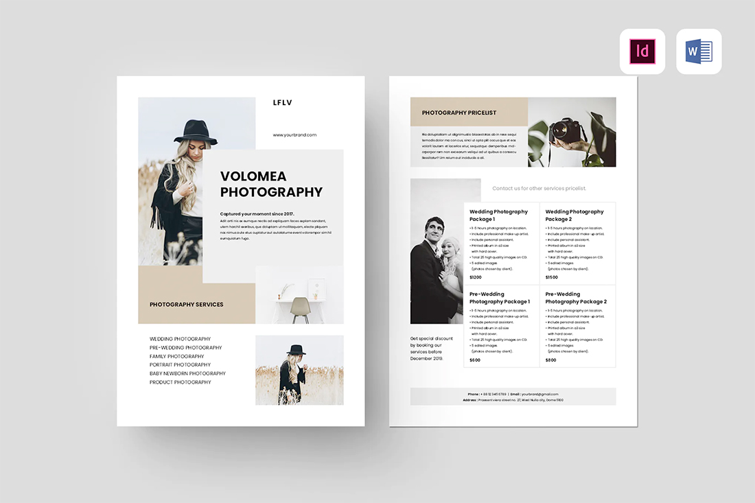
White space never goes out of style.
A minimal approach with well-planned space establishes a design that’s easy to understand and follow. It’s something that doesn’t often happen with Word documents, where we have almost been “trained” to fill all the space in a document.
Break out of that mold with open space around elements and in the page gutters so that everything has a seamless flow and light style.
Don’t forget to use a typography style that matches the minimal feel as well. (A simple sans serif can be a nice option.)
7. Color Overlays
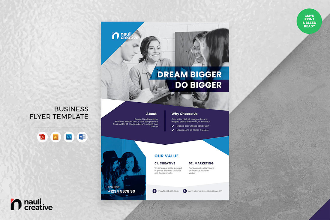
Color overlays can be paired with color or black and white images or against other colors with an overprint look.
Putting together blocks of color adds visual interest – particularly with fun shapes such as in the example above – when you don’t have a lot of other artwork to finish out the design.
If you plan to use color overlays, stick to one or two colors from your brand palette. Using too many colors with this style can get overwhelming because color takes on all kinds of tints and tones when used as an overlay.
A tight palette will likely serve you better than a more expansive one here.
8. Bold Color Palettes
Bold, high-contrast color palettes are an immediate attention-getter. (And something that’s not generally expected when it comes to designing Word documents.)
Boldness isn’t always defined by color alone. Boldness can also be the combination of color choices or the display contrast from the pairing.
The black and white resume template, above, with a simple yellow line, is bold and striking. But there’s not a lot of color. A small accent adds an amazing level of boldness without being over the top.
9. Clean Typography
For most designers working in Word, the end goal of the document is to create something that people will read. That starts with clean, simple typography that’s highly readable and understandable.
Often, that’s not just one font, size, or style. It’s using different levels and layers of typography to create an architecture that helps people move through the document in the right order with an understanding of the content.
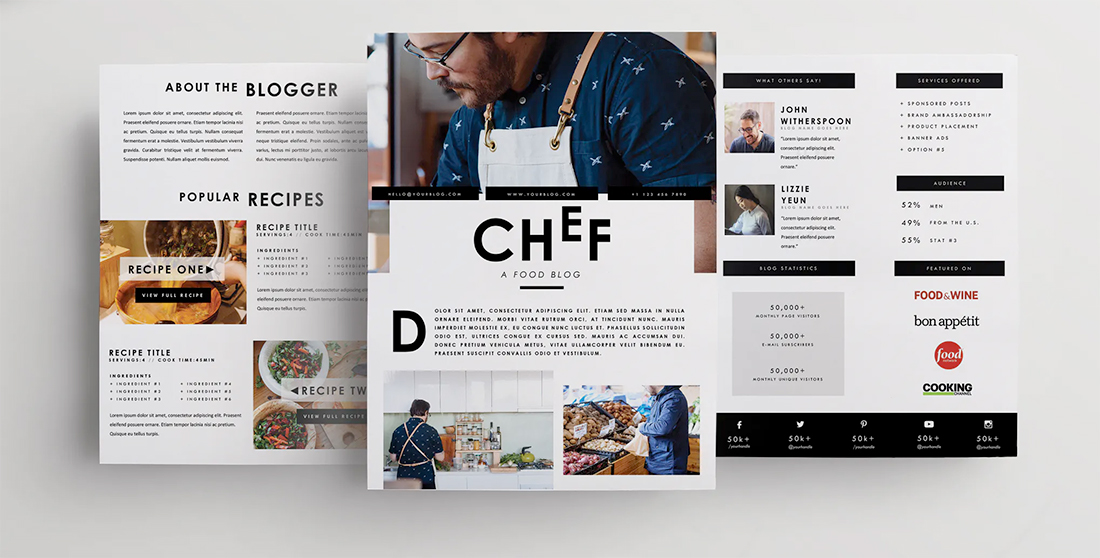
One of the best ways to accomplish this is with type size. A trend in typography is to use oversized typefaces for key information. That also works well in Word documents of almost any type. Go big with the main headline or key point to draw attention to the overall design.
10. Beautiful Images
Depending on how your Microsoft Word document will be used, amazing photos can take it to the next level. Great images almost always look good with digital transmission. (Consider printing if you are working on a document that will be physically handed out.)
Don’t be afraid to go big with one or two images that make your design sizzle. Avoid clusters of tiny photos. The key to making beautiful images work is the ability to see them at a glance and be drawn into the detail therein.
Here’s another thing that makes a beautiful image work and feels fresh and modern: It needs to match and mesh with other design elements. The image and text should “say the same thing” and support each other.




0 Commentaires