It’s not difficult to design a PowerPoint presentation. Designing an effective presentation, however, is an entirely different story.
Studies show that 91% of presenters feel more confident when presenting a slideshow with a great design. But, the problem is that 45% of professionals find it difficult to design creative layouts.
A PowerPoint presentation is not just about creating a few slides with bright colors and images. It mainly needs to be able to convey your message more effectively, maintain your audience’s attention, as well as to persuade and convince them.
Designing such a slideshow is not a Herculean task. You just need to know the right tricks.
In this guide, we share some useful PowerPoint tips and PowerPoint design ideas to help you learn how to craft creative slide layouts more easily. Without further ado, let’s get started.
Use the Built-In Design Ideas Tool
PowerPoint Designer is one of the best built-in tools available in the software that many users are still not aware of. This tool allows you to instantly apply high-quality design layouts to slides with just a few clicks.
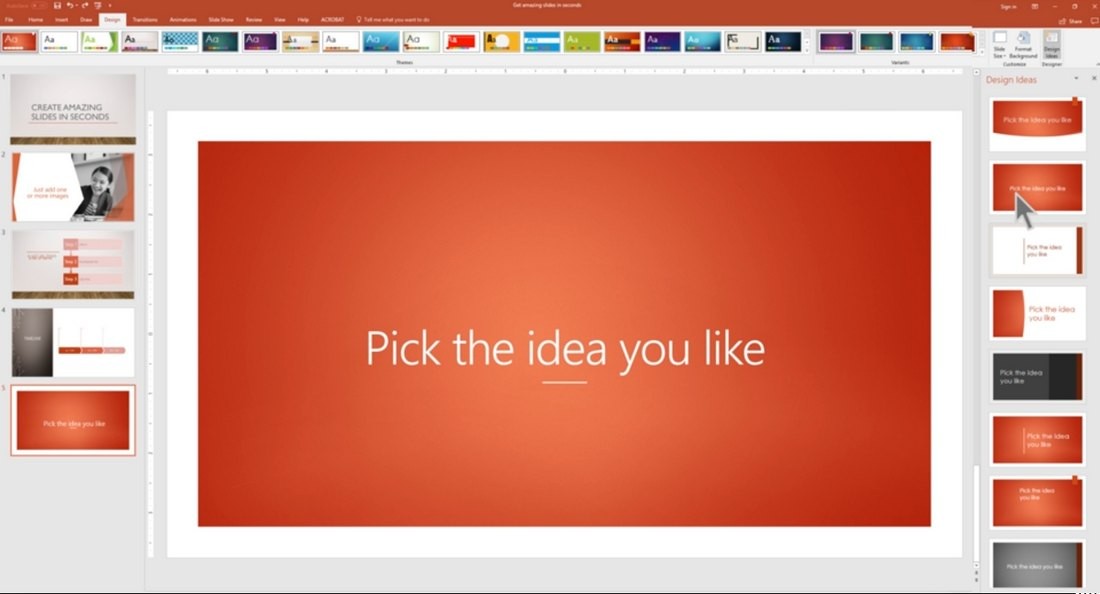
You can find the PowerPoint Designer under the Design tab of the software. Simply add some text and an image to a blank slide and the Design Ideas tab on the far-right will start suggesting different design layouts. All you have to do is pick one.
This AI-powered feature in PowerPoint works wonders when you have to quickly put together a slideshow. The only downside is that this tool is only available in the Office 365 version of PowerPoint. If you’re using PowerPoint 2019, using a good template is the best alternative.
Get a Professional Template
Coming up with a great slide layout design is a big responsibility. And it’s probably why it takes over 8 hours for most professionals to design a PowerPoint presentation.
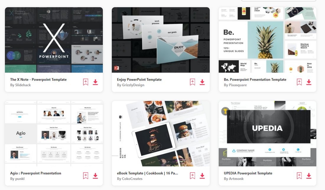
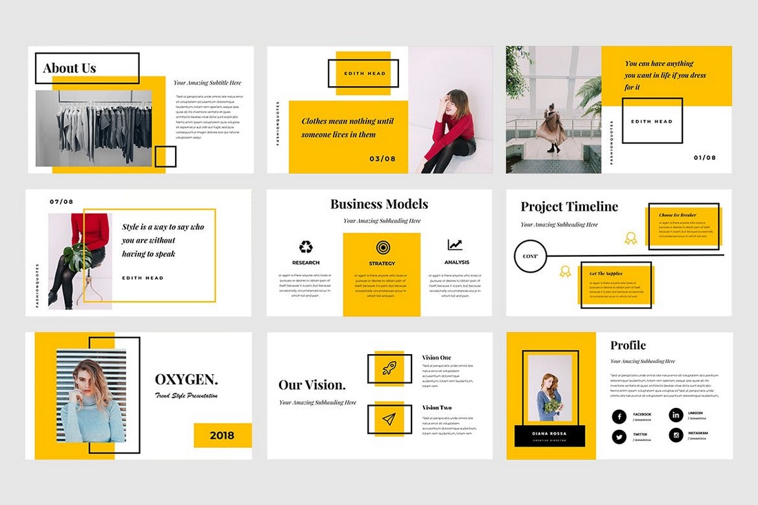
Using a custom PowerPoint template is the easiest way to save hours of time and still design a professional-looking slideshow. You can download pre-made PowerPoint templates from third-party marketplaces and customize them with your own content. You can change the colors, fonts, and add your own images. It’s much easier than having to craft creative slide layouts on your own.
You can find inspiration by browsing our best PowerPoint templates collection.
Pick the Right Color Scheme
According to color psychology, specific colors have the power to evoke emotions in humans and even persuade them to take action.
For example, there’s a reason why Stop signs and For Sale signs use the same Red color. It’s simply hard-wired into our brain to stop and look when something is displayed in this color.
You can also leverage color psychology to design more effective PowerPoint slides. Based on the topic, you can pick colors to evoke the right emotions in your audience.
In order to do this, you need to pick a color palette for your slideshow design and create a consistent design across all slides in the presentation.
Add Custom Fonts
The text you use in each slide is the driving force behind educating and convincing the audience. Needless to say, it’s very important to make sure your titles and descriptions are easily readable and clearly visible in each slide.
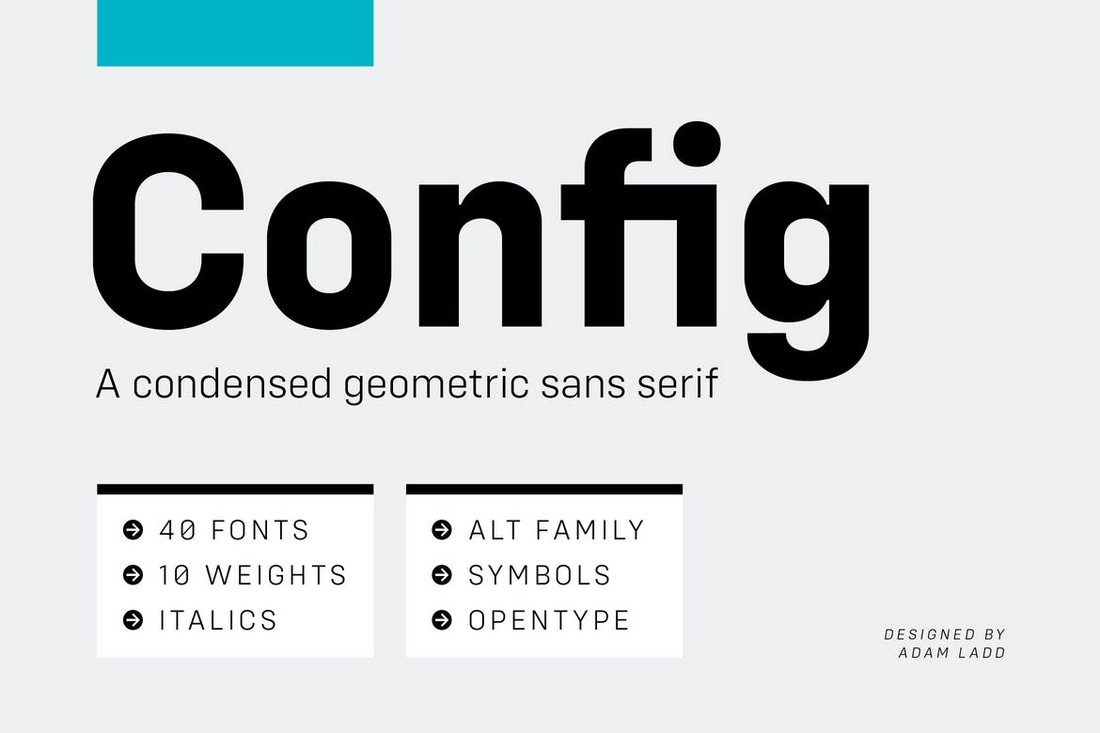
Find a great font family for your presentations and avoid using the default system fonts. This will give your slideshow a unique and professional look.
You can check out our best fonts for PowerPoint collection to find a unique font for your designs.
Learn to Use Master Slides
The aptly named Master Slides in PowerPoint is where you can master the art of customizing your slide layouts.
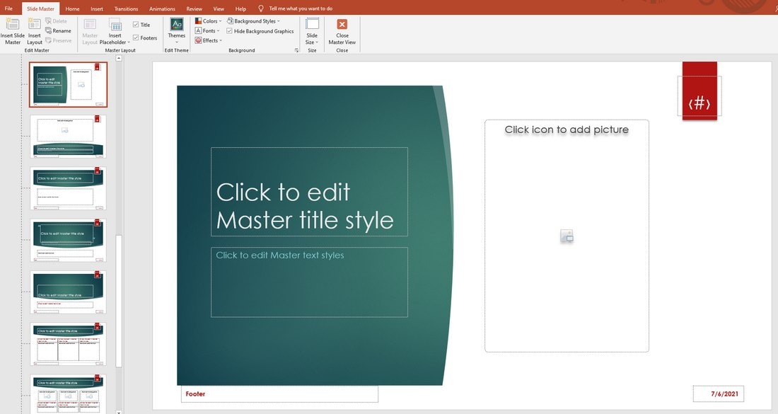
From the View tab, you can find the Slide Master option to open the editor. Here, you can customize the pre-built layouts included in the slide theme you’re currently using.
You can change the colors, fonts, styles and the changes will automatically apply to all of the master slides in the theme. You can even design your own custom slide layouts to quickly add slides to your presentations in the future.
Learning to use Master Slides will make your presentation design process much simpler.
Adopt Design Trends
Fusing design trends into your PPT slide layouts is another great way to make your presentations look creative and relevant.
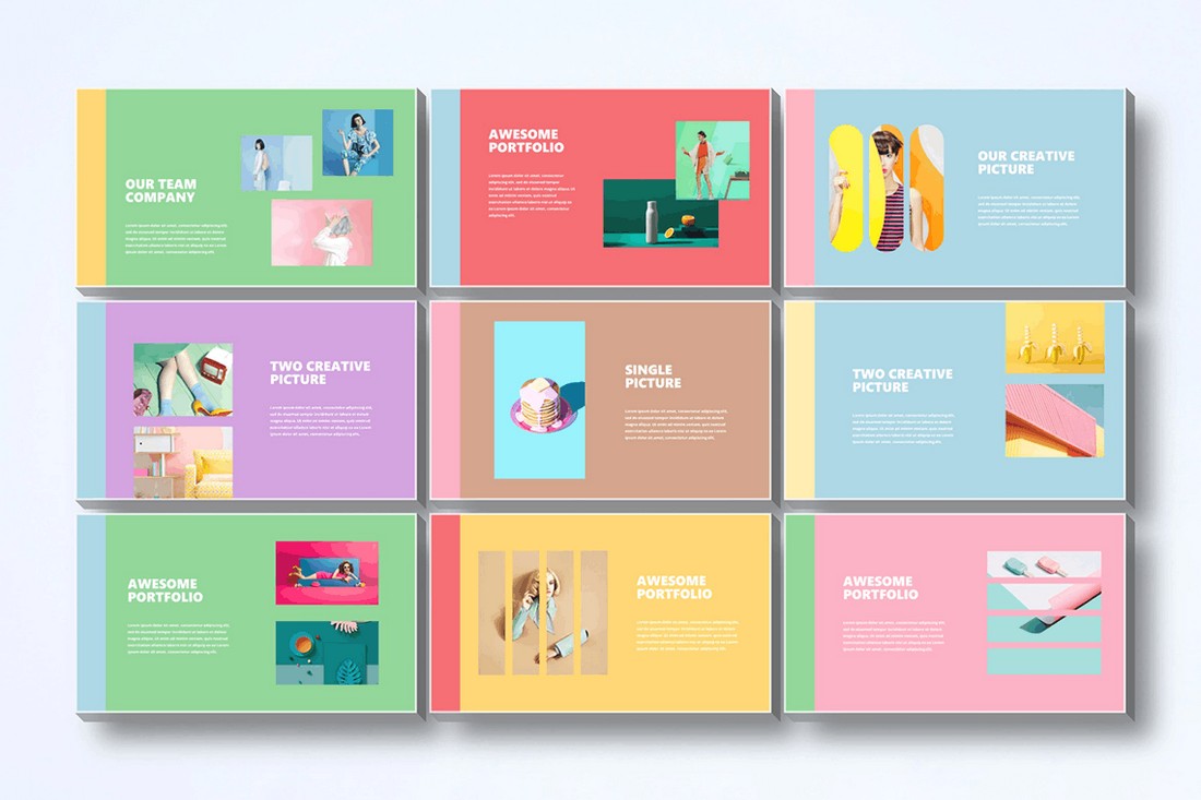
For example, using pastel colors in PowerPoint slide design is a popular trend these days. You can use such trends to add unique and personalized layouts to your presentations.
Vintage design, Art Deco, dark color themes, and geometric are a few other PPT design trends you can use.
Include Infographics & Charts
Presenting numbers and data is an important part of a PowerPoint slideshow. It’s much more difficult to convince your audience without data to back your claims.
The way you present the data in a presentation is also important. Because if you present them in plain numbers, you’ll have a tough time getting through to the audience.
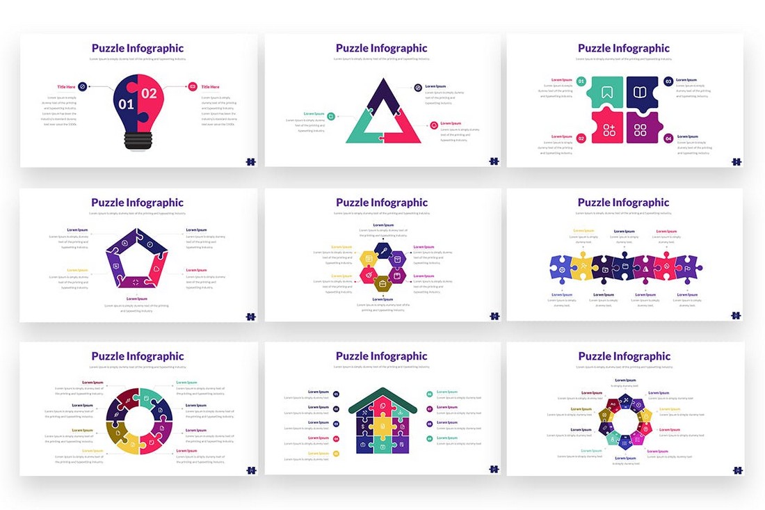
Instead, visualize your data in a more appealing way. You can do this by using infographics, charts, timelines, and graphs.
You don’t have to hand-craft these visuals. In fact, there are PowerPoint templates that come loaded with editable infographics and charts you can use in your own presentations.
Follow the 10/20/30 Rule
Guy Kawasaki, a popular author, speaker, and entrepreneur, introduced a very simple rule for creating effective PowerPoint presentations called the 10/20/30 rule. It goes like this:

- Use no more than 10 Slides in your presentations
- Present the slides in under 20 Minutes
- Use a 30-Point Font for text
It’s simple and straightforward. The main goal of this strategy is to create short and efficient presentations without filler content.
While these rules are too strict for delivering certain presentations, you can still use them as guidelines to create better slideshows.
Use Illustrations Instead of Stock Images
If you’re tired of seeing the same images in every presentation, blog post, and social media post, keep in mind that your audience is just as tired as you are.
There are many great free stock photo sites with great selections of images. Unfortunately, these images are used by thousands of people all over the web. If you use the same images, the chances are your audience will easily recognize them.
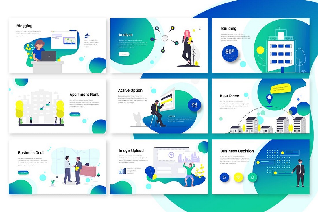
A good alternative you could try in your presentations is to use illustrations. With the right illustrations, you can make each slide look and feel unique. As well as add personality to your presentation.
Illustrations are easy to find. You can download illustration packs from marketplaces like Envato Elements or download them from free sites.
Remember The KISS Principle

KISS, the design principle popularized by the US Navy in 1960 is still relevant today. The idea behind the Keep It Simple, Stupid principle is to encourage designs that are simpler and easier to understand.
Follow this principle when designing your presentations. Instead of filling each slide with long paragraphs of text, use short sentences. Instead of adding lots of images, use just one or two images per slide. Keep It Simple and Straightforward.
Conclusion
Hopefully, these PPT design tips will help you craft better and more effective presentations in the future. Learning new tips and tricks is part of the design process. So keep learning and keep experimenting with new ideas.
Also, check out our complete guide to using PowerPoint templates to learn more about presentation design.
0 Commentaires