High-color, print-style backgrounds are making an impact in what is known as the “Risograph style”. Packed with charming imperfections, bold colour overlays, and hints of duotone style, it’s a winning style to experiment with.
Typically associated with printing, this design technique is making its way into digital projects as well, most commonly as a background element.
Here, we’ll look at the Risograph style for backgrounds, how to use this design trend to your advantage, and a selection of templates that can help you get started quickly.
What is the Risograph Style Background Design Trend?
Risograph styles emerge from printing. The technique is somewhat of a digital screen print, where each color of the design is printed on its own to combine multiple hues to create other colors and patterns.
The term comes from the printer and ink company, Riso from Japan. The company name, which translates to “ideal,” began using soy-based inks.
Today, Risographs are still printed in much the same way, but digital designers have taken the color visual aesthetic from the design and repurposed it for digital use.
How to Identify Risograph Styles
While color is a key defining element for Risograph styles there are some other features that can help you identify this design trend.
Bright and vivid color is the key element. Expect to see bright blues, oranges, yellows, and pinks. Some of these same colors are part of the material design palette that was popular not too long ago, so there’s a natural carryover for this trend.
The color palette in the riso style is often rather limited and might even be reminiscent of a duotone or include a dot grain or halftone effect.
Finally, this style is identified by charming imperfections. Risograph backgrounds are quite imperfect with lines or shapes that aren’t exactly as you’d expect, but have a quaint quality to them.
Tips for Using this Background Trend
When it comes to using the Risograph style background trend, you’ll want to incorporate this concept into your overall design plan. It’s not generally something you can use in one place and not others.
That means it is important to think about how this technique can play with or against your content before going down this design path.
Because Risograph styles include a lot of color, imperfections, and even cartoonish imagery at times, this might not work for every type of content.
Risograph backgrounds tend to be bold and somewhat oversized, might include a lot of texture, or feel like a full duotone project. One of the best uses of Risograph background styles might be Spotify, above, which creates interesting cover images for playlists with this effect.
Create Your Own Risograph Backgrounds
You can create Risograph-style textures and backgrounds on your own using a tool such as Adobe Photoshop. Alternatively, you can use a premade action or brush or even download a template that has the effect you are looking for. (We have a few favorites below.)
If you are interested in making your own Risograph-style backgrounds, try one of these tutorials.
- How to Make a Risograph Texture Effect from Tuts+ (image above)
- 4 Ways to Mimic a Risograph Effect in Photoshop by Shutterstock
- How to Create a Noisy Risograph-Style Gradient by Cat How
- How to Make a Risograph-Style Print in Adobe Photoshop from Adobe
5 Examples We Love
We’ve got some Risograph-style background inspiration for you. Use these examples as a springboard to thinking about how this style might benefit projects you are working on.
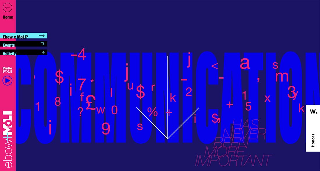
Ebow x Moli
Risograph backgrounds have a lot of varying potential in the digital space. Here, the style is created using lettering in super bright hues. There’s a lot of visual interest with high impact.
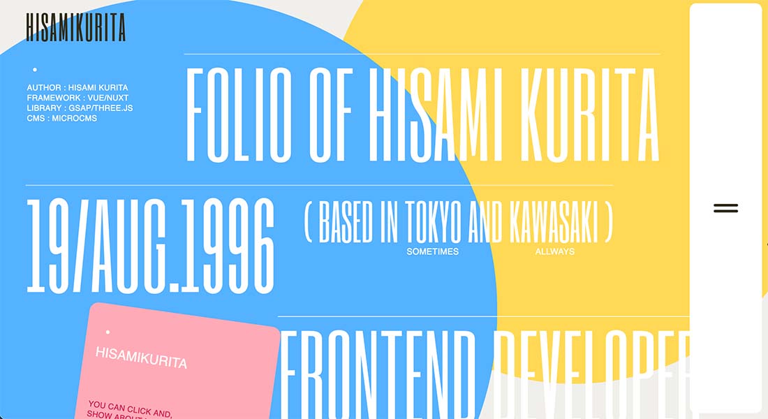
Hisamikurita Portfolio
This portfolio site mixes big geometric shapes – a common theme with Risograph styles – that overlap in haphazard ways to really highlight the trend and make the text on the screen readable. Without any other imagery, it is impactful.
Evozyne
The other common element of Risograph themes can be the look of overprinting. (If we are “stealing” ideas from print, why not?) This example is fun because it also includes a hint of animation and you don’t see it until you click into the menu, which pops out full screen.
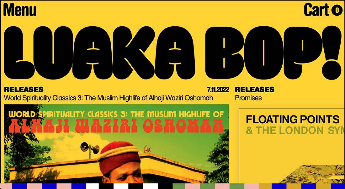
Luakabop
A little bit Risograph and a little bit brutalist, this example shows how to use the color palette concepts of this trend with other elements for an eye-catching display.
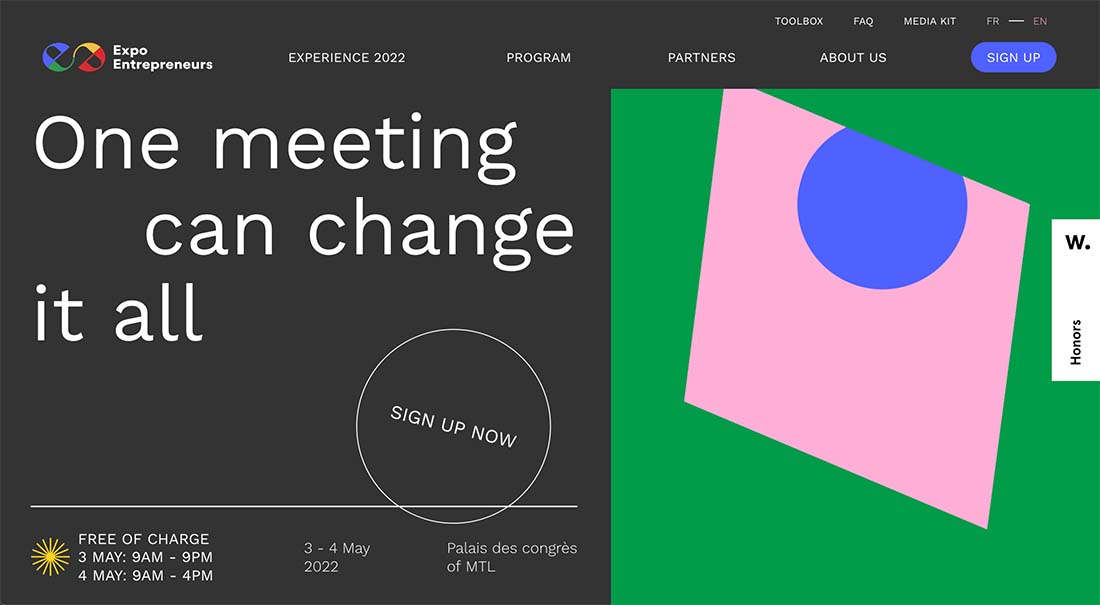
Expo Entrepreneurs
Shapes and subtle animation are the primary element in this Risograph style background that are paired with a dark split-screen element. This design optimizes balancing strong color with a more subdued partner effect.
5 Templates to Try
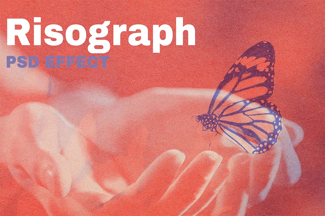
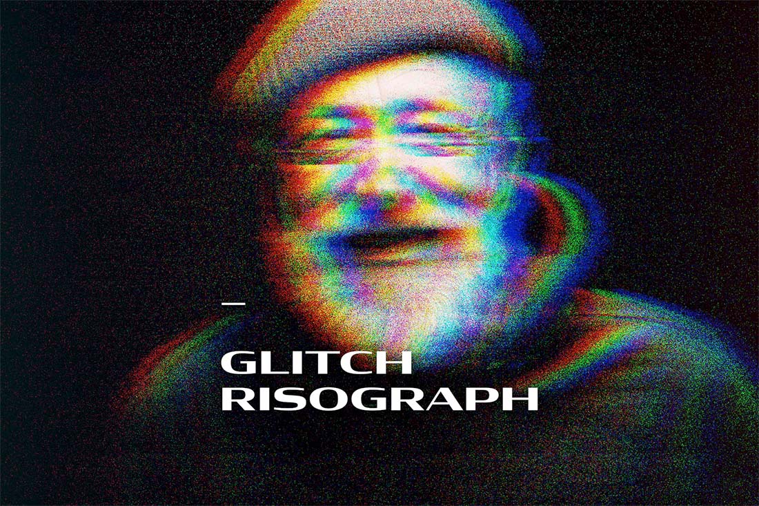
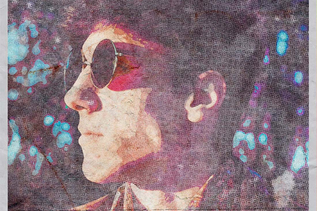
If you want to try a Risograph style without creating it yourself, a template can be the way to go. These options from Envato Elements offer plenty of variety and style that you can create and adjust quickly.
Risograph PSD Effect
Glitch Risograph Photo Effect
Halftone Poster
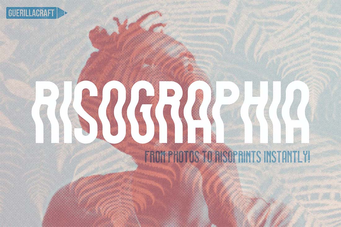
Risographia for Adobe Photoshop
Risograph Double Exposure Effect
Conclusion
A Risograph-style background can be a fun and interesting design technique that can work in a number of ways. Consider this trend as part of an overall aesthetic for the most impact and design consistency.




0 Commentaires