What to put on a business card? It’s a tricky question. A business card that contains just the right information (and a stellar design) will grab attention and help you stand out. It’s the thing that makes someone else remember you, or your pitch.
Even in the digital age, a business card is a popular–and necessary networking and communication tool. Having a great business card provides legitimacy to your or your business, it’s a quick and easy way to exchange information, and can provide ways to help promote your work.
What you put on your business card says a lot to others. Here’s a guide to what to put on a business card, with plenty of creative ideas to help you get started.
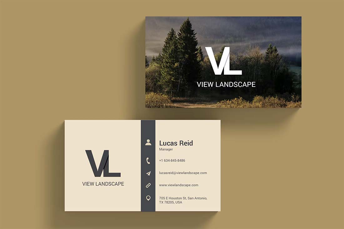
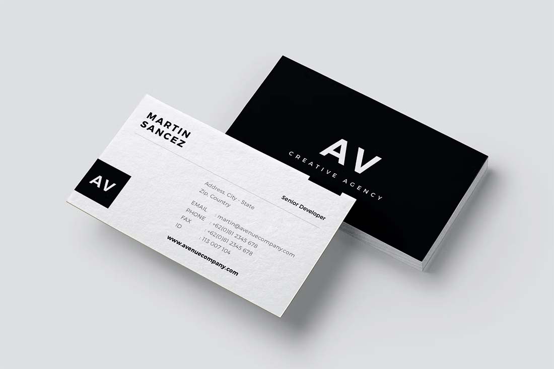
1. Identification and Contact Information
No matter how you decide to create the design, every business card should include the basics.
It almost goes without saying, but there are too many beautiful cards out there with no real information to identify the source. Equate this to an awesome website that loads slowly. You will just move on to something else.
There are a few vital elements that every business card needs:
- Name and business name (if you have one)
- Basic contact information such as an email address or phone number
- Something that tells people what you do – designer, photographer, web developer etc.
- Website URL to showcase your work
2. An Image That Shows What You Do
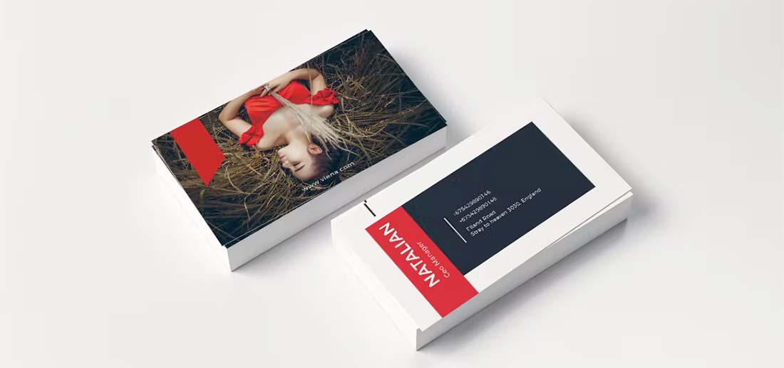
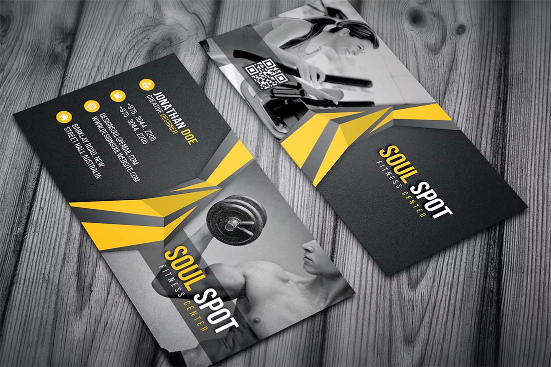
A great photo can take an average business card to the next level. Leave a visual impression with new connections by using an image that shows what you do or your work on the card itself.
This is a popular choice for photographers and artists, although it can be a little more tricky for web developers. Look for an image that’s sharp and easy to understand at a small size. (Your canvas is probably no bigger than 3.5 inches by 2 inches if you opt for a standard size.)
Other ways to use creative imagery for a business card design include using an image or illustration that shows what you do. Maybe you have a great “action” photo of yourself. Maybe you have a creative take on your job. Any stellar image can make an impression. The trick is to make sure it communicates exactly what you want to say visually.
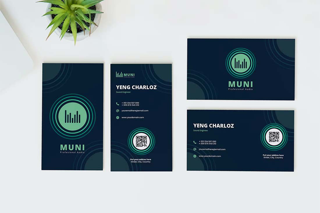
3. QR Code
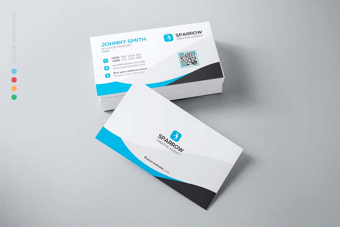
QR codes are one of the trendiest design elements on business cards because they provide a digital way to connect. Users can scan the code to save your contact information, web address, or get a map to your address.
Think carefully about what to include in your QR code and consider this option. You may also use a QR code with tracking or a UTM-based link so that you can determine how many people are linking from your business card.
As for the design, just make sure to make the code big enough to scan with ease.
4. Plenty of Color
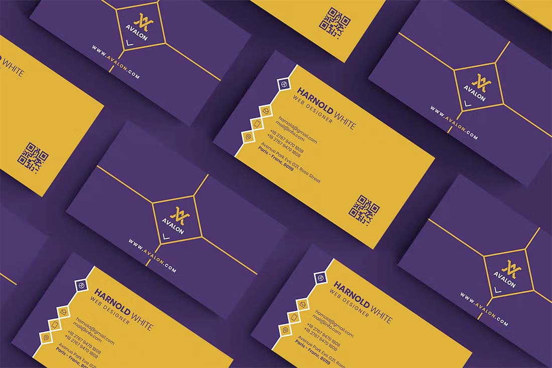
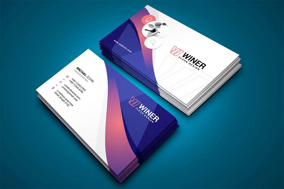
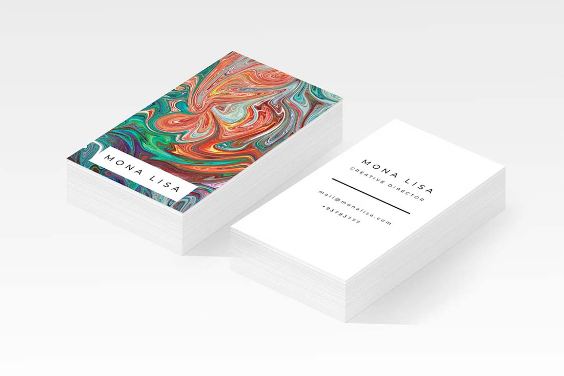
Black and white business cards can be kind of boring. Create maximum impact with high color visuals that connect to your personal (or business brand) and personality.
One of the best tricks to make sure your card stands out is to use thick paper with a color edge. Since most business cards will probably be on the thinner side (too many people do this to save a few bucks) and have a white edge.
A thick card with a color edge will be a lot more memorable, screams quality, and will be easy to find in those endless stacks of cards that get collected at professional conferences or networking events.
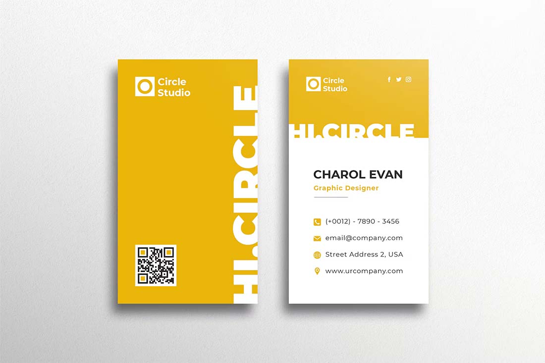
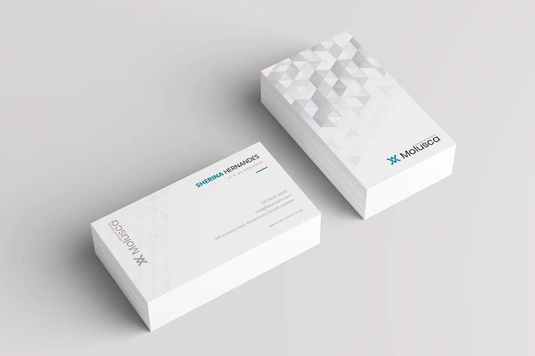
High color designs can work for any part of the business card design. Look for ways to incorporate a logo with a bright logo or typography on a white card or consider a color card with reverse lettering. (Just remember, the goal is to stand out professionally.)
5. Textured Effects
Since a business card is a physical medium, make the most of it with something that users can see and feel.
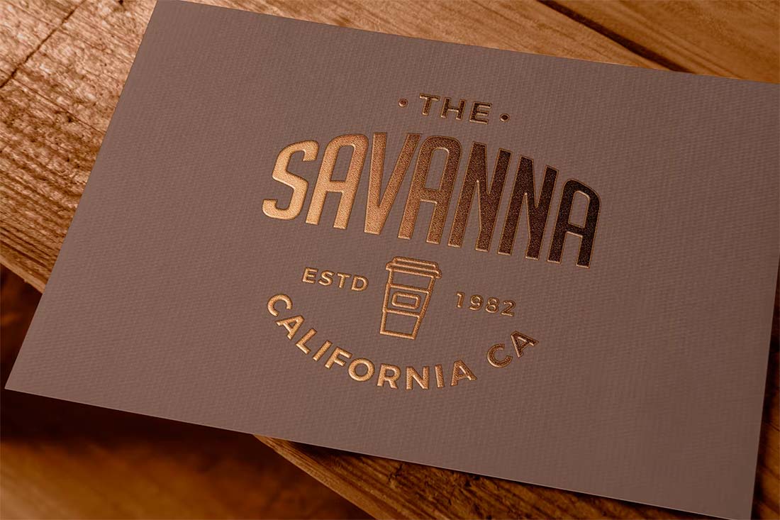
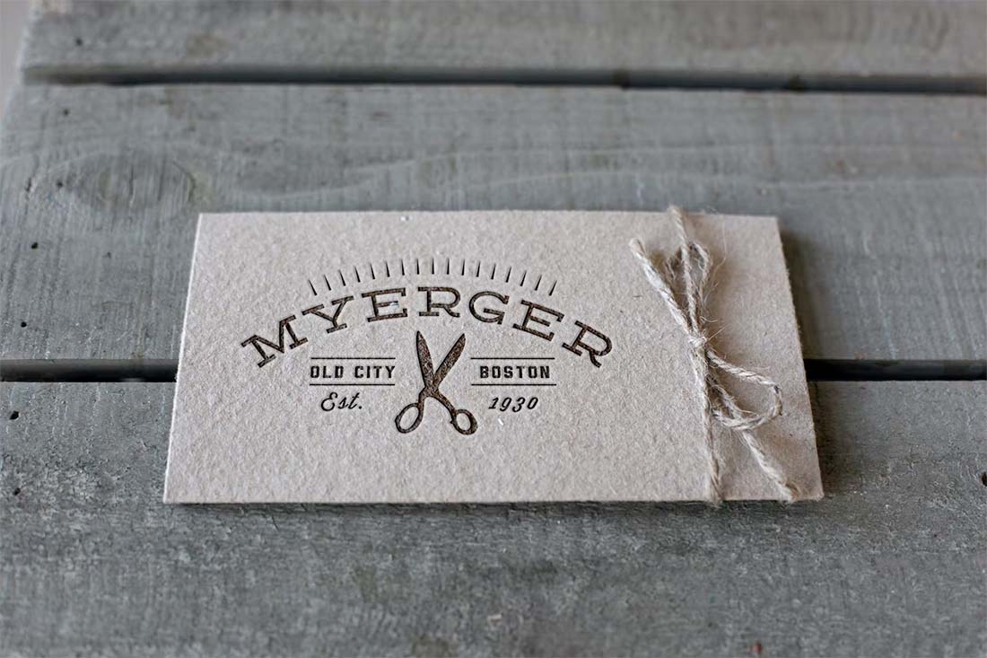
Opt for a textured effect such as letterpress or foiling. Use high-quality printing (not copying) for production so there’s a subtle raised quality to letters on the card.
You can even look for a laser cutout or curved or nontraditional edges to make the most of a tactile design. The longer a user holds on to your card to examine these features, the more likely it is that they will have a stronger memory of it – and what you do. It’s an easy way to create a longer-lasting impression.
While these effects are some of the most costly on this list, there are ways to avoid breaking the budget. Print two types of business cards – one is a more standard design at a lower price point (use these in mailing and non-contact marketing touches), then have a second card with a premium design for top clients and meetings that you hand out in person. Try to use a similar visual design for each.
6. Amazing Typography
There’s almost no design project where great typography isn’t a must-have element.
With something as small as a business card, typography is vital to creating a design that people can understand. A common flaw in business card design is typography that’s too small.
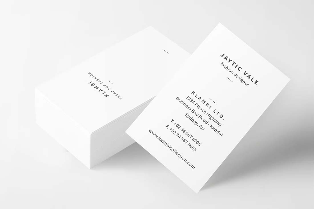
A good business card design has a typography hierarchy and structure just like any other project. Don’t be afraid to go big with important words such as your name or what you do.
Use clean, easy-to-read typography. This is especially important if your name is uncommon or your business name or location includes difficult words or spellings. Make it easy for the user.
7. Plenty of White Space
Don’t cram your business card with too much stuff.
In addition to all the reasons why white space is good for the design, a bit of usable space can enhance business card usability. It allows the card recipient to make notes or write down information that they might need later.
If this is something you see happening a lot, consider a matte or flat finish so that taking notes directly on the card is easy and so that ink does not smear.
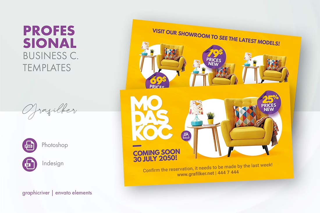
8. A Call to Action or Promo
Physical elements such as business cards don’t come with the same measurable ROI or analytics that many of us are used to getting with digital products. Include a call to action or promo code for a product or service to help measure who is looking at and engaging with your card after a meeting.
It’s not a surefire way to measure results – many people never redeem promos – but it can help you give users something in exchange for their time. An enticing call to action or promo can at the very least drive some traffic to your website or generate emails or phone calls, so why not try it out?
Conclusion
Just because you need a business card, doesn’t mean you have to be boring. Make a great first impression with a strong business card design that lets people know who you are and what you are about. Use high-quality paper and printing techniques to solidify that impression.
And don’t be afraid to get creative. In a creative field, your business card should not just tell people who you are; it should also showcase your style.
Looking for more business card inspiration or love these ideas? You can find them all at Envato Elements.
0 Commentaires