Sometimes a logo just doesn’t work. It happens to everyone from startups to major brands. (You’ll definitely know when you see these logos.) Maybe it’s too complex. Maybe it’s too generic and similar to other logos. Or maybe it’s just not dating in a timeless way.
So, we collected five logos from established brands that we think are in need of a redesign this year!
See if you agree with our takes on these marks. Logos are famously subjective—you might have a completely different opinion!
1. Sherwin-Williams
Sherwin-Williams is a classic brand with a classic mark. The trouble with it today is that there’s just too much going on for the logo to stand out and be readable.
Let’s start with the icon/graphic mark. There are some obvious challenges:
- Multiple small words
- Harsh color combinations
- Complex graphic design element (paint bucket, paint pouring, and a globe)
- Size and scale is impossible to read small – icons, favicons, etc.
- Overall dated style for iconography
Combine those elements with a long word in an all caps, italic style and there’s just a lot to digest visually.
This brand could benefit from simpler iconography and typography. It needs fewer, or no words, in the graphic element. The logo could retain the basic idea and feel, but without creating such a heavy visual load for people when they see it.
2. Animal Planet
Animal Planet has been through quite a few logo redesigns in recent memory and this one needs work again. The blue elephant design launched in 2018, but still seems to miss the mark.
The blue elephant isn’t really identifiable with the brand when used alone without the text. And then there’s this – why an elephant? There’s so much more to the network’s programming that this representation seems too narrow.
It almost looks like an element you’d see for a baby- or child-based brand.
The color also presents some visual challenges. The blue is extremely bright on screens and feels almost out of place when paired with some color combinations, not to mention accessibility concerns.
3. American Airlines
The American Airlines logo combines pieces that are too complex and too simple at the same time.
The primary font is lacking inspiration and definition while paired with an overly complex and dated-looking mark. The shadows and gradients make the plane wing seem like it was from a decades-old branding effort.
Simply, this logo needs some tweaks so that the pieces match. Either the mark needs to be simplified or the typography needs a little more personality to match the graphic element.
4. Mastercard
Mastercard is the third logo here with a common theme: Did you notice the typography similarity between Animal Planet, American Airlines, and Mastercard? They all seem so stark.
Animal Planet and Mastercard also opt for no capitalization. That seems like an odd choice. The use of a capital letter implies importance and “proper noun” stature. It also dates the logo designs to the mid-late 2010s when the no capitals style was popular. (It’s not anymore.)
Mastercard, according to brand standards, launched the design in 2016 with the use of the brand name but has since dropped it in most uses. That poses another problem with the logo.
It’s just two circles. Is that really enough?
It seems too stark, too minimal, and not really descriptive enough to carry the brand – particularly the brand name – well. Think of new generations of credit card holders that don’t know what those circles are and in turn don’t establish any loyalty with Mastercard over one of the other credit card companies.
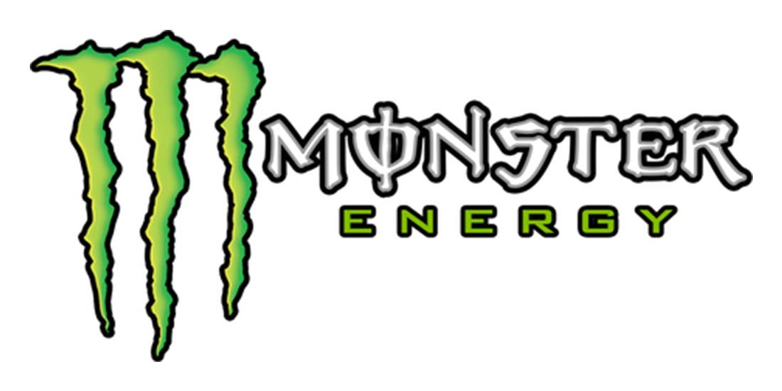
5. Monster Energy
You hate to say a logo is just plain bad, but Monster Energy is just that by today’s standards. There are so many things happening in this logo design that it’s hard to list them all. (But we’ll try.)
- Ragged font
- Paring two funky typeface styles
- Shadows and dated elements in icon
- Trapped spaces
- Outlines
- Lack of balance
- Connection to product
While some of the logos here might be too simplified, this one could use some minimalization.
Bonus: 5 Logos We’d Never Redesign
There are also some logos out there that we love so much we hope they’ll never change.
- Nike: Timeless and classic with a simple mark that is identifiable by almost any- and everyone.
- Apple: The same simplicity is with apple here. The mark and the company name are the same and easily identifiable.
- LG: The clever smile in the LG logo with the letters is understandable, whimsical, and elegant.
- FedEx: With nice color contrast and the embedded arrow, there’s nothing to fix about this brand mark.
- NBC: With a lot of color, this mark shows the rich history of the media company and the peacock feathers also relate to the brand’s streaming service, aptly named “Peacock.” It’s refreshing to see this old brand pull history and modern use together in that way.
Conclusion
A logo redesign can be a major undertaking. It’s about more than just the look, it connects to overall identity and connection with a company as well as the expense to make a wholesale change.
So when does a brand that’s used the same mark for a long time make that choice? What’s the balance between modern and classic?
There’s no right answer. A lot of it is paying attention to shifts and how marks look and work in all the places they might be used. In 2022, it’s almost vital to have an icon-style element that’s part of your brand identity, something that wasn’t a consideration even 10 years ago.
Do you agree with our assessments here? We bet you can find others that need a redesign as well.

0 Commentaires