Sometimes a one-page website is all you need.
From simple landing pages to coming soon design projects, there are plenty of reasons why you need to have a good grasp of how to create a stellar one-page design. While the idea of one page might not seem intimidating, it can be a tough thing to do.
Here are some tips and tricks to help you design a user-friendly one-page website.
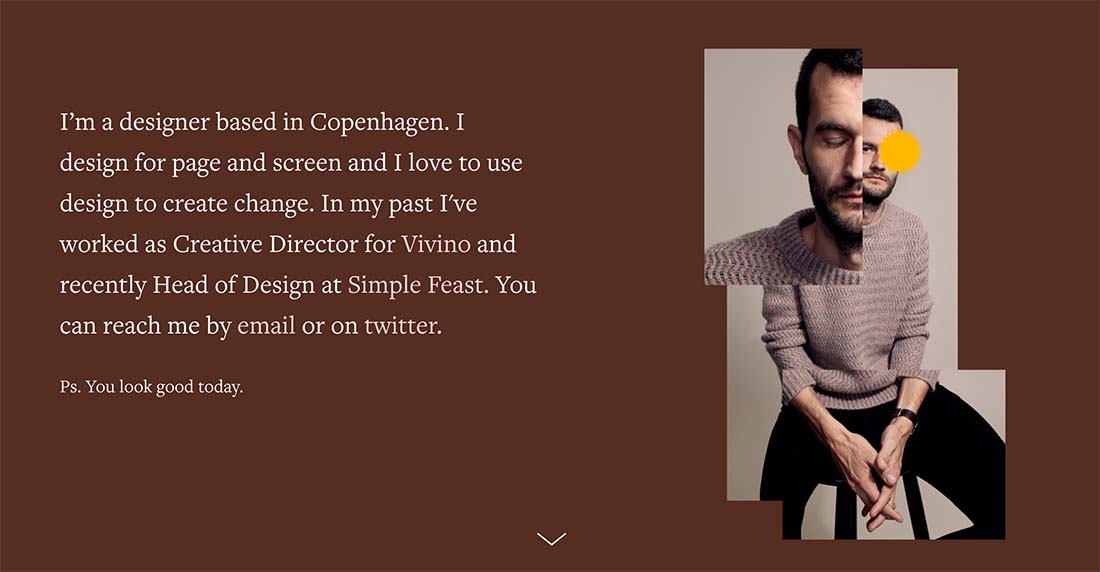
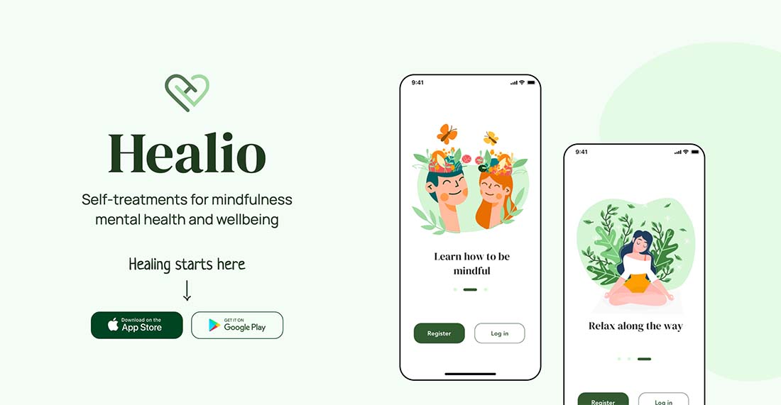
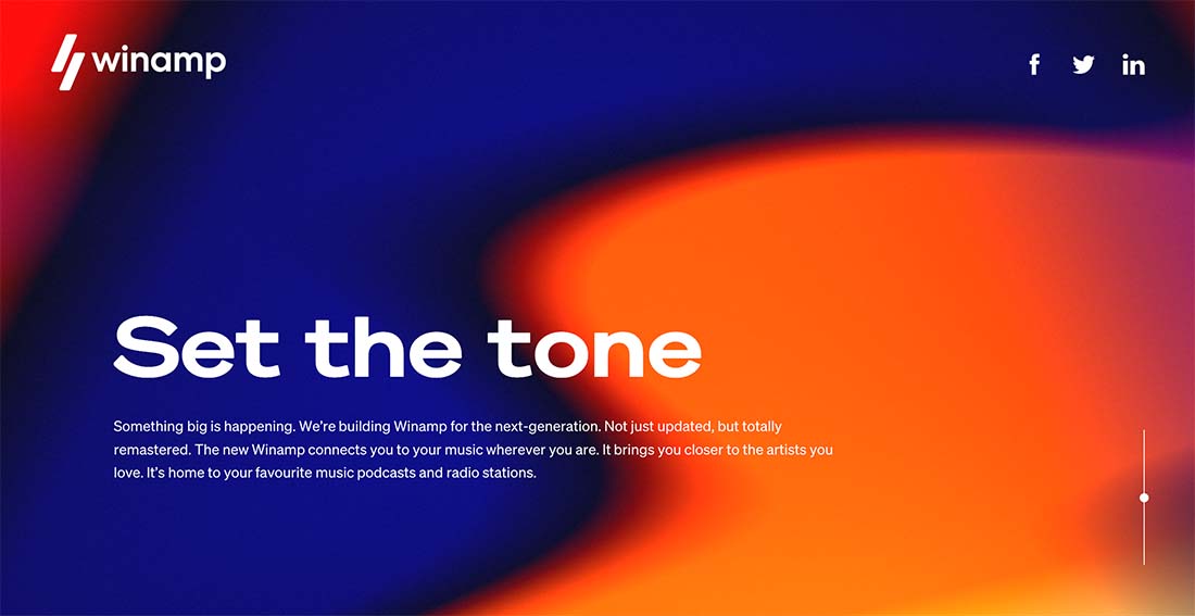
The first example features the full one-page design, but you’ll have to click through for the rest!
Start with Framing (aka Header and Footer)
Even one-page websites need a header and footer. These static elements are part of what helps organize and contain information on the screen.
They help keep the design-focused and ensure you design within the set of rules or constraints you set for the project.
What’s quite different about the header and footer for a one-page site though is what’s in the header or footer. Depending on how long the scroll is, there might not be any true navigation elements – unless you are anchoring within the page or sending users off-site. There probably won’t be a search bar with limited content.
You will still need many of the essential elements that users look for in headers and footers:
- Logo or branding element
- Contact information
- Social media links
- Hours (for physical locations)
- Direct CTA – sign up for an email list, notifications, etc.
Create Organized Sections for Content
It’s easy to just put a bunch of items on a page but then they don’t always flow together.
The best one-page websites work well because sections are designed and organized to contain specific bits of content. (One section equals one thought or piece of content.)
Consider a visual theme, such as color blocking, use of cards, or text sizes to create variance between sections to make them easy to scan and skim.
Design the Whole Picture
While you are thinking about organized sections for the one-page website design, you should also think about how the whole design comes together.
Sketch it out on paper so you can see the full design.
- Do the sections flow to one another with ease?
- Is it obvious to users that they should keep scrolling for additional content?
- Are there cues to encourage interest?
- Is spacing and flow consistent?
- Do you use common design elements – color, shapes, typography, user interface elements – from top to bottom of the page?
Include Calls to Action
Even if your website design is small, what can users do? Tell them the desired course of action with clear calls to action.
Repeat CTAs throughout the design. The longer the scroll, the more times the call to action should be repeated.
Consider multiple types of CTA elements to drive the message home – buttons, inline links, and navigation or footer links.
Experiment with Trendy Effects or Techniques
In many cases, a one-page website design is a temporary solution. You may be planning a larger project and need something now, or have a small portfolio that you need for an upcoming job interview.
Because these sites are temporary, it creates an opportunity to try trendy techniques or effects that you might not otherwise. If the site won’t be around that long, you don’t have to worry that the design will get dated.
Dark Mode Toggle
One of the trendiest effects you can try is a dark mode toggle.
This is a good experiment on a one-page site because you can see the impact of dark mode on every part of the design at once. Sharpen your skills here before you deploy a dark mode toggle to other projects. (And you will be asked to do it at some point.)
Remember, dark mode is more than just inverting dark and light colors, sometimes it requires having both light and dark color palettes to best represent your brand. If you don’t start accounting for it, devices and browsers are giving users the control to toggle on their own without your input, resulting in potentially subpar user experiences.
Use Strong Images and Video
A one-page website is not an analogy for a website without images or video. Too commonly, designers go for a one-page site when they lack content, but that should not be the case.
The best one-page designs include full multimedia experiences with images, illustrations, video, you name it.
As with any other website design project, it is important to take inventory of your assets to ensure that you have everything you need to create a stellar and highly usable project.
Create Patterns or Repeated Elements
Humans are creatures of habit and that’s especially true when it comes to using and interacting with websites. We like patterns and repeated elements that tell us exactly what to do.
Use color, user interface elements, and repeated patterns to help guide website visitors through the design and show them how to engage with it.
One common design technique is alternating color boxes, or “screens,” that each contains a content element. With each scroll, you get a new content block or element to discover. This can encourage scrolling and keep users on the website longer.
Don’t Force Content You Don’t Have
If you don’t have it, don’t force it.
One-page websites should be simple by nature. Don’t try to force content you don’t have or make the site bigger than it needs to be. Particularly for a website such as a coming soon page, there might not be much content. Maybe only one screen, and that’s ok.
Use what you have to make the most of the design. Less is often more.
When to Try a One-Page Design
There are certain types of websites that lend themselves more to one-page designs than others. This is not a one-size-fits-all solution.
One-page websites can be ideal for:
- Landing pages or promo sites
- Coming soon or startup launch sites
- Portfolios
- Games or movie tie-in pages
- Event-based sites (in-person or virtual)
- Personal websites
Conclusion
One-page website design can be a lot of fun. But it’s not necessarily easier just because there aren’t as many pages to think about.
All of the same design theories and techniques are still applicable. Organization and user flow are key to ensuring the design is usable and keeps visitors engaged.
One-page designs are a good place to experiment with new things because the overall site is smaller and the designs aren’t often expected to last a long time. So try some new things and test the effectiveness of trendy elements with these projects.


0 Commentaires