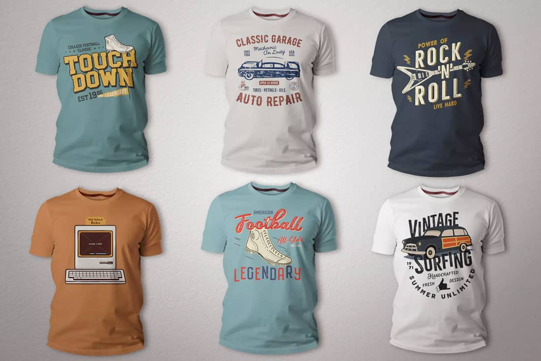
Designing a t-shirt that people will actually wear can be a design challenge of epic proportions. Let’s take a look at some tips for creating a t-shirt that won’t just get left in a drawer!
You have to create something that people connect with and want to wear. You have to deal with issues such as color and sizing (which aren’t really a concern for many other design projects). And even the style of apparel or brand can impact someone’s desire to wear your design.
Today, we’re breaking it all down with tips for creating a shirt design that people will want to wear (and maybe even buy in your e-commerce store!)
1. Keep it Simple
Whether you’re creating a t-shirt design for marketing or to sell in your shop, many of the concepts are the same. And this is the golden rule: keep it simple.
We are constantly talking about reasons to simplify designs, but when it comes to shirts, this is vital. Overly busy shirt designs can get cluttered, have issues in printing, and be awkward to wear in a hurry.
An overly complicated shirt design can also be difficult to read. (No one wants to be stared at while someone is trying to figure out what a shirt says, right?)
Figure out a single message or piece of imagery that you want to create, and focus on that for a shirt design. Strip out any design elements that don’t need to be there. Even try designing it in black and white to help create even more simplicity. (You can always add color later.)
2. Understand Borders or Edges
How will the design print on the shirt itself? Did you create something that looks like a photo that has a design with a border? Or is it more of a free-flowing design without edges?
Most shirt designs fall into the latter category. Border styles are a bit outdated.
There’s a technical aspect to this as well. When you submit artwork for printing, be aware of “invisible” borders or edges that can sabotage the job. (Turning in the artwork on a background can cause some confusion here, so have a clear conversation with the shirt printer about expectations for the final product.)
3. Consider Shirt Color and Imprint Color
Before you get too far into a t-shirt design, make sure you know what color the actual shirt will be.
The next question to ask is how many ink colors are available for the imprint?
Not only can things such as shirt color and ink options impact the budget but they will make a big difference in how you might approach the design.
If you are planning to sell in an online marketplace, you should limit the color options of shirt colors to ones that work with the design. If you aren’t careful, elements of the same or similar color could look bad in the final result or the meaning of the design could be altered.
Even with a one-color imprint (that’s a shirt where all the ink is the same color in the design), shirt color can make a big difference.
4. Shirt Fabric Matters
How many times have you gotten a shirt that you loved, washed it and then never wore it again because of shrinkage or pilling?
If you want people to actually sport your t-shirt design, it needs to be on quality fabric.
And you should think about your target audience as well. What kind of shirts would they wear? Are they athletes? Try a performance wicking fabric. Are they in a cooler location? Try a fleece or sweatshirt. Are they men or women or kids? Consider gender specific cuts.
The fabric has an impact when it comes to inking as well. A thinner fabric can get heavy, lay funny against the skin and even feel bad if there’s too much ink in the imprint, making this a decision you should make before the design is finished.
5. Think About the Cool Factor
Why are you creating a t-shirt design in the first place?
The answer is likely either:
- As a marketing promotion or giveaway
- To sell (and make money)
For either to be successful, the shirt needs to have a cool, trendy, modern design that people will want to show off. The prospect of a free shirt is enough to make someone take almost any design, but to be effective they have to wear it out in public. If you expect a customer to give you money for a shirt design, they have to like it.
So, any old boring design won’t do. Take the time to create something special. Don’t copy something from social media and try to think ahead of what’s trending today (that’s probably already been done).
6. Be Aware of Graphic Placements
Where on the shirt will the design go? Are there other logos or brand marks to consider?
There’s a fine line between just right and hilariously off the mark.
The most common placements for graphic design on shirts include:
- Front center
- Back center
- Front “pocket” (small imprint)
- Sleeve
- Top back center (small imprint)
The other consideration is if your design is going on name brand apparel with other marks. Nike, for example, allows you to order custom design shirts and there’s often a swoosh on the front right pocket area. Make sure your design complements this.
Common placement is your design goes opposite of any branding on the shirt itself, not stacked with it. So, if there’s a swoosh on the pocket, your logo might go on the opposite sleeve or back of the shirt, but not on the same sleeve or below the swoosh.
Get out a ruler and measure it out if you need to. Where the image is placed on the shirt contributes to the overall balance and aesthetic quality. (It can also create a perception of how high-value the shirt is; poor placements can be perceived as cheap or low-quality.)
7. Scale and Size Matters
Scale and size of the design on the shirt itself can be just as important as the placement of an imprint.
The trouble is you probably won’t know there’s a problem until you see it.
Here’s a time-tested trick for getting it right. Create the design. Print it out. Hold it up to a shirt for a representation of scale. (You might even want to do it while wearing the shirt.) Does the scale of the design work? Does it feel balanced?
After you get this right think about the size of your shirt. The scale of the design can change based on clothing sizing and should probably be adjusted accordingly for women’s versus men’s versus children’s sizing.
8. Use Vector Artwork
This one is almost a no-brainer.
Use vector artwork so the design is scalable.
If you don’t have vector artwork, it at least needs to be high resolution. Image files should be of the size they will be printed at 200 dpi or higher.
9. Talk to the Printer About Inking
We’ve already discussed ink a lot here. When it comes to shirt designs that is a big deal.
Have a conversation with the company printing your shirts about how heavy or thin the ink lay should be. (The trend is toward less ink right now. That can result in lighter shirts but less color gain and could impact the design.)
10. It’s All About the Fonts
Bad typography equals poor shirt design.
T-shirt designs with phrases are a fad, but what sets apart the good ones (aside from proper spelling and grammar) is great typography. Use high-quality fonts, placements and lettering styles to make your catchy saying wearable.
Conclusion
Don’t skimp on quality or time when creating a shirt design. Pay attention to every detail so that you get it right before the print order runs. (Mistakes in shirt design can be costly if you have to carry that inventory or toss it because of an error.)
A smaller run of higher quality shirts with a super cool design can have a lot more traction than a huge run of uninteresting design on cheap material. Shirt design is more than a marketing tool or product sale, it’s something that people associate with your brand. The quality (or lack thereof) associated with a shirt can impact what people think for a long time to come.


0 Commentaires