Whether you’re a designer wanting to show off work or have a request to create one for a client, a lookbook can be an effective way to showcase a variety of elements in a single design.
A lookbook is a portfolio of sorts and has wide application in a number of fields, including website design, graphic design, and development.
Here’s a guide to what a lookbook is, what to include in one when you start designing it, and some examples that are sure to help you find a little lookbook inspiration.
What is a Lookbook?
A lookbook is a design collection that started in fashion but has applications for designers and photographers as well. A lookbook is essentially a portfolio, that’s formatted and updated in a diary-style with frequent changes and updates.
For designers, a lookbook can be a great way to show off projects as they evolve from start to finish or blog a day in the life of a designer.
For photographers, a lookbook can showcase a range of styles or help you stretch your creative muscles.
Generally, a lookbook is a collection of design change over time. Having a solid platform for this collection, whether printed or digitally, can help showcase your work to others and even potential clients.
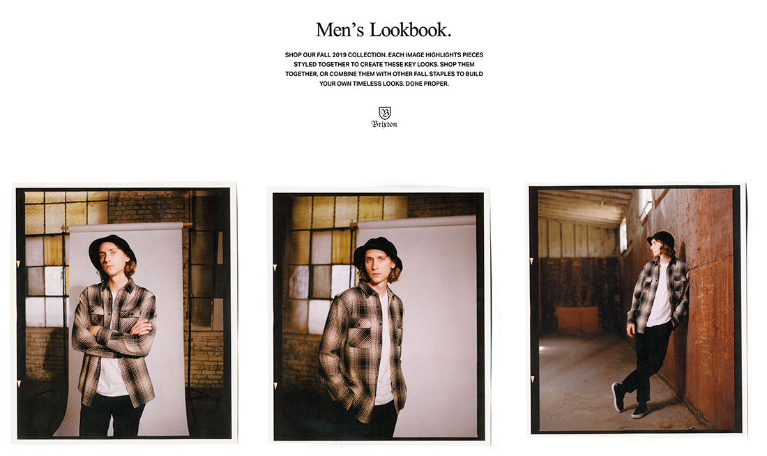
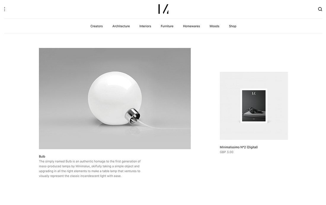
Lookbooks can be printed or PDF books, presentation decks or slides, or websites. The format really depends on your needs and audience. Some may opt for a lookbook in multiple formats.
5 Things a Lookbooks Should Include
When it comes to building a lookbook, include many of the same key elements you would in a traditional portfolio. Every lookbook should include the following elements:
- High quality images (or video)
- Descriptions of projects and what makes them special; for projects that show an evolution over time, include dates or a brief history
- Bio of the person who the lookbook showcases
- Clear examples and explanations of what the lookbook is for
- Contact information and if you are available for work
Key Design Elements
The design and style of a lookbook is a lot like a traditional portfolio. Much of the design of the project is related to elements that the lookbook features and the personal style of the owner.
But there are a few common design themes to consider when it comes to lookbooks. Primarily, you want to create an aesthetic that gives room to the content. Design elements are not the primary visual here, individual content elements are. Therefore, a lookbook design probably has a simple feel so that projects are better featured.
A simple feel and style can also help create a consistent lookbook design even when different projects have varying and unique designs. It’s a lot easier to mix a retro-styled project against a clean and modern style if the overall framework of the design doesn’t get in the way.
Think of it this way: You don’t want the lookbook design to compete with the projects featured therein.
Key design elements for lookbooks include:
- White space
- Simple typography, often sans serif
- Design accents and elements in a limited color palette
- Consistent design hierarchy for images and text elements
- One project per page/screen/slide
10 Stunning Examples
Ready to get started with a lookbook project? Here are 10 examples of lookbook designs – in print, presentation, and online – that you can use. (Every one is a design template, courtesy of Envato Elements.) https://ift.tt/3ffV5bA
1. Lookbook
Lookbook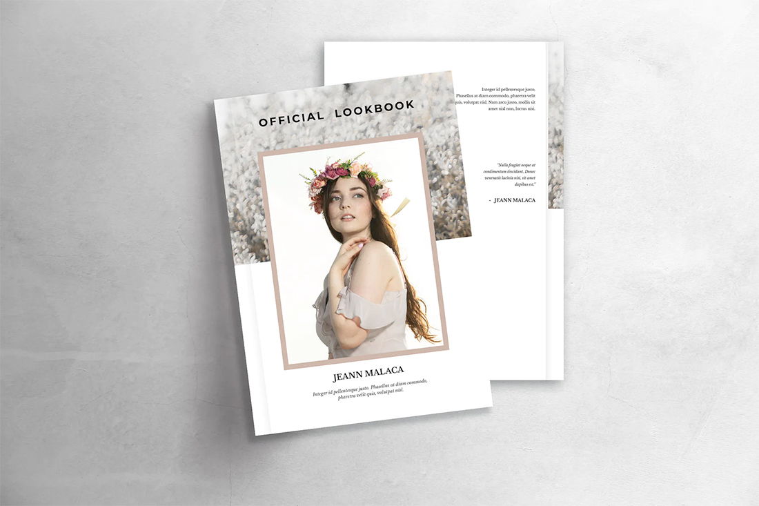
2. Mono Lookbook Powerpoint Template
Mono Lookbook Powerpoint Template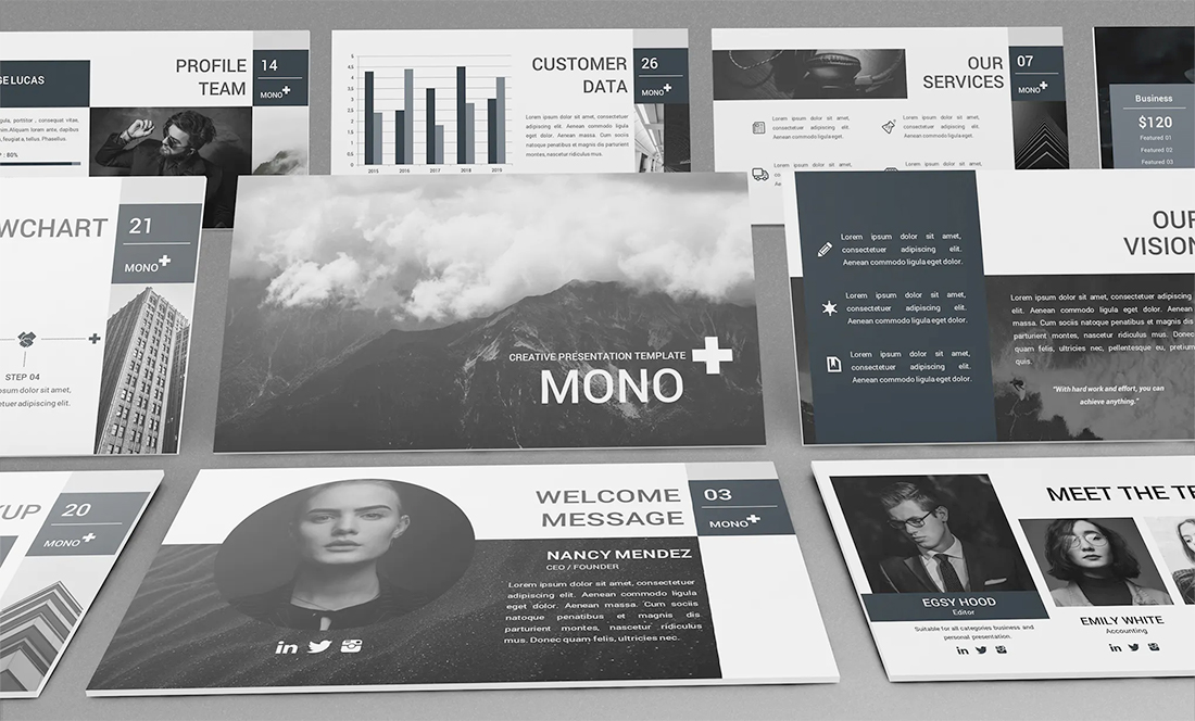
3. Olive Fashion Ecommerce Email Newsletter
Olive Fashion Ecommerce Email Newsletter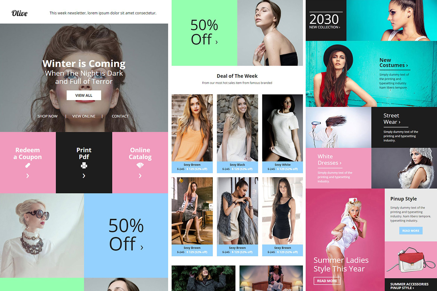
4. Marzia Lookbook
Marzia Lookbook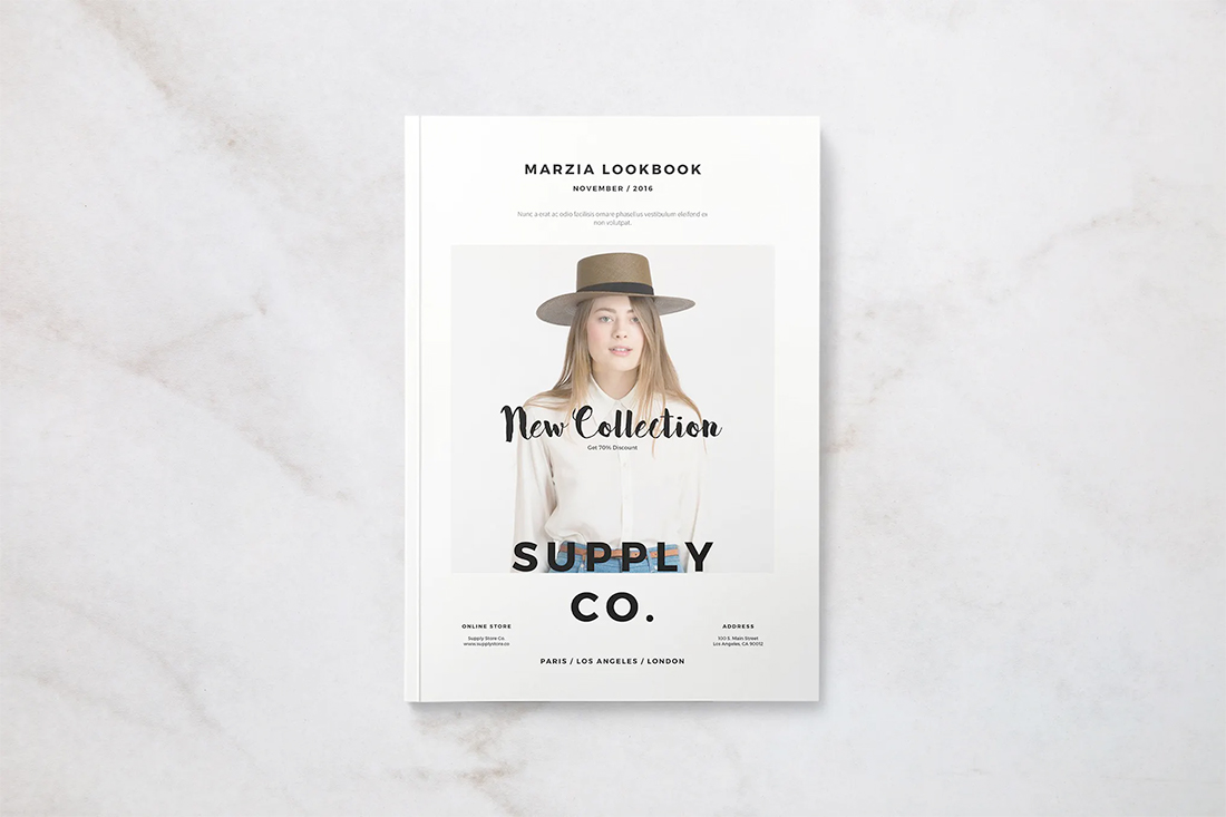
5. Antive
Antive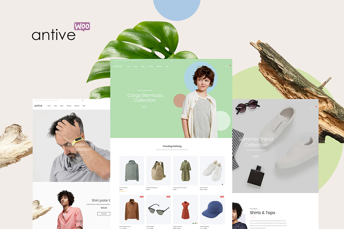
6. Graffiti Pop Art Lookbook Magazine
Graffiti Pop Art Lookbook Magazine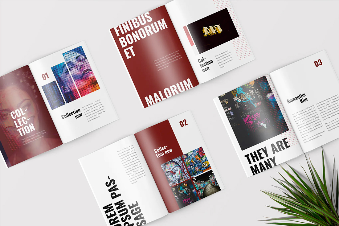
7. Rosely
Rosely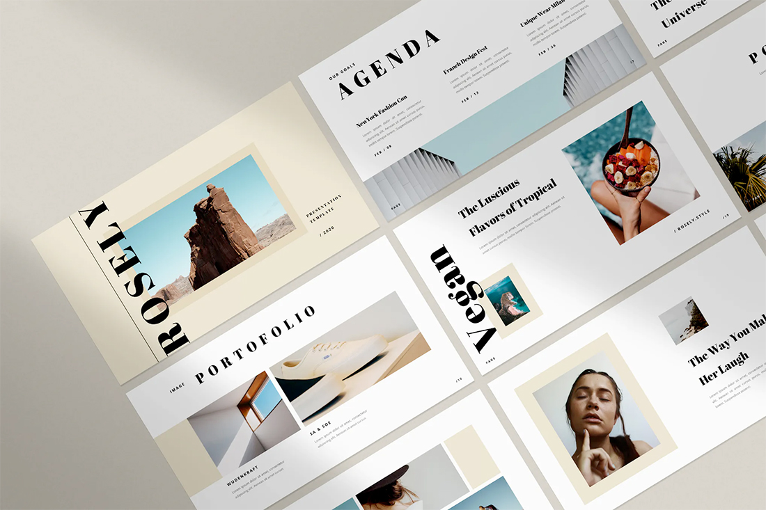
8. Amely
Amely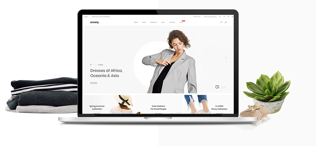
9. Persona
Persona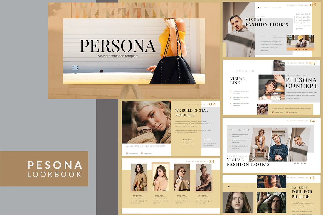
10. Lookbook
Lookbook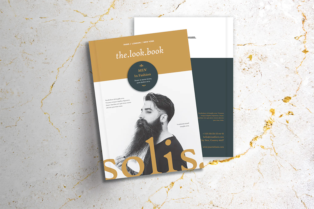
0 Commentaires