One of the biggest trends in web design these days is custom cursors. At first glance, a custom website cursor may look like just another stylistic element. But there’s much more to this design concept.
When viewing a website from a desktop device, the cursor is the main component that bridges the gap between the user and the website. If you’re creative enough, you can actually use this cursor to your advantage to boost website interaction and engagement rates like never before.
In this guide, we take a closer look at what custom cursors are all about, why you should use them, and offer you a few tutorials for designing your own custom cursors.
Let’s get started.
What is a Custom Cursor?
Simply put, a custom cursor is changing the default icon design of the mouse cursor (or pointer). On your computer, you can easily change the cursor using the system settings. The same can be done on a website design, except custom website cursors are unique to each individual website.
With the help of HTML, CSS, and a little bit of JavaScript, you can design unique cursor designs for websites. You can make the cursor change, add hover animations, click effects, and much more to create a memorable experience.
Why Use Them?
Yes, it’s mainly for style and looks. However, you can use a custom cursor to make your website design more immersive.
Imagine designing an incredible website experience for an event page with animations, parallax effects, and moving objects. Yet the cursor has the same old system default design. It can be a real mood-breaker.
Instead, you can use a custom cursor to make it more fun for the users to interact with the website. Give users directions on where to go and what to do. And more importantly, to make your website stand out from the crowd.
Custom Cursor Ideas & Examples
The following examples will give you an idea of how powerful a custom cursor can be and how to leverage them.
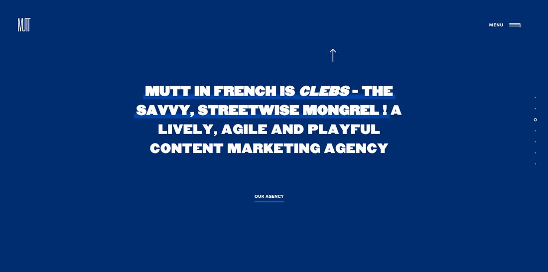
Mutt Agency
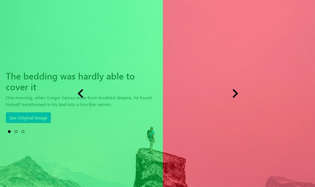
This agency website uses a section-based website design. Its cursor is designed perfectly to help users easily navigate the site. When a user moves the cursor to the bottom area of the website, it changes to a downward arrow and to an upward arrow when moving to the top area.
This is a brilliant approach for encouraging users to explore more of the website. Once the cursor magically turns into an arrow, you just feel compelled to click it to see what happens.
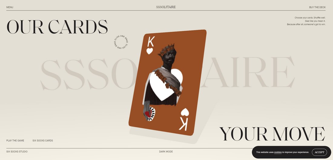
SSSolitaire
You can also use a custom cursor to give literal directions to the user. This website uses a custom animated cursor to tell the user exactly what to do. And what happens when you follow the direction is another incredible surprise.
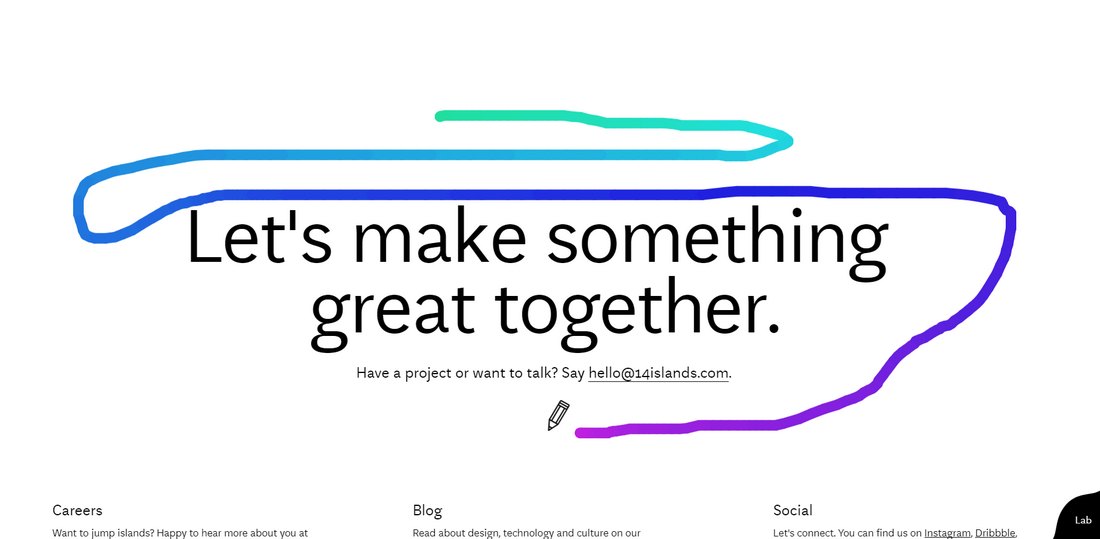
14islands
If you want to get more creative and experimental, you can try different styles of custom cursors throughout a single website design. This agency website shows how it’s done.
It uses several different custom cursors for different sections of the site. But the section at the end has the most creative custom cursor. It transforms the mouse pointer into a marker and lets you draw all over the website.
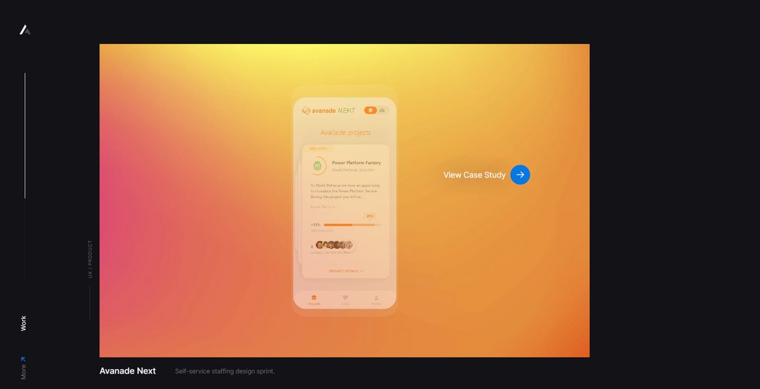
Alex van der Lit
Custom cursors are perfect for giving the user actionable directions as well. In this example, Alex uses a custom cursor that changes its icon based on different areas of their UX design portfolio.
When hovering over a link, the cursor hover element locks onto the link. And when hovering the cursor over a case study, it tells the user to click to view each item.
MDFF Athens
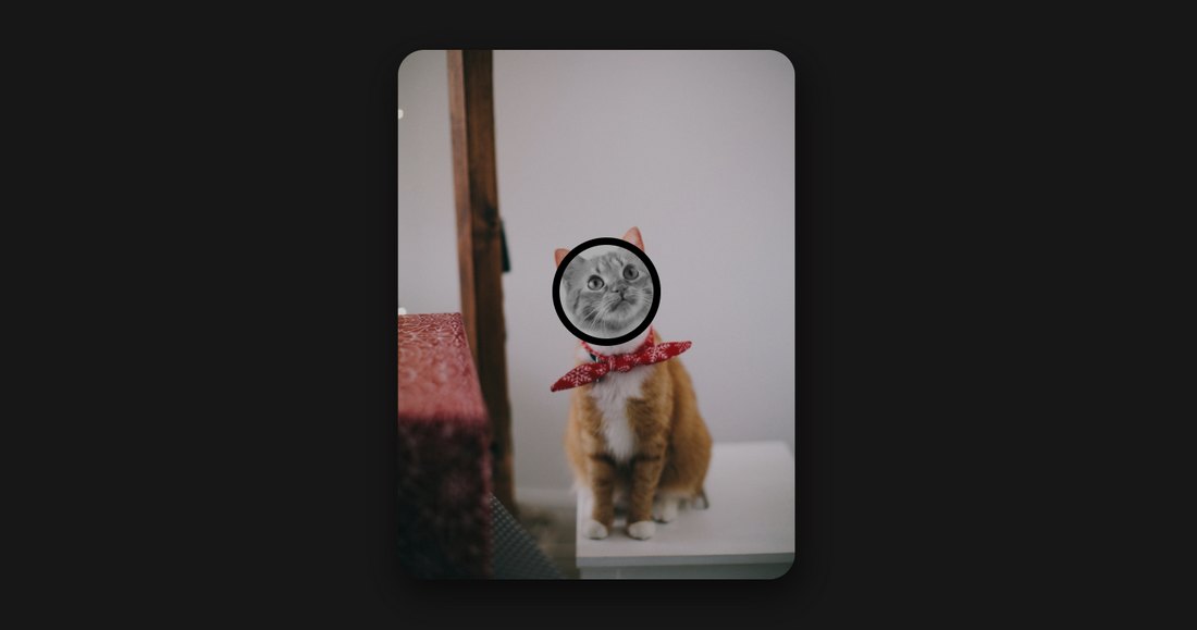
Another creative concept is to use a custom cursor to create a reveal effect. This website is an extreme example of this concept as it makes the website difficult to read.
However, you can use this same strategy to create a zooming effect. For example, you can let users hover over a product image to zoom in on specific parts of the product.
PPP
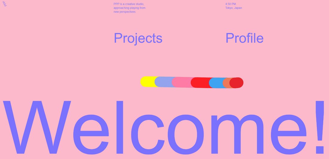
This website has one of the most unique custom cursors we’ve seen. It features a colorfully animated cursor that leaves a trail whenever you move the cursor around. It’s almost like a colorful snake.
It should give you an idea of how far you can go with custom cursor designs.
Tips for Designing Custom Website Cursors
Before you get started on designing custom cursors, remember to follow these tips and guidelines to ensure you don’t overdo it.
Focus on the Interaction
The main goal of using a custom cursor should be to generate more interactions. Like encouraging users to click on a link or image to view more.
Rather than making the cursor entirely stylistic, focus on designing cursors that improve the user experience.
Use Multiple Cursor Designs
Using large custom cursor designs with weird shapes is all fun and games until you have to click on a small text link. A good practice is to use multiple custom cursors, especially adding a simpler pointer for the menu sections.
This will help users avoid the frustration of trying to click the right link with a giant blob cursor.
Know When to Use Them
Custom cursors are not appropriate for all types of websites. There’s a reason why the big brand, corporate, and eCommerce websites, like Uber, Airbnb, Shopify, never use custom cursor designs.
Mainly because these big brands have multiple websites for different regions and they want to create a consistent design across all websites.
Also, using custom cursors in non-profit websites can be very unthoughtful as well. Be mindful when and where you use them.
Disable on Mobile
Custom cursors don’t work well on smaller screens. When you swipe to browse a website on mobile, the custom cursor will just stick and float around, interfering with the user experience. So remember to disable the custom cursor in mobile view.
How to Make a Custom Cursor
There are several approaches you can take when designing custom website cursors. You can use CSS to craft simpler cursor designs. Or mix some JavaScript to design more advanced cursors with animations and effects.
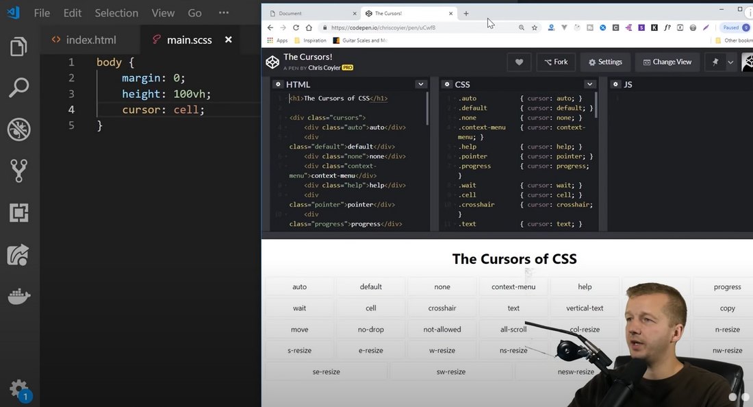
The cursor property in CSS is the simplest approach you can take for designing custom website cursors as it offers plenty of property values for you to work with.
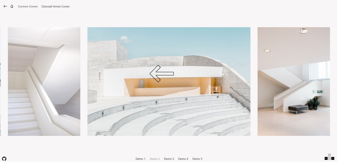
A much easier approach is to grab some code snippets to experiment and practice. CodePen has a whole lot of custom cursor code snippets you can play around with. Or try using this custom cursor effects kit from Codrops.
Custom Website Cursor Tutorials
If you want to learn how to craft your own custom website cursors, here are a few great tutorials you can use.
Creating Custom Cursors (YouTube)
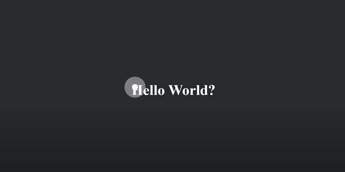
This is one of the most comprehensive guides on creating custom cursors. It shows you how to craft custom cursors with CSS-only as well as with JavaScript. The best thing about this tutorial is that it describes every step while explaining what each code element does. A great place to start your learning process.
How to Create a Custom Cursor (Step by Step Guide)
A step-by-step guide that shows you how to make a custom cursor that changes into a completely different design. It’s perfect for learning to design custom cursors for portfolio sections.
How To Make A Custom Cursor For Website (YouTube)
This tutorial will show you how to create a custom cursor with a click effect. The lesson is explained in a simple and easy-to-understand way, making the tutorial even suitable for beginners.
How to Manipulate the Cursor Appearance With CSS (Guide)
This is a quick and simple guide that shows you how to change the default cursor design with CSS. It shows how easy it is to manipulate the cursor design with just a few lines of code. The tutorial walks you through the process step by step.
Custom Cursors with PNG or GIF Images (YouTube)
There’s another much easier way to make custom cursors by simply replacing the default cursor with a PNG or GIF image. This method is not recommended for designing custom cursors for websites. But, you can use this trick to design fun experiences for smaller projects, including your portfolio.
In Conclusion
If you’re already familiar with CSS and JavaScript, you’ll be able to create wonderful and creative custom cursors for various projects you work on. As we mentioned earlier, knowing when and where to use custom cursors is the key to delivering a great user experience.
While you’re here, you should also read our best UX design courses and tutorials article. As a designer, understanding user experience design is very important. This guide will help you get started.

0 Commentaires