It didn’t take long for the “dark mode” to become a requirement for every user interface design. What started out as a design trend turned into a must-have feature for offering a comfortable user experience.
Due to its popularity, every type of design, from the UIs of operating systems on computers to websites, mobile apps, and even print designs now features a dark mode option.
According to a survey by Android Authority, 81.2% of 2,514 users claimed they prefer dark mode on their phones over light mode. It’s quite effective on desktop as well. After switching to a dark mode theme, a company was able to reduce the bounce rate by 60% and boost pageviews by 170% on their website.
But not everyone gets it right. Dark mode design is more than about adding a black background to a design. It’s about improving accessibility while balancing aesthetics at the same time. This process comes with some challenges as well.
In this post, we explore the importance of implementing dark mode in designs and discuss the benefits and the challenges that come with it. Let’s dive in.
The Role of Dark Mode in Accessible UIs
Dark mode plays a big role in accessibility as it helps reduce eye strain and improve readability. It especially helps people with low vision and light sensitivity to explore digital interfaces much more comfortably than light mode designs.
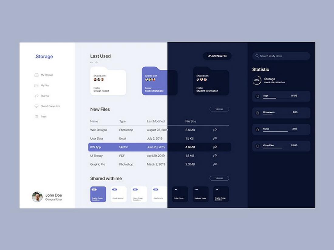
Today, the dark mode is the preferred way to explore digital user interfaces, by everyone. However, it goes beyond just inverting colors. There are many elements you need to consider in order to create a proper dark mode design.
Poorly designed dark mode interfaces can cause more problems leading to readability issues and overall visual incompatibilities that will affect not only the user experience but also your brand image.
To avoid such errors, make sure to follow the proper dark mode design guidelines.
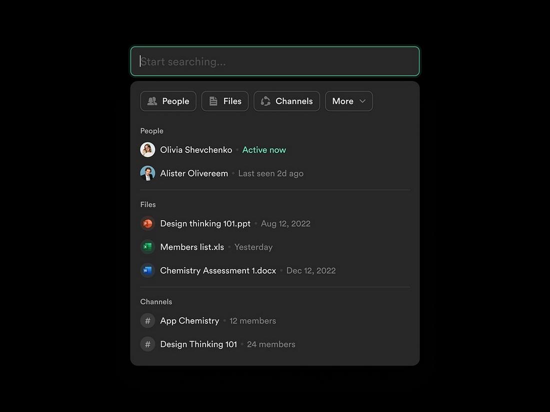
Finding the Contrast Sweet Spot
Finding the right balance in contrast is crucial to creating the most effective dark mode design. If you make the colors too dim, it will affect readability. But if you use brighter whites, it will end up straining the eyes.
The same rule applies to visual elements such as text and images. You can avoid this by following the WCAG color contrast guidelines. Using a 4.5:1 contrast ratio is the ideal approach for text elements. For large images and titles, use a 3:1 ratio.
When it comes to colors in dark mode designs, using off-white colors for text on a dark background is the best approach for improving readability.
Think Beyond Black and White
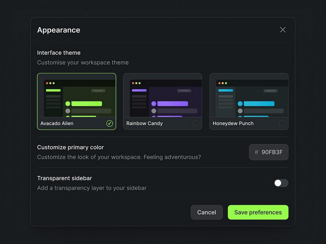
Dark mode doesn’t always have to be pure black and white. You can use many other dark shades of colors, like dark gray and navy blue, to create smoother and softer dark mode designs.
Also, consider using accent colors appropriately to highlight important sections and call to action. Combining a colorblind-friendly color palette with other visual elements such as icons and labels is a great way to improve visual aesthetics in dark mode designs.
Enhance for Readability
Improving the readability of your dark mode design goes beyond choosing the right colors. You should also pay close attention to choosing the right fonts, font weights, and sizes that offer the best user experience.
Using lighter font weights tends to look thinner on dark mode designs. So, consider using bold font weights. And increase line height to make text look less cluttered, especially in longer paragraphs.
Reducing Visual Fatigue
We all know how difficult it is to navigate a website or app layout when it uses colors with overly contrast. Bright red warning messages with hard-to-read text and flashing UI elements on dark backgrounds are telltale signs of bad design.
It’s important to remember that there are people who are sensitive to flashing elements, motion, animations, and even bright colors. To make your designs more inclusive, add options to improve their experience.
Most apps and websites now allow users to switch between the light and dark modes. Some UIs allow users to customize their experience by adjusting font size, colors, and removing animated elements as well.
Tips for Creating a Great Dark Mode Experience
Following a few simple guidelines and significantly improve your dark mode designs. Start with these basics.
1. Add Visual Focus Indicators
Adding focus indicators, such as outlines, underlines, and highlights, is especially important in dark mode designs. This allows people with color blindness to easily identify call to actions and the important elements much more easily.
2. Optimize Media for Dark Mode
Some of the images, videos, and media items you use on a light mode design may not look the same in dark mode. Take extra steps to ensure that the media doesn’t blend into the background and stand out on a dark background.
3. Include a Light Mode
Even though dark mode is now the preferred option by many users, don’t neglect the light mode users. Always give the users the option to choose between light and dark mode. It’s an important part of improving a design for accessibility.
4. Optimize for Screen Readers
For some users, buttons, text, and other elements will be much more difficult to see on a darker background. Optimize your designs for screen readers and keyboards by including ARIA roles to help those users navigate the designs without obstructions.
5. Test in Real-life Conditions
Always test your dark mode designs in real-life conditions and environments. For example, see what your dark mode design looks like in low-light and bright environments. Test them with different accessibility software. And check compatibility with accessibility guidelines as well.
Conclusion
Finding the right balance is key to creating a better and more accessible dark mode design. Keep in mind that it’s not about making your design look good with a dark background, it’s about prioritizing user comfort and usability.


0 Commentaires