Hierarchy is an important part of many aspects of our lives and the same can be said about hierarchy in design.
Visual hierarchy plays an important role in creating designs that are not just beautiful but also functional. Without the right balance of size, color, and spacing, a design will become cluttered, confusing, and chaotic.
Today we take a deep dive into the topic of hierarchy in design to learn the importance and usefulness of visual hierarchy. We also share a few tips on how to use hierarchy to make designs that communicate effectively with the users.
Let’s get started.
What is Visual Hierarchy?

From the early days of our childhood, we are taught about hierarchy. At home, there’s a hierarchy of family members and at school, we respect the hierarchy of students and teachers. And when we go to work we follow the hierarchy of the business or organization. That same system applies to design as well and we call it visual hierarchy.
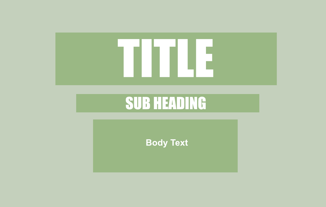
Visual hierarchy is all about the arrangement of elements in a design according to their importance. On a newspaper, for example, at the very top of the page, you will see the headline in large, bold text. Followed by a smaller subheading and then the body text. This arrangement is used to attract the attention of the reader and guide them through the content.
Websites, mobile apps, posters, banners, wedding invitations, and basically every kind of design follow the same principles of visual hierarchy as it is at the very center of creating effective designs.
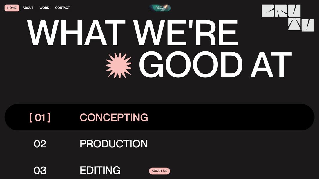
We always expect to see a navigation menu at the top of every website and then a header section with a big title. On posters, we always look at the top to see what it’s about and then look at the bottom of the design to learn about other details such as venue, contact numbers, and QR codes. That’s how powerful of an effect visual hierarch has on us. It’s almost like we are trained this way to follow a tradition.
Learning to master this system is key to creating effective designs in every field.
The Main Elements of Hierarchy
To master hierarchy in design, you first need to understand the main components of visual hierarchy.
Size and Scale

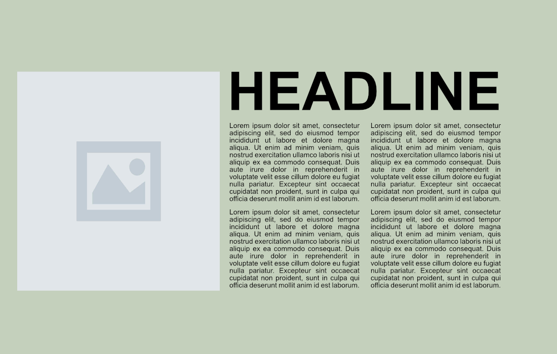
Size and scale play a big role in hierarchy. Whether it’s text, images, shapes, or icons, the scale of the elements will often determine their importance. Larger objects will always draw the most attention.
Scale and size also need to be used sparingly. If you add too many large objects to a design, there will be chaos and break the hierarchy. It should be a balance between large and small objects.
Color and Contrast

Color is another important player in the visual hierarchy. Using different colors not only makes it much easier to highlight and organize objects, it also helps to demand attention.
Using specific colors for call to actions and “buy” buttons has proven to be most effective in web design, especially by utilizing color psychology. Using different contrasting colors and shades is also a popular way of creating hierarchy in visual designs.
Spacing and Placement

Negative space, or empty space, is another part of visual hierarchy and content prioritization. Proper arrangement of content with the right amount of empty space helps highlight the important elements of a design. And, more importantly, it helps declutter and boosts user experience.
While these are the main elements there are other parts to visual hierarchy, such as alignment, empty space, repetition, and style. It’s a combination of all these components that create great visual designs.
How to Use Visual Hierarchy in Your Designs
Knowing how and when to use visual hierarchy is also important. These are a few ways you can use it in your designs to create a proper user journey.
Typography
Typography is one of the main components of visual hierarchy. With effective use of font pairs, font weights, and styles, you can effortlessly guide users through a journey to achieve your goals. While it’s perfectly fine to experiment with different arrangements, you should always use a proper structure for your text to create a well-balanced hierarchy.
Color Psychology
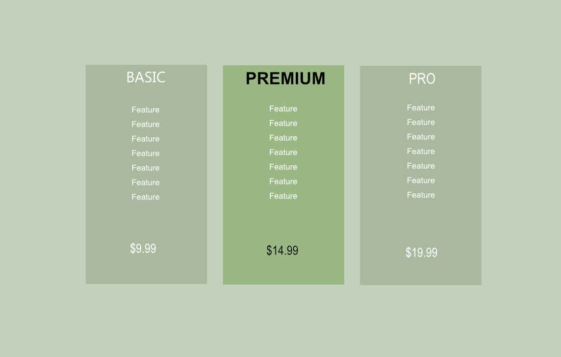
When using colors to create a visual hierarchy, you can also take advantage of color psychology to make your designs not only visually striking but also persuade users to take action. You’ll often see this in action on the pricing pages of websites.
Directional Cues
Using arrows and lines is a great way to give users directional cues to guide them through your design and point them toward the most important parts. Sometimes, using a simple numbered list is enough to give directional cues in your designs.
Layering
If an image on your design appears to take more attention than the title, go ahead and overlap the title on top of the image. Layering objects, textures, and using shadows and outlines are great ways to enhance hierarchy.
5 Tips for Creating Strong Visual Hierarchy
Follow these basic tips to use visual hierarchy properly.
1. Start with a Single Focal Point
Visual hierarchy is mainly about structuring and creating order. To achieve this, you should first decide where you want to guide your users. Find that focal point and make it stand out by structuring your content and guiding users to follow that path.
2. Use Contrast Thoughtfully
Color is not your friend. You need to be extra careful when you use it. Use colors that enhance visual hierarchy while also staying true to your brand identity. Use contrast and styles to highlight elements but don’t overdo it.
3. Be Consistent
There’s a reason why almost every website, mobile app, poster, and greeting card have similar structures. When exploring these designs, we expect them to be familiar. We expect a navigation menu at the top, contact details to be at the bottom, headlines to be big, or buttons to be clickable. Consistency creates good designs!
4. Don’t Be Afraid of White Space
You don’t have to fill your designs with content to create visual hierarchy. Use negative space to your advantage to create minimalist designs and create structures that are easier on the eyes. Plus, it will make it much easier to highlight the most important parts of your design.
5. Keep It Simple
Don’t try to create multiple focal points and highlight several important elements. This will lead to confusion and clutter. Instead, focus on highlighting one main focal point and maybe a few secondary ones.
Conclusion
Visual hierarchy is a fundamental system that every designer should learn to master. Knowing how to properly size text, arrange images, and use the right colors is the key to creating user-friendly designs.
With good practice and experimentation, you will learn to utilize visual hierarchy in many ways to make designs that serve a purpose much more effectively.


0 Commentaires