If you’re working on a tri-fold brochure design, we have some cool design ideas to help you find inspiration for your project.
Tri-fold brochures are the ideal choice for spreading information as well as promotions. Whether you’re making a brochure for an event, promoting a product, or even selling a property, tri-folds are the most effective medium for educating your target audience.
But, how do you choose the right design for your brochure? That’s where we come in. There are many different trends and design styles you can follow when crafting a beautiful tri-fold brochure. In this post, we look at the best of those ideas.
Let’s start with some cool and trendy tri-fold brochure design ideas. And then we’ll share a few tips on designing more effective brochures.
Pro Tip: The examples we use in this post are actually tri-fold brochure templates. You can download them to design your own brochures.
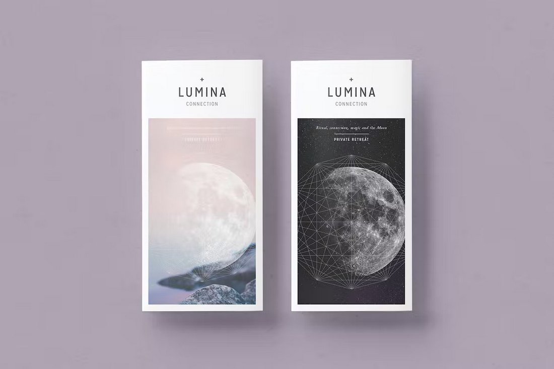
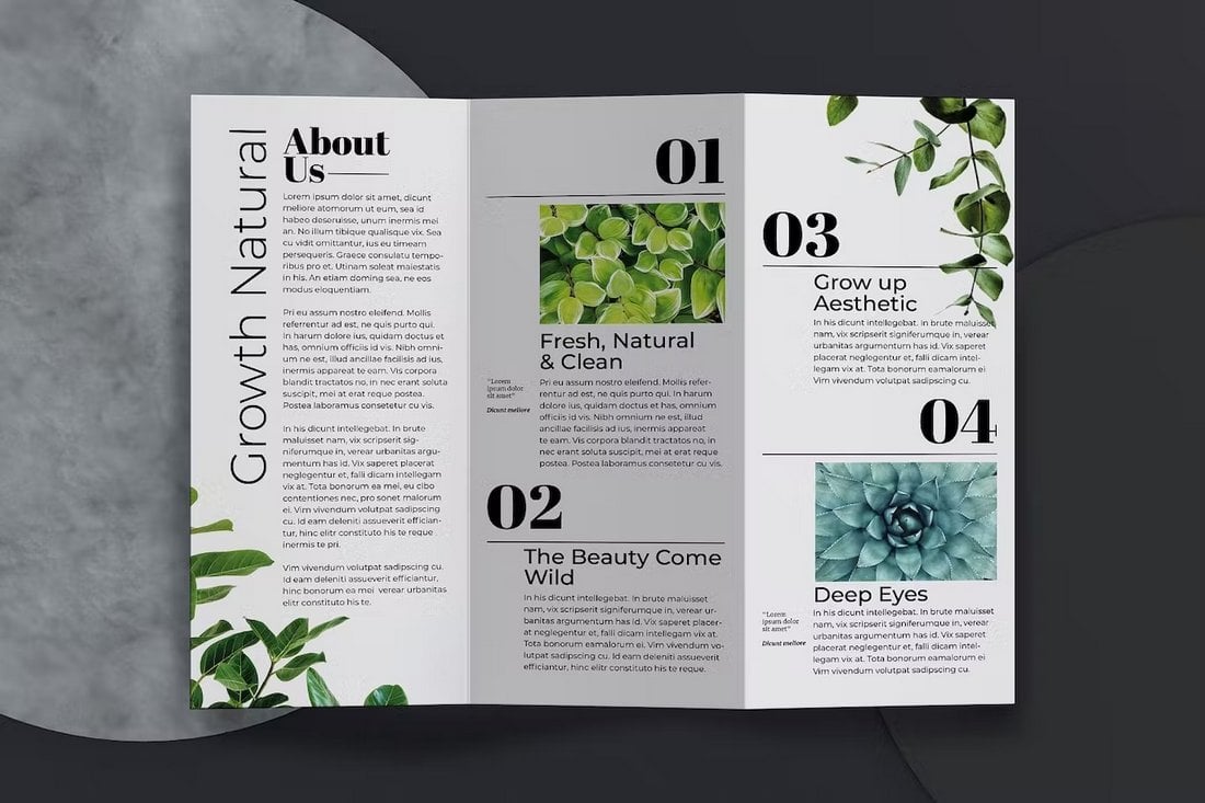
Minimalist Tri-Fold Brochure Design
“Simplicity is the ultimate sophistication.” – Leonardo da Vinci.
When there’s a black dot in the middle of a blank white canvas, your eye will immediately go to the black dot. When using a minimalist design, your brochure will have the same effect.
You can use empty space as a way to put a spotlight on your content. It’s a very effective way to highlight your core message and call to action. Plus, a minimal design offers a very calm and soothing experience for the users as well.
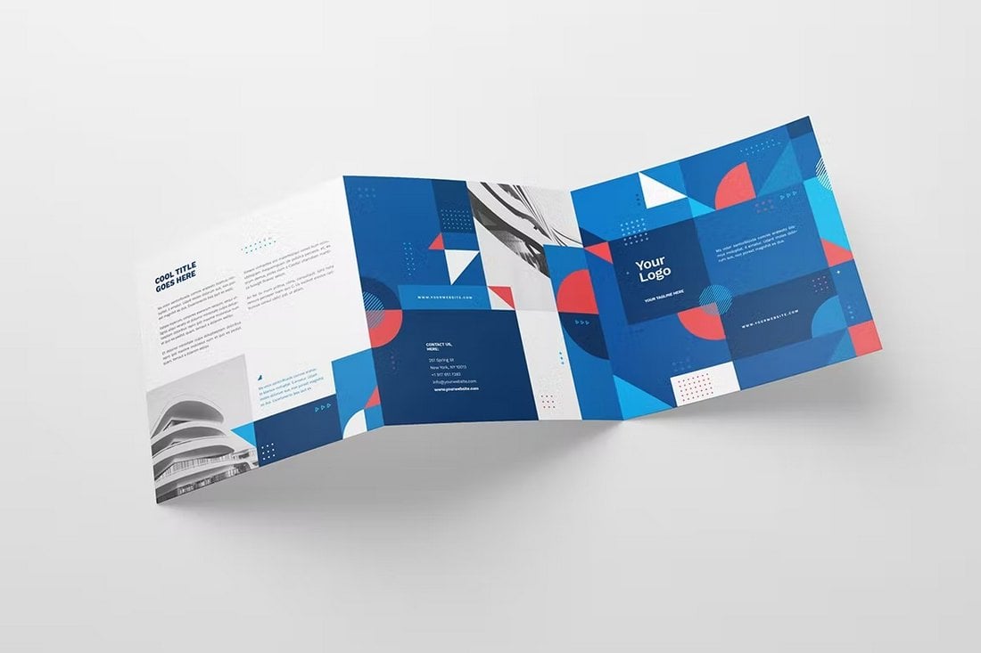
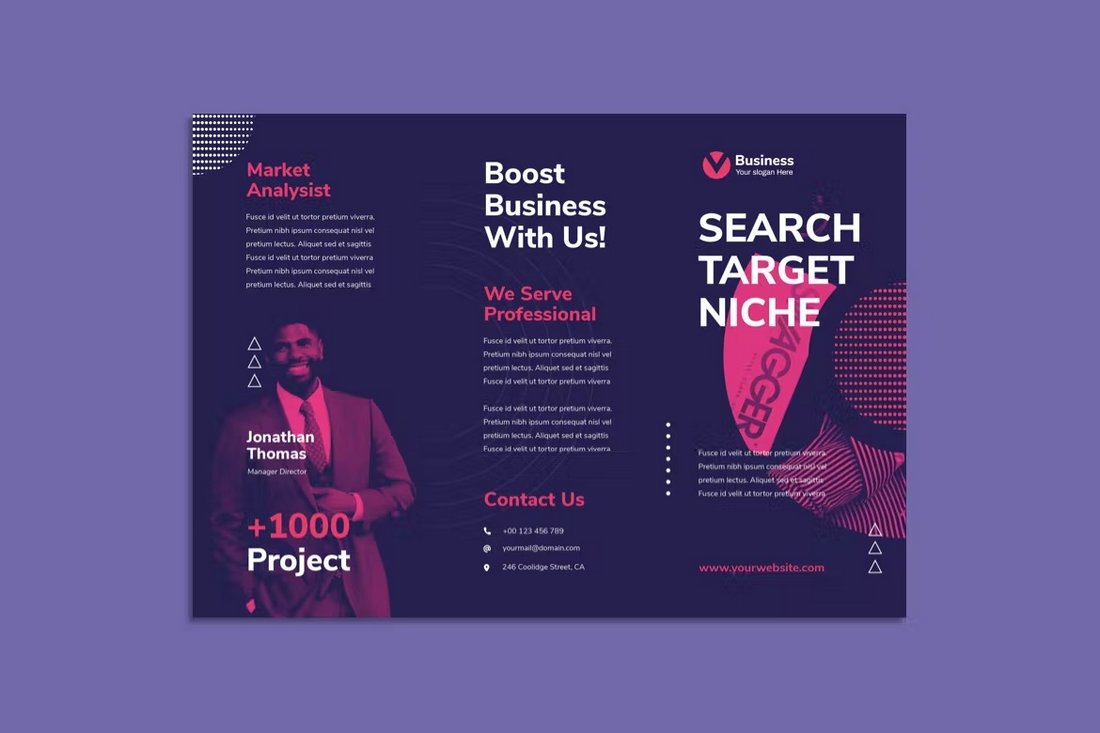
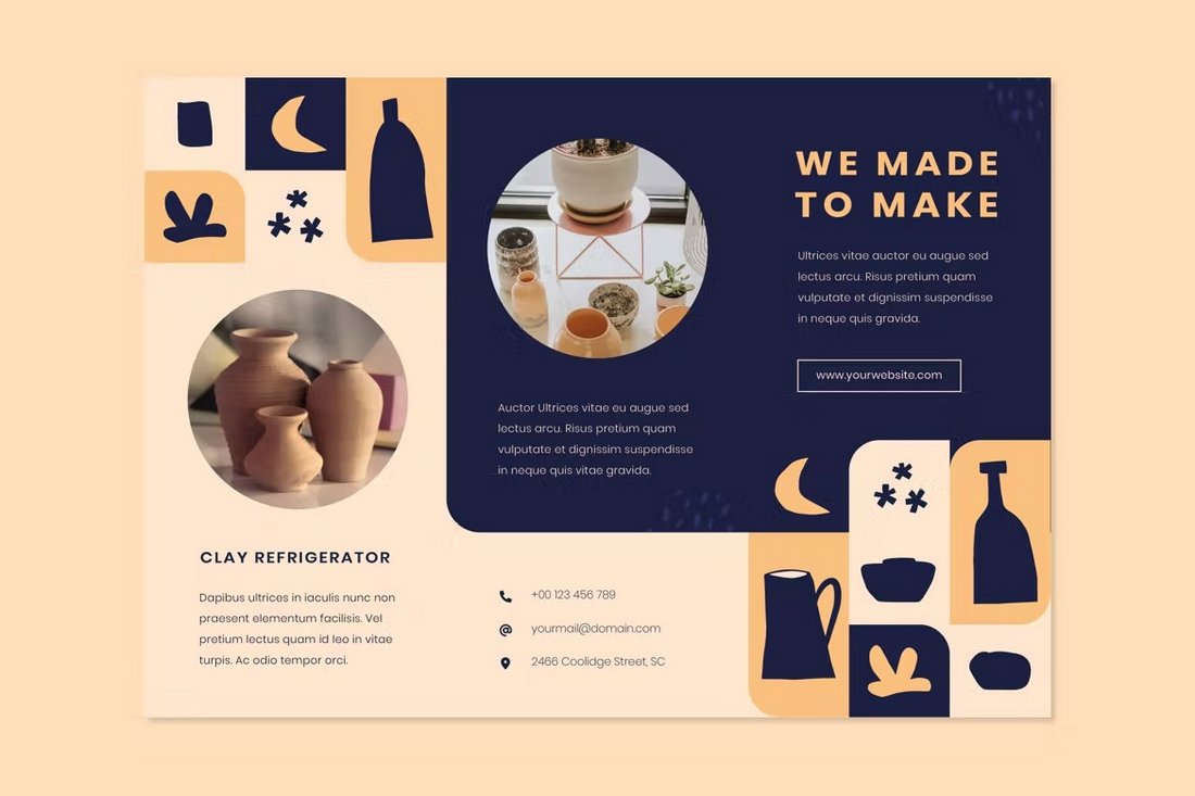
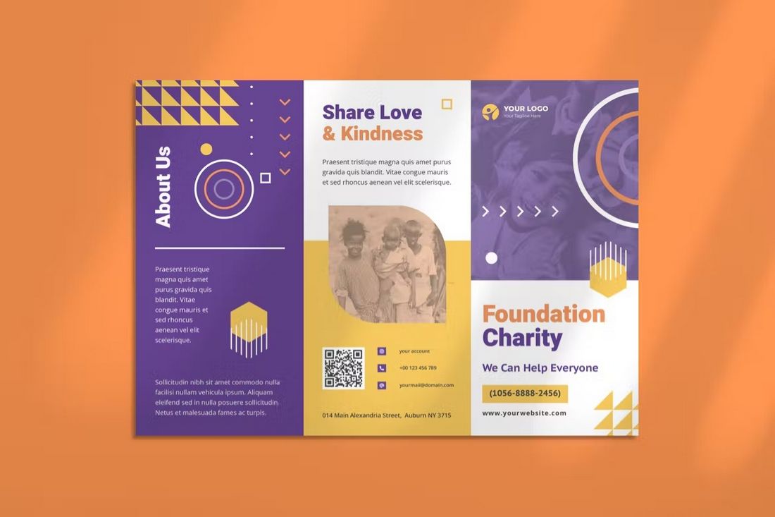
Geometric Shapes Tri-Fold Brochure Design
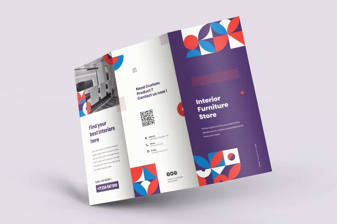
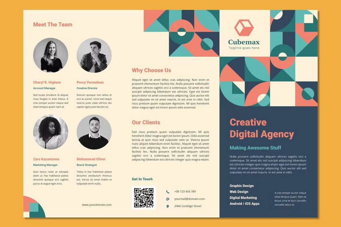
Adding colorful geometric shapes to your brochure design is a surefire way to instantly attract the attention of your audience. This approach is most suitable for designing tri-fold brochures for modern businesses like design agencies, special events, and even startups.
Using a geometric shapes design is more than just about placing a bunch of shapes in a design. It can also be used to create structure and balance for your overall content design. You can use shapes creatively to design sophisticated brochures or use them to add a bit of controlled chaos to the design as well. The choice is yours.
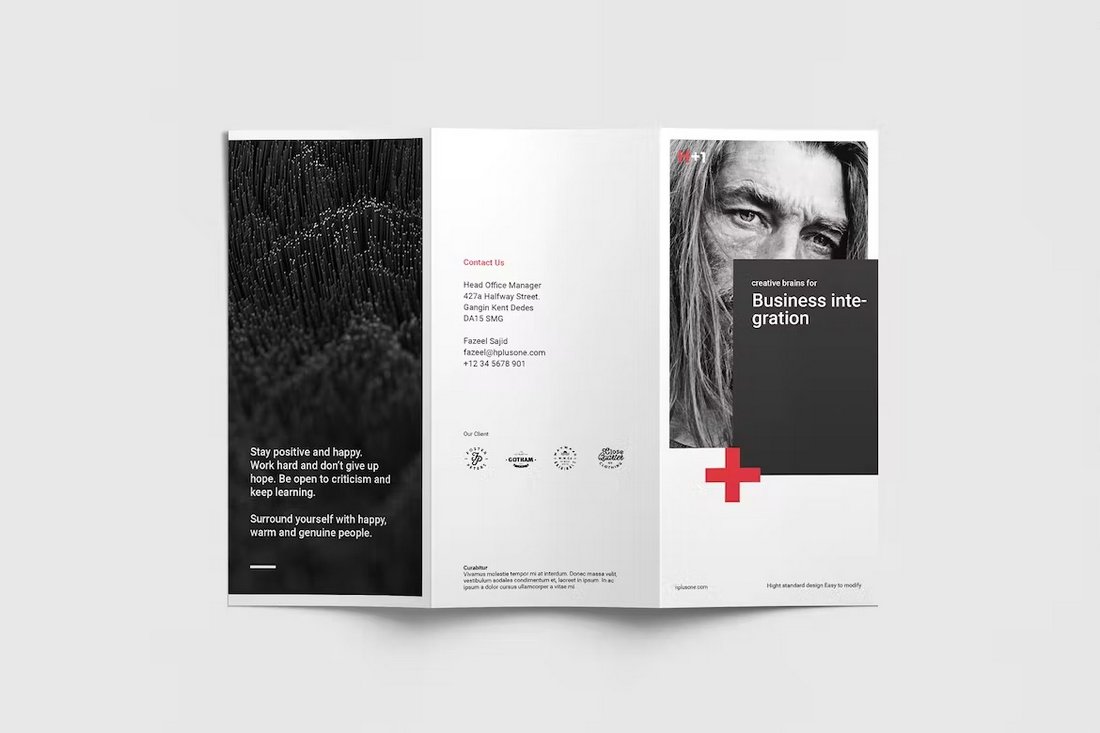
Bauhaus Tri-Fold Brochure Design
Inspired by the popular German art movement, the Bauhaus design trend is a popular design style used in everything from interior designs to posters, logos, and brochures. It’s one of the most unique design approaches you can use to create a brochure that stands out from the crowd.
The Bauhaus style is well-known for its timeless design style that has lasted for more than a century. Use it to add that same iconic brilliance to your brochure designs.
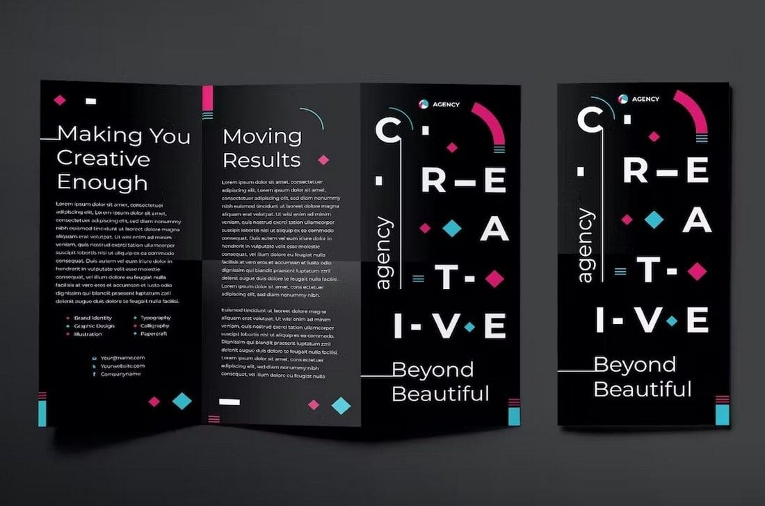
Creative Tri-Fold Brochure Design
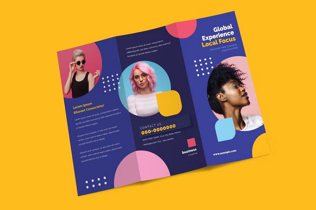
Sometimes you need to let your creativity run wild and give full control to your inner instincts to drive your design process. That’s where true creative designs come from. Add shapes, try different paragraph styles, use cool typographic effects, add neon colors, and experiment with new things.
The above image is just an example that shows how creative and beautiful a tri-fold brochure design can get. Take inspiration from it to craft a more creative brochure for your project.
Black & Gold Tri-Fold Brochure Design
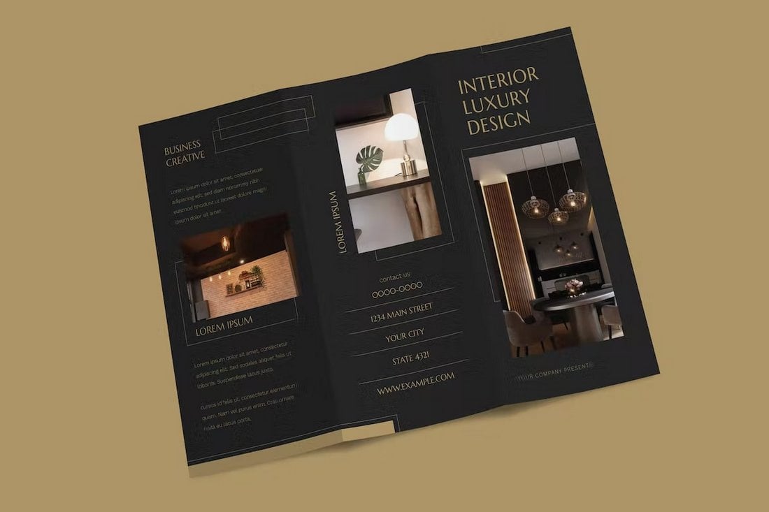
The black and gold color scheme is the go-to choice for luxury designs. The blend of these two colors helps add a high-end look to make any design look more magnificent.
If your tri-fold design is related to a luxury brand, hotel, high-end fashion brand, or jewelry business, you should consider using this design style.
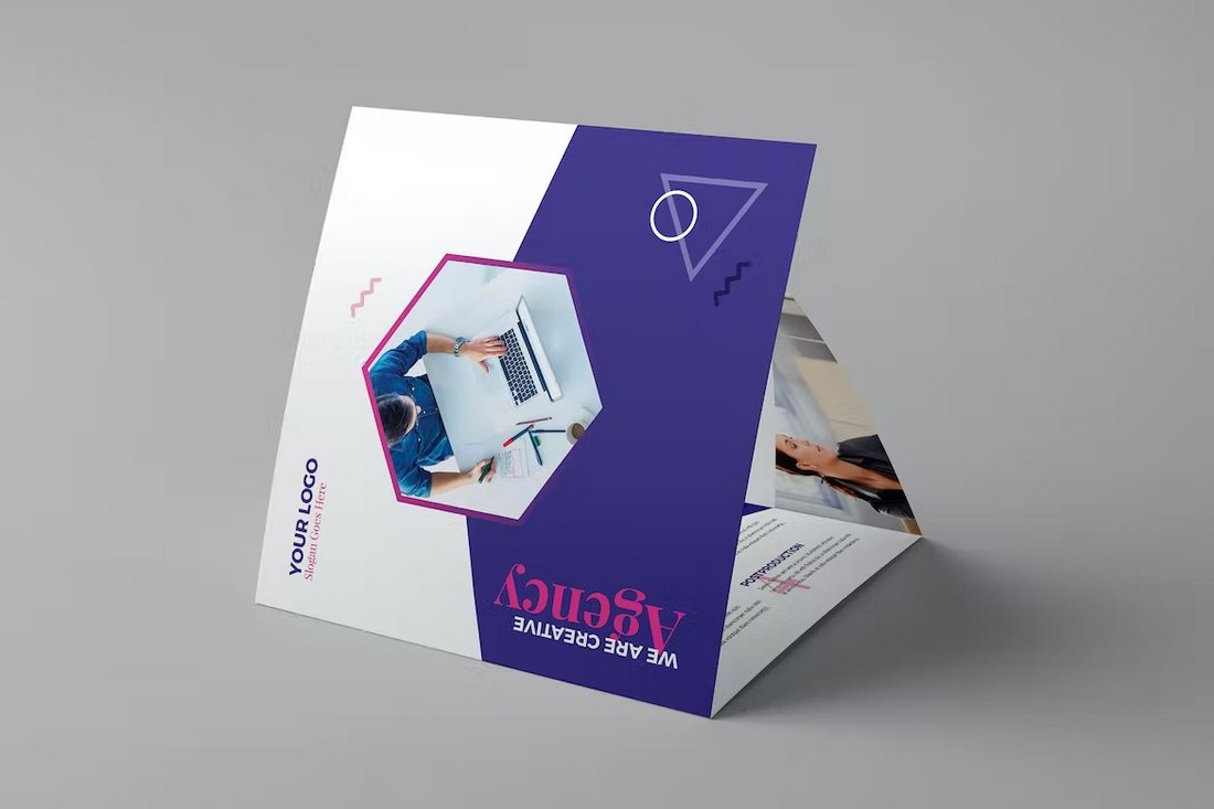
Square Tri-Fold Brochure Design
The square-shaped brochure design is perfect for creating a tri-fold brochure that innovates upon the traditional design. You can use this design style to create a brochure that looks different and modern. As a bonus, you’ll get lots of space to include more details in your brochure.
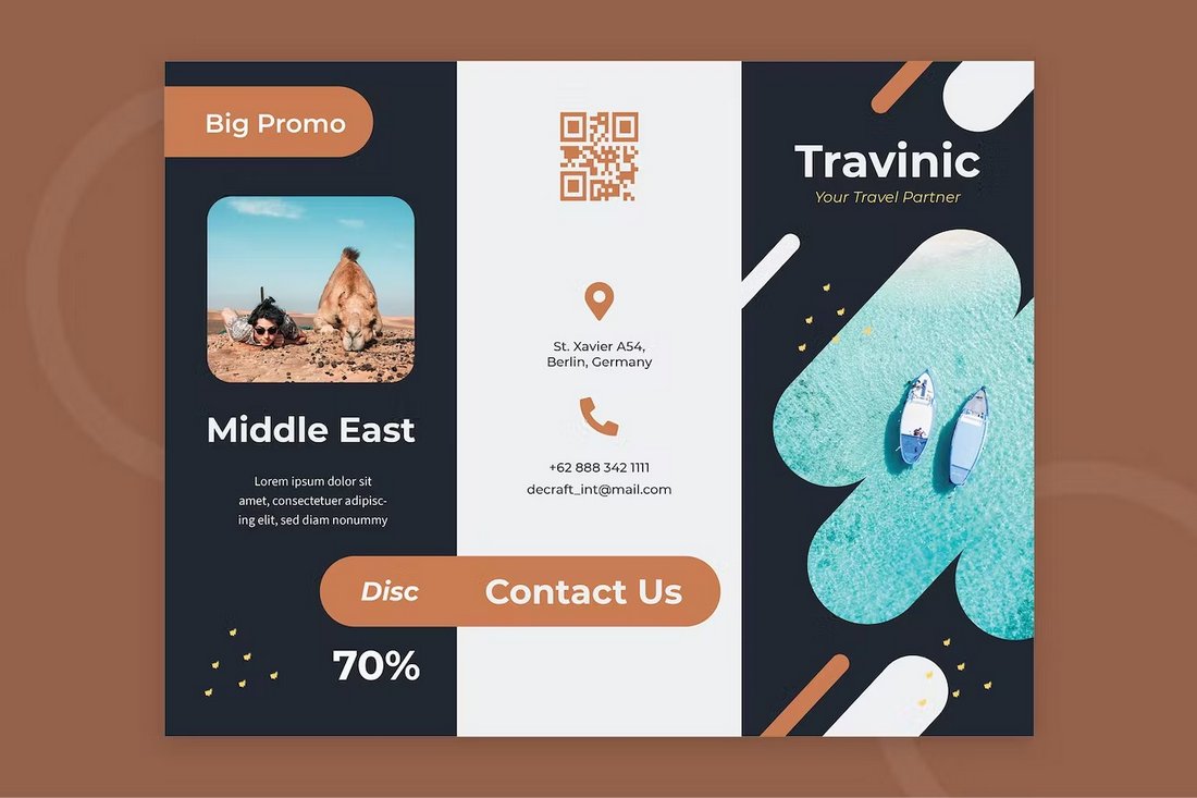
Brave & Bold Tri-Fold Brochure Design
Creating a bold design is all about making brave design choices. One example is using images or visuals to create contrast for the brochure design. Or using strong colors to accentuate specific parts of the design.
This design style will help you create eye-catching tri-fold brochures that deliver a more memorable experience to your target audience.
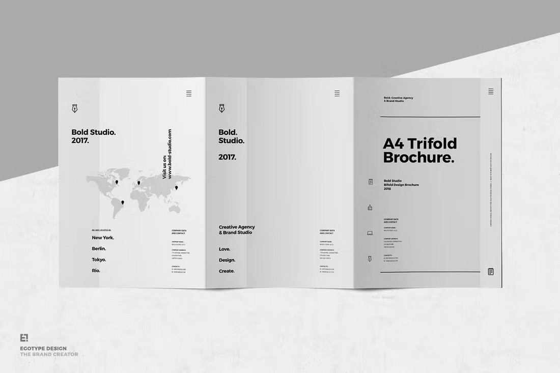
A4 Tri-Fold Brochure Design
The traditional tri-fold brochure is only the size of a single sheet of A4 paper or US letter size. How about creating an A4 tri-fold brochure that takes up 3 sheets of paper?
This new approach is perfect for creating bigger tri-fold brochures. It’s especially effective for making more detailed brochures, portfolios, or showcasing services.
Seamless Tri-Fold Brochure Design
A seamless tri-fold brochure design is about creating a layout that spreads across all three folds of the brochure. This type of design has two main benefits. One, you get a much larger space to create better formatting for the content.
Two, you can use it to create a different experience for the user. Like a customer journey or timeline. That makes it a great choice for brochures that showcase products and startups.
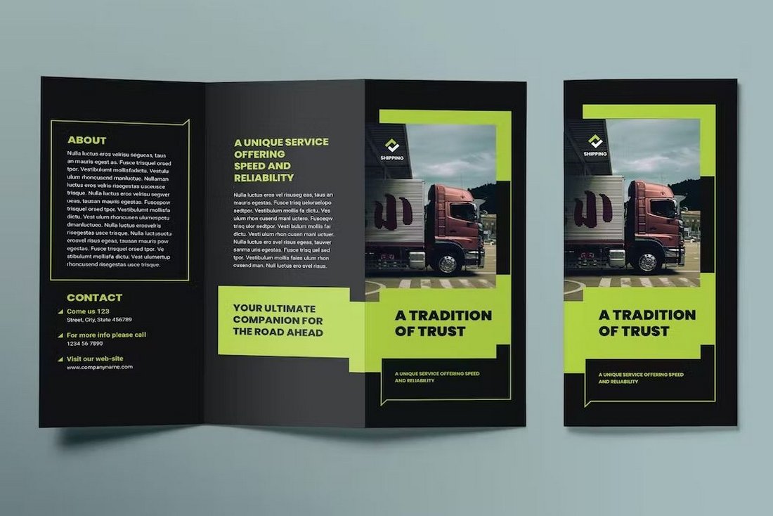
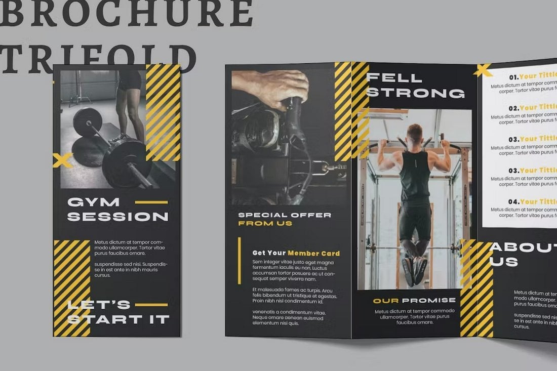
Dark Theme Tri-Fold Brochure Design
This design style needs no introduction. The dark color theme is a popular design trend that looks great no matter how and where you use it. It’s now used in both digital and print designs.
One of the many great things about using a dark theme for your trifold brochure is that it makes things much easier to highlight important text and titles with accent colors.
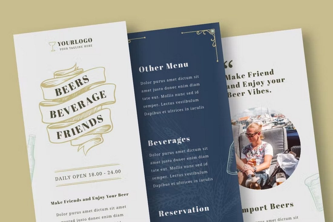
Vintage Tri-Fold Brochure Design
You can never go wrong with a classic vintage-style brochure design. Of course, this design style does not fit all types of industries. However, it’s an ideal choice for designing brochures for niche businesses like tours, travel, activities, and brands related to drink brands.
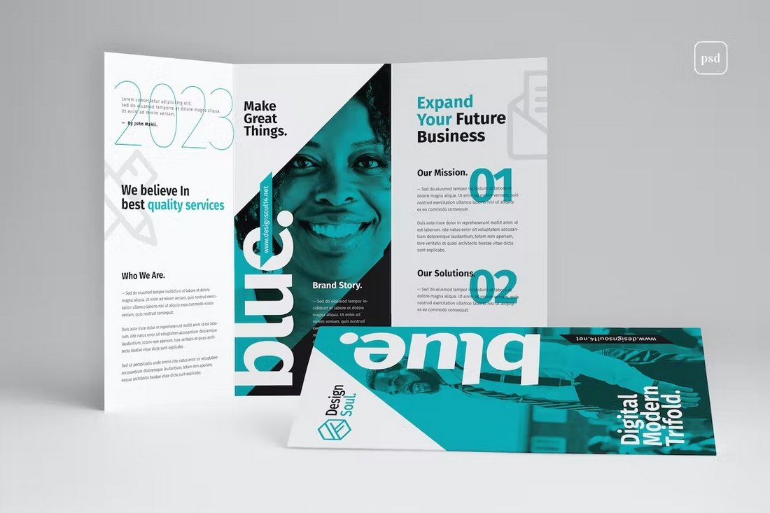
Modern Tri-Fold Brochure Design
Using a modern design for your trifold brochure will say a lot about your business and brand. It’s a way to show your audience that you stay up-to-date on current trends, that you are able to adapt to changes, and that you embrace innovation. Also, it will just make your brochure look amazing too.
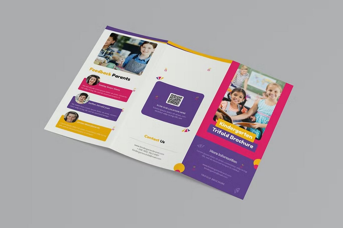
Colorful Tri-Fold Brochure Design
Colorful designs are often associated with inclusiveness, variety, and diversity. So it’s a great choice for brochures that wants to showcase those qualities.
And, if you’re working on a brochure related to children or education, a colorful design will bring you the best results.
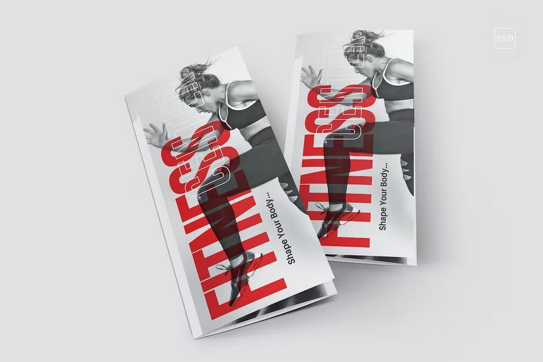
Typographic Tri-Fold Brochure Design
Rather than using the same old basic titles and headings for your brochure design, try using a creative typographic effect to design unique titles for your brochure. You can use Photoshop text effects to easily create cool typography designs.
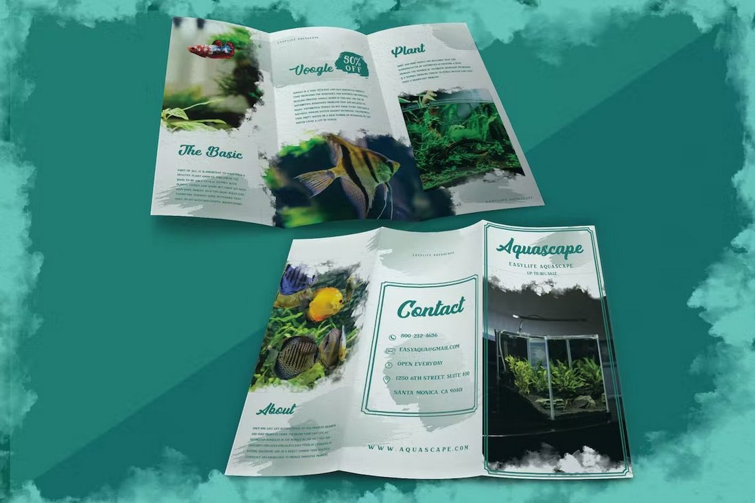
Brush Ink Tri-Fold Brochure Design
The brush and ink style of the tri-fold design offers a very uncommon look for brochures. It’s perfect for making brochures for creative shows, art galleries, museums, and many other businesses.
Another great alternative to this style is using a watercolor-themed design.
5 Tips for Designing Tri-Fold Brochures
As promised, here are a few useful tips and rules to follow when crafting a tri-fold brochure.
1. Start with a Template
Designing a brochure from scratch is a time-consuming task and you can save hours of time by just using a pre-made template. Even the most skilled designers use templates to get a head start in their designs.
With the right template at your side, you will be able to avoid having to think about the design and focus on what matters the most—the content.
You can check out our best tri-fold brochure template collection for inspiration.
2. Typography Matters
Readability is king in tri-fold brochures. If the text in your brochure is difficult to read, all your efforts will go to waste. So choose the right font for your design.
Look for a font that fits your industry and the category of the brochure. Don’t use overly decorative fonts. Make sure the text is easier to read.
Try looking for a font in our best business fonts collection.
3. Use Your Brand Colors
The colors you use in your brochure are another important factor that determines its effectiveness. Consider using the psychology of color to your advantage and evoke emotions.
Above all else, you should try to incorporate your brand colors with the brochure design. It will go a long way to establish your authority and deliver a branded experience.
Use our poster color schemes guide for tips.
4. Avoid Clutter
Using a minimalist design is often the right approach for a tri-fold design. It will allow you to easily highlight your content and offer a more user-friendly experience through the brochure.
If you’re using a different design style, pay close attention to the content formatting. Make sure to get rid of unnecessary paragraphs of text, images, and headings to create a clutter-free design.
5. Consider the folds
Designing a trifold brochure is different from designing most other types of brochures. You have to consider the folds to carefully design and arrange the contents. Think about how the user will open the folds and then place your content accordingly.
0 Commentaires